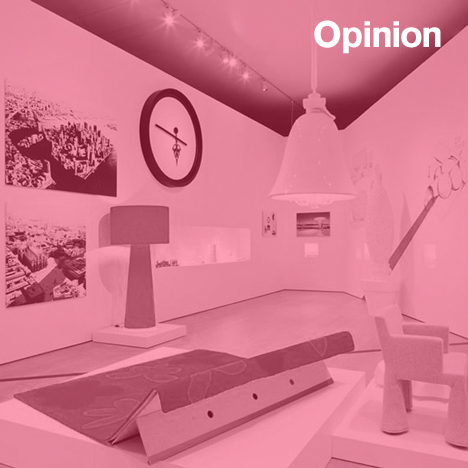
Opinion: Dutch writer Christian Reinewald defends Marcel Wanders' Pinned Up exhibition at the Stedelijk Museum Amsterdam, following a series of critical attacks claiming Wanders' work does not have the cultural weight to merit a major retrospective.
Louise Schouwenberg and other critics may not like the work of Dutch designer Marcel Wanders but his attitude is a sign of the times. His hybrid approach, combining pure shape making with an eye for commercial design, is a clear follow-up to the work produced by conceptual design company Droog in the 1990s – in which he participated – and Memphis: his earliest influence.
Maybe we critics just don't want to accept that our artistic idea of a kind of historically-correct conceptualism is becoming less relevant and has been blunted by popular consumption.
When the Memphis movement presented itself in Milano in 1984, Dutch designers, working in the (neo)functional tradition of Bauhaus, were shocked. In the leading Dutch design magazine ITEMS, some of them even warned design-educators to keep their students away from this dangerous example of post-modernism, lacking content and seriousness.
When a younger design generation appeared in 1992 with Droog and their studentesque objects, it took some time before the so-called "dry" (a word that translates directly into Droog) humour was understood and picked up. Still, despite their conceptual influences, Droog products were either misused as marketing tools by design companies like Cappellini or immediately archived by museums like the Centraal Museum Utrecht. Droog failed to reach a wider audience because of poor marketing and production issues. Now it runs a design shop, a "formula" Renny Ramakers, one of its founders, had once detested.
The Stedelijk Museum is being criticised for showing Marcel Wanders and accused of playing in a part in a marketing operation directed by him. But there is a significant difference between exhibiting in a museum and its purchase of contemporary art or design. A contemporary museum is obliged to show recent developments in art or design, at least to arouse a discourse among professionals.
Despite previously hosting major exhibitions of the then highly controversial visual artists Julian Schnabel, Keith Haring and Jeff Koons, only some of the works by these artists were bought by the Stedelijk.
The "message" of Wanders' show might be not agreeable to design-hardliners, who still judge design in the context of art history, referring to mostly the same sources. But even in the early 20th century, Walter Benjamin was referring to the popular culture which surrounded him.
The art-historical approach to design criticism is out-of-date with a recent transition to a design-historical context, in which it is no longer appropriate to judge a product solely on its aesthetic qualities – its role in society and mass culture now carries equal weight. Let's just face it: the "circus" of the Milan Salone only proves that most product design has become a lifestyle, fashion, last year's model, a fling of the season.
From a curator's point of view it might be have been better if the Wanders exhibition was accompanied with a timeline of Dutch conceptual design including Hella Jongerius, Jurgen Bey and Bertjan Pot. The work of these designers is clearly related to, and has some influence on, the work displayed by Wanders. Instead we find a commercially oriented product presentation of Wanders' company Moooi.
But the most shocking conclusion of the Wanders exhibition is how the internationally cherished and acclaimed concept of "Dutch Design" has been replaced by a media oriented, commercial format. This may not come as a surprise if you are familiar with Dutch culture's most recently successful exports including the musicals by Joop van der Ende or internationally bought formats of TV programmes The Voice, Diving with the Stars, Big Brother, naked datin': shallow ideas generated by young, male adolescents in a pub, however produced and marketed in an impeccable professional way and becoming valuable.
This formatting suits our "need of spectacularity", as Italian author/culture philosopher Alessandro Baricco states in his collection of essays, The Barbarians. According to Baricco, superficiality and spectacularity are genuine qualities, whether we like it or not. After postmodernism our culture is part of a mutation-process, similar to the changes experienced in the middle of the 19th century, according to Baricco.
In the midst of economic crisis Wanders has become a world player in truly international design – from Florida to the Arabic world and Russia: a position other "Dutchies" Gerrit Rietveld or Jan des Bouvrie never achieved. This in itself is remarkable enough to justify this spectacular, exciting exhibition for a wider audience.
Wanders has had an avalanche of ideas and, therefore, it is inevitable that the items on display are very different products. These may no longer fit in with our dogmatic ideas about style, but why can't art directorship and cultural entrepreneurship be part of the 21st century design-profession?
If we as design writers bluntly criticise from the perspective of our acquired taste and the presumed responsibility of a museum, we deny the important role of lifestyle approaches to design in newspapers and magazines, which are now being echoed and created by designers themselves. Marcel Wanders is as good an example of this phenomenon as any other designer.
By showing the spectacular and the design of the culturally "incorrect" Wanders, the Stedelijk Museum invites us to discuss the role of design in 2014. And our part in it.
Christian Reinewald is a design writer for Tableau Magazine and www.designhistory.nl, editor-in-chief of Museumvisie and former editor in chief ITEMS Magazine.

