Fuseproject creates mobile-friendly brand identity for PayPal
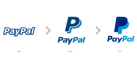
The identity features a new monogram made up of two overlapping, translucent Ps, as well as a redrawn logo, both of which are designed to be more readable on smaller screens such as phones and watches, and in real-world uses at retail outlets that accept PayPal transactions.
"It felt that the current brand had been created for an online world and a lot of it is moving to mobile," said Behar in an exclusive interview with Dezeen. "It's time for things to be more compact and most importantly for the icon to become the leading element that is seen online."
Behar said that technology companies such as PayPal have been slow to update their brand identities and had overlooked the importance of design.
"Silicon Valley tends to be very focused on great products but isn't as focused on great brands in some ways," he said. "If you think about the size and scale of their influence, I believe they really deserve a look at their identity in a way that is more global and they need look at it in a way that matches their ambitions."
The rebranding of PayPal came after the company carried out an audit and discovered that customers regarded its identity as similar to the traditional world of banking. "Over time the PayPal brand identity, having entered the world as an innovator, now in some ways resembles the banking and financial establishment it once challenged," the company said in a statement.
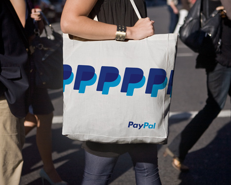
Behar said the overlapping Ps in the new monogram represented "the physical act of peer-to-peer transactions [which is] something that's very difficult to compare to traditional financial institutions. That was a core element that we wanted to bring out."
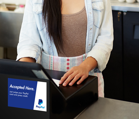
"We've made a lot of changes over the last couple of years at PayPal and we wanted to build on the foundation of being the number one payment processor online," said Christina Smedley, PayPal's vice president of global brand and communications. "We felt that our logo hadn't been changed for a very long time and also it hadn't really adapted to the new forms it was going to be used in: for wearable devices but also in the [real] world."
Smedley said the company has developed payment solutions for smart watches and other portable devices, as well as solutions for real-world outlets, including "pay with your face" technologies where customers can preorder via the internet and then walk into a store, where point-of-sale equipment will show staff a photo of the customer.
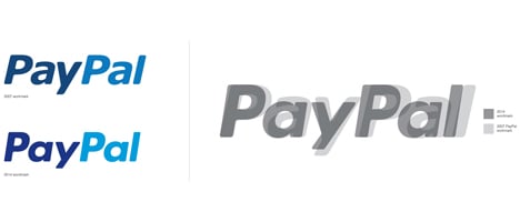
In a statement, fuseproject described the new identity as "a flexible system that extends and adapts across online, mobile and real‐world applications."
"The system is built around four key elements: a stronger word mark set in modified Futura, a new monogram of PayPal's double Ps, more vibrant colours, and a dynamic angle graphic," the statement says. "The word mark and monogram together lock up for PayPal's new signature."
Founded in 1998, PayPal now has 143 million active accounts in 193 countries, with transactions being made in 26 currencies.
Here's an edited transcript of Dezeen's telephone interview with designer Yves Behar of fuseproject and Christina Smedley, PayPal's vice president of global brand and communications:
Marcus Fairs: Christina, tell me how you got a high-profile international design company to work on your logo. That's quite an unusual step for a Silicon Valley company.
Christina Smedley: We've made a lot of changes over the last couple of years at PayPal and we wanted to build on the foundation of being the number one payment processor online. We felt that our logo hadn't been changed for a very long time and also it hadn't really adapted to the new forms it was going to be used in: for wearable devices but also in the [real] world.
You think about how we're moving away from online into real life, where you get points of sale etcetera who use PayPal regularly, we wanted to make sure we had a market that worked across that whole spectrum. We've worked with Yves before [fuseproject designed the PayPal Here mobile credit-card reader] and it just felt like a great continuation of our collaboration.
Yves Behar: We were looking at at all the innovations that are happening in payment and a lot of the marks have been made by PayPal. But it felt that the current brand had been created for an online world and a lot of it is moving to mobile. It's time for things to be more compact and most importantly for the icon to become the leading element that is seen online.
We've been working with PayPal for quite a while on some of those new experiences and some of those new products and you know for me the challenge that Silicon Valley has in general is that Silicon Valley tends to be very focused on great products but isn't as focused on great brands in some ways. I'm not talking about the obvious people who do it well, but all the ones who aren't focused on their brands much.
Marcus Fairs: What do you mean by brand? The logo? Or the whole way that the company is named and perceived?
Yves Behar: I mean like identity. The way your logo appears today in literally millions of places such as on people's phones, online as well as the physical world. If you think about the influence that those brands have now on the world, I think when they were conceived, they were tech startups. I mean they were small companies with small budgets that were just trying to survive. Now if you about the size and scale of their influence, I believe they really deserve a look at their identity in a way that is more global and they need to look at it in a way that matches their ambitions.
Marcus Fairs: So the new identity is designed to be more mobile friendly but how is payment changing? How will people be making payments through wearable devices or mobile phones in future? How is the landscape changing?
Christina Smedley: Everything over the last couple of years we've been doing here at PayPal is being designed totally mobile first. So absolutely every single one of our experiences has been transformed somewhat to work better on a smaller device but also by being simpler in the way you use it. To do it quickly, to actually get to where you want to be, to make the payment.
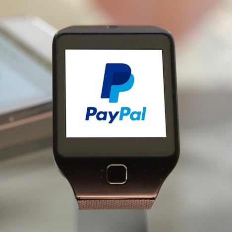
We think that for example we are the first payment provider on a wearable. We've been working with Samsung and we just went onto a watch. It's actually really rewarding because the work that Yves and the team did looks really strong on a small watch.
Then payment today is a rapidly transforming industry at the moment and there are many different ways that PayPal is integrating new experiences. So we have something called the Beacon, which will enable the merchant to plug it into their wall in a store and as you walk into a store, your phone might vibrate or give you an alert and offer you discounts or coupons.
Likewise, you're also able to order ahead in some of these retailers and you can pay with your face. So you actually don't have to get your phone out of your pocket even, because on a point of sale system that exists, you will just be picked up and the shopkeeper will see you and you'll be able to pay your payment with PayPal and then you'll be able to move through.
So actually in some ways, at some point, we kind of expect these wearables, smartphones to almost disappear out of the process. There will almost be a trigger point and that's what we've designing for.
Marcus Fairs: So did you say that you pay with your face? How does that work?
Christina Smedley: OK so if you went into a store, like we've got lots of different locations around the UK, but if you go into [noodle restaurant chain] Wagamama, you can order ahead using your phone and some of the retailers will have on their points of sale, the thing they have behind the counter, a capability to see your face.
You can order ahead and say "I'm paying by PayPal" and they will see a picture of you come up and they'll know that you've payed, they'll know that we sort the payment. That's instead of payment moving through the line at a really slow pace. And this is happening all over the UK and we've been got some places where you can go and try it out if you download the app
Yves Behar: The Beacon product we've also worked on with PayPal. It plugs into a laptop or straight into a USB port, which actually lights up this payment capability, in and around the store.
Marcus Fairs: Yves, could you could talk us through the rebrand from a design perspective? There's something in the press statement that says you did market research and people said that they thought PayPal's identity looked like a bank's.
Yves Behar: Well PayPal was founded in 1998, so a while back, and they were doing it down the phone. If you look at the founding team, it's a who's who of innovation. I think in many ways the company scaled very quickly and that sort of character of innovation wasn't as visible, wasn't as present [any more].
So for us it was very important to bring back this notion of innovation and also this notion of people. The brand scored really high in trust, meaning people trust in it, but it didn't score as high in notions such as innovation and having a human face to that innovation.
There is the physical act of peer-to-peer transactions and that's very difficult for me to compare that to traditional financial institutions and that's was kind of a core element that we wanted to bring out. So the two Ps come together [in the monogram] and are translucent.
Marcus Fairs: What is next for payments?
Yves Behar: If you look at the recent announcements from the last couple of weeks that PayPal has made which is that payment can happen in the essence of a phone or a watch, with wearable devices, it's easy to imagine how we'll be able to do payment without a physical wallet or with a phone or devices that we wear.
It's already something that can be accomplished and that's something that's going to continue. So the kind of frictionless experience that we have for example when you step into [a vehicle booked via ride-sharing application Uber], which PayPal is a partner of as well, when you step into an Uber and you step out of an Uber and you haven't had to really think about the transaction. You don't have to worry about leaving a tip which is included, and pulling out a card and signing anything or showing an ID. That's the kind of frictionless world of payment that we can imagine.
Christina Smedley: I think that the opportunity is a great one because the opportunity is human, we want things to become simpler and in some ways more beautiful. One of the things that we really focused on here over the last couple of years was how do we make things easier to use and to do that you have to have great design.