Kouichi Kimura's Tuneful House features contrasting materials and split levels
Shifting ceiling heights, sliding partitions and contrasting materials create a variety of spaces inside this house in Shiga, Japan, by Kouichi Kimura of Japanese studio Form (+ slideshow).
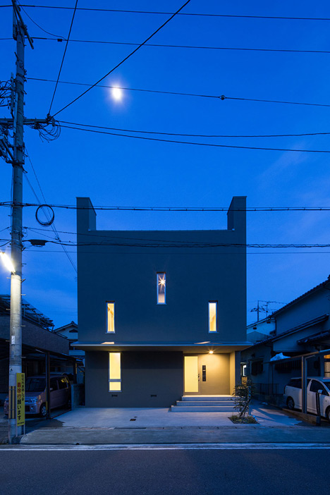
Koichi Kimura was asked to design Tuneful House on a limited budget, so the architect came up with a concept where simple detailing and low-cost materials offer a substitute to costly features and fittings.
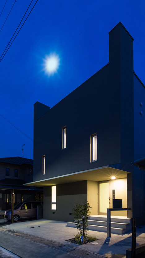
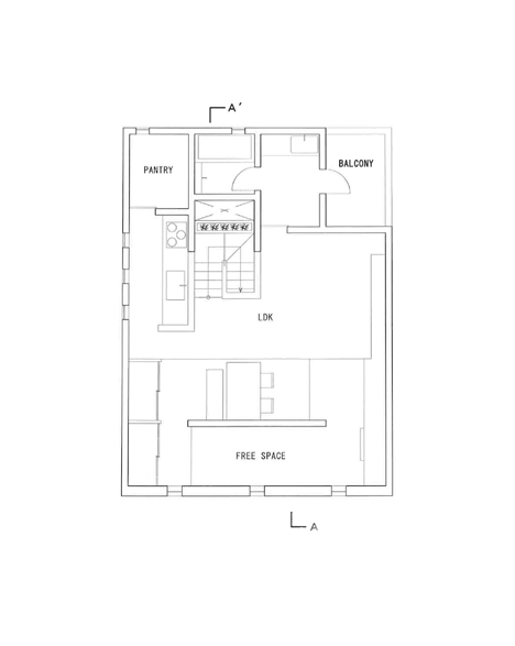
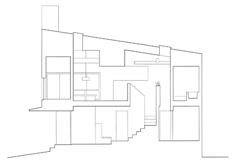
The house is laid out over two-storeys, with the upper level accommodating the family living areas. Rather than using walls to partition the spaces, the architect used raised platforms and changes in material to frame different activities.
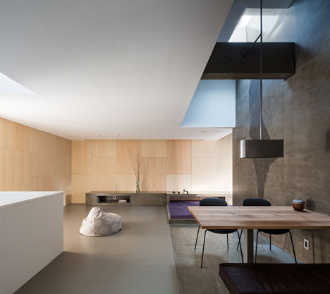
Different flooring marks the junction between the kitchen and dining area, while purple carpet marks out an area that could be used as a children's play space or as a study.
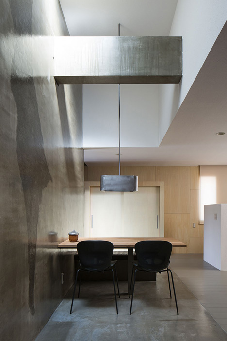
A single concrete wall sections off part of the room. This is framed by high ceilings, and features a textured surface and an overhead skylight.
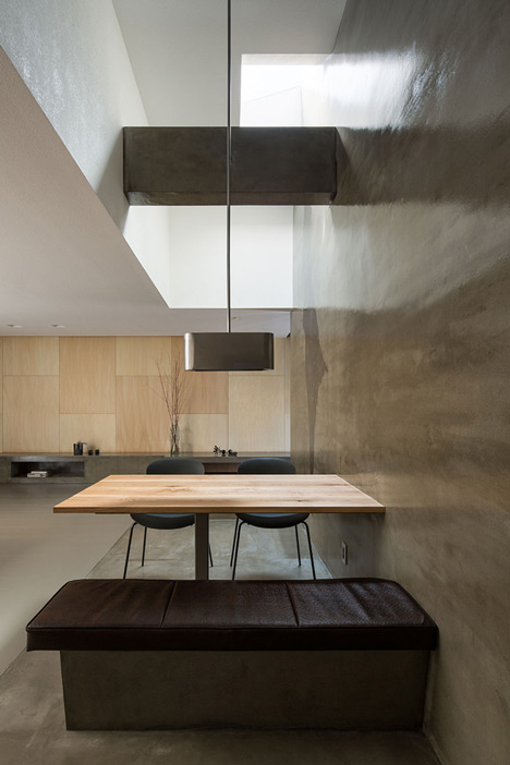
"What enhances this house are neither the elaborate details nor expensive materials, but the spatial composition resulted from the visual effect," explained Kimura.
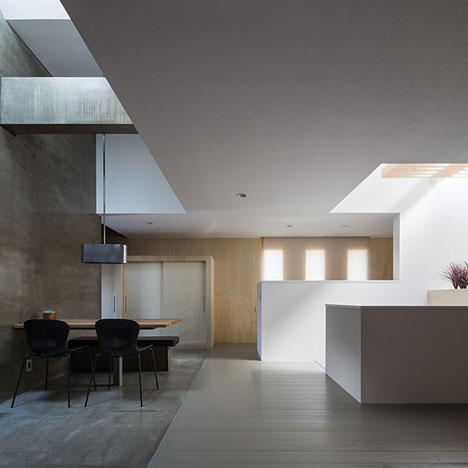
"By dividing the room, it has brought about migratory traffic that creates a fascinating sequence," he said.
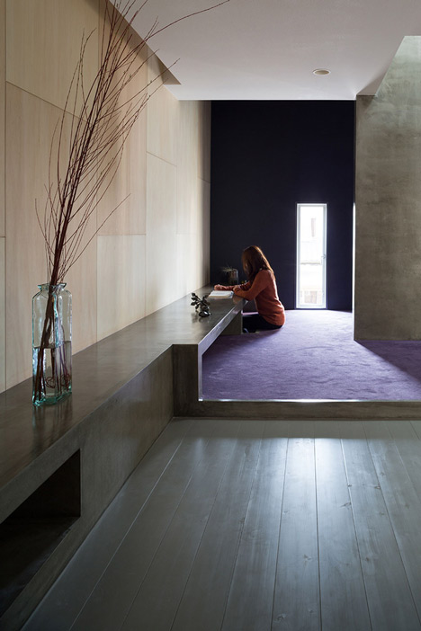
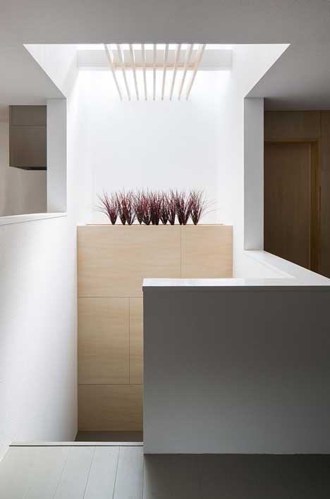
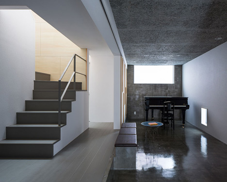
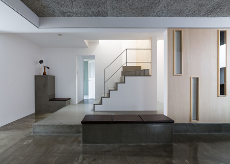
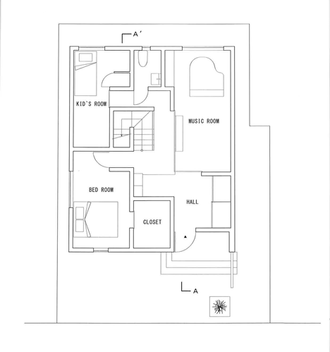
A second skylight signals the position of a staircase that winds down through the centre of the residence. This leads down to an open-plan ground floor space used by the residents as a music room.
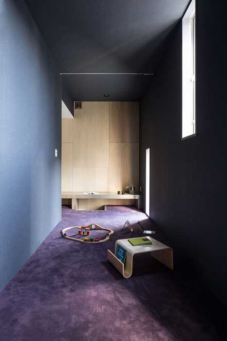
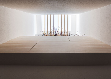
Stepped flooring also features on this level, where a series of sliding partitions allow residents to either close off or open up parts of the space. These are punctured by narrow windows.
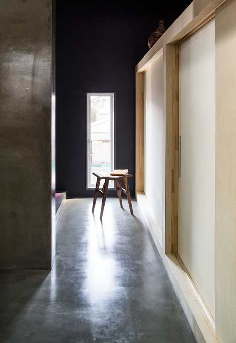
"The rhythmically laid out slits create atmosphere that matches the room," added Kimura.
Two bedrooms are also located on this floor.
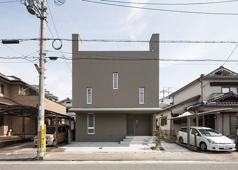
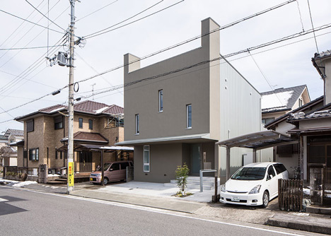
The house's facade is made up of vertical elements, including more narrow windows and eaves that extend upwards like horns.
Photography is by Yoshihiro Asada.
Here's a project description from Kouichi Kimura:
Tuneful House
The site is located at a corner of the residential area where old and new houses are mixed together. The client has requested to build a house for their enriched lives at an ordinary cost.
The reclusive external appearance, induced by the surrounding environment, is composed of the vertical walls that stand at both sides, the longitudinal opening, and the eaves that accentuate horizontal line. It blends with the surroundings and yet gives a peculiar feel, implying that the house includes a unique space.
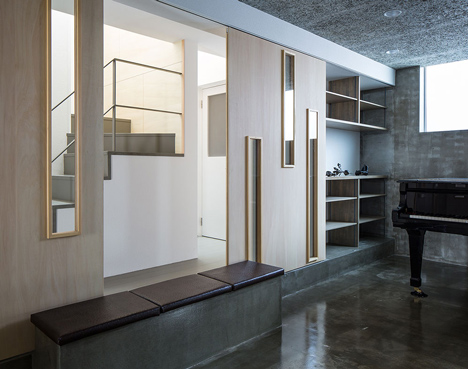
Entering at the front door appears a room separated by the sliding doors that have rectangle slits. It is used as the music room. The rhythmically laid out slits create atmosphere that matches the room. In contrast, by closing the sliding doors, the room is connected with the entrance, hall, and passage, functioning as a unified, visually expanded space.
On the second floor, the living-dining room is planned. Various space renderings are provided in this single room. The room contains a wall which dimly reflects light from the top light and thus its texture is highlighted. This is a structural wall, and also an element that divides the space.
By dividing the room, it has brought about migratory traffic that creates a fascinating sequence. In addition, the carefully placed table, bench, and lighting fixture provide beautiful life scenes.
Such visual effects and light renderings are also planned around the staircase located at the opposite side. The planting space at the staircase modestly separates the staircase and the atrium to give a pleasant distance between them. The wall with warm wood surface and the light dispersed through the wooden louvre gently embrace the space to produce comfortable lives.
What enhance this house are neither the elaborate details nor expensive materials, but the spatial composition resulted from the visual effect.
Architects: FORM/Kouichi Kimura Architects
Location: Shiga, Japan
Client: Private
Site Area: 125 sqm
Constructed Area: 130 sqm