Mirrored displays and walls have been designed to create a surreal visual effect at this pop-up design shop that Dutch interiors studio i29 has created inside an 18th-century building in Amsterdam (+ slideshow).
Created for Dutch design magazine Frame, the Frame Store provides displays for products, fashion, food and other design objects inside the grand Felix Meritis building, as part of a six-month events programme organised by the Foam Photography Museum.
The i29 team was asked to develop a proposal that could occupy the hall without interfering with the historical interior. It also needed to be demountable when the store's residency ends in the autumn.
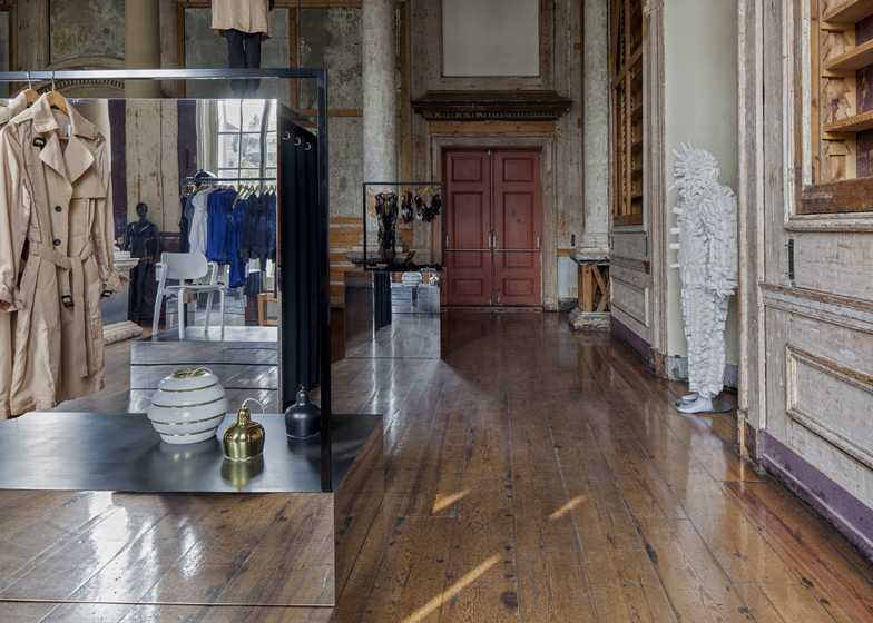
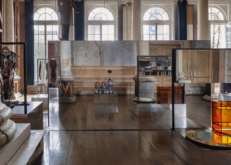
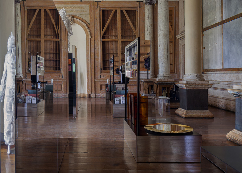
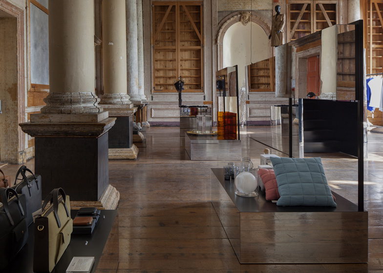
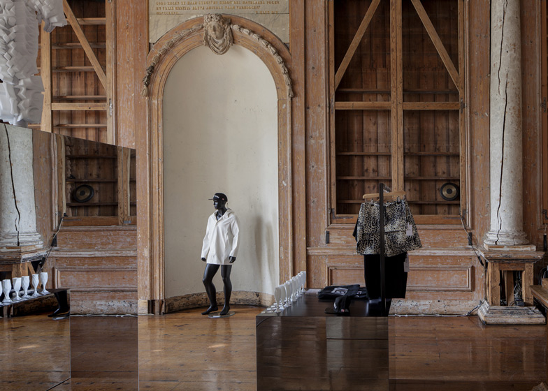
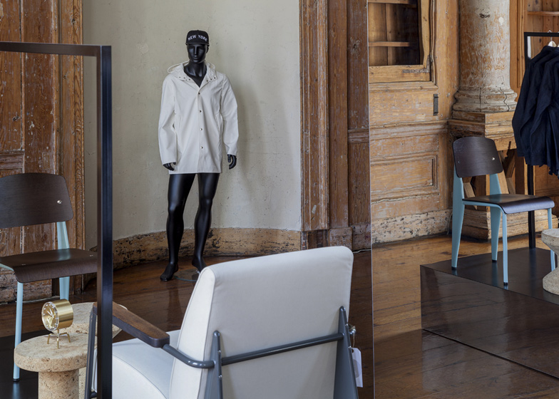
As well as highlighting products on display, the mirrors conceal changing rooms and exhibition spaces, and reflect original features including wooden columns.
"The multiple use of mirrors throughout the monumental space stands for reflection of time and history: the old versus the new," the designers explained. "The goal was to create a surreal world of reflecting elements."
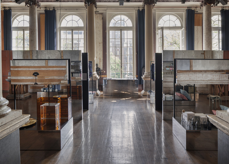
Plinths with mirrored sides and black surfaces support a selection of furniture and products, while black metal frames rise from the some of the plinths to provide clothes rails and shelves for other merchandise.
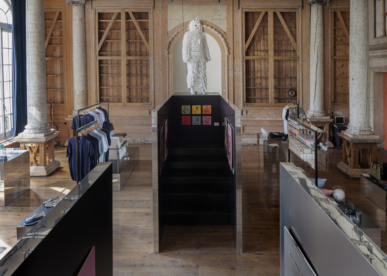
Two larger reflective boxes aligned along the centre of the room house the changing rooms, as well as small gallery spaces with black-painted walls.
Stairs at the rear of the space allow shoppers to get closer to a sculpture and a mannequin positioned above the changing rooms, and to peer over the top of the walls to gain an unusual perspective of the entire store.
For those on the ground, the appearance of people partly rising above the shiny walls creates "a surreal image for the other visitors" that complements the visual effects created by the mirrored surfaces, said the designers.
"The contradiction of this minimal and modest intervention is that the volumes are absorbed in the existing space and seem to disappear," said the designers. "At the same time they are adding extreme sharpness and intensify the experience of the existing space more than ever before."
Illuminated signs on the building's grand staircase guide visitors to the store's second floor and exhibition spaces on the levels above.
Read on for a project description from i29:
Frame store
Frame Publishers and Foam Photography Museum Amsterdam joined forces for a creative centre in the historic Felix Meritis building.
A new creative platform has opened its doors, enlivening the monumental Felix Meritis residence at 324 Keizersgracht in Amsterdam. The space will host numerous events and exhibitions organized by both Frame and Foam. Alongside the events, Frame Publishers has created two retail spaces – designed by local outfit i29 – with a focus on fashion and design.
The Frame Store offers a three-dimensional experience of the magazine – a creative and innovative universe that surprises and inspires. The world of Frame shows what good design can do, and is a celebration of beauty, functionality and accessibility through timeless products. The Frame Store will stage new talents, new products and new brands from various genres. Fashion, art and design sit alongside media, beauty and food.
The interior of the canal-side store is just as inspiring as its innovative products. The monumentality of Zuilenzaal – an attraction in itself – has been heightened through an intervention by i29 interior architects. Transforming the space into a mirrored universe, the award-winning designers elevate and reflect its grandeur.
To i29, the multiple use of mirrors throughout the monumental space stands for reflection of time and history; the old versus the new. Products are presented on series of single platforms with mirrored sides and black top surfaces with integrated black frames. The surfaces and products seam to float through space. The goal was to create a surreal world of reflecting elements presenting the products without interfering with the quality of the monumental environment.
Two larger mirrored objects contain fitting rooms, a small art gallery and stairs that offer a different perspective for the visitors climbing them, and a surreal image for the other visitors in the shop looking only at the top half of these personages. The contradiction of this minimal and modest intervention, is that the volumes are absorbed in the existing space and seem to disappear. At the same time they are adding extreme sharpness and intensify the experience of the existing space even more than before.


