Sagmeister & Walsh uses "sacred geometry" to rebrand New York's Jewish Museum
American design firm Sagmeister & Walsh has created a new brand identity for New York's Jewish Museum based on traditional shapes used in Judaic symbolism (+ movies).
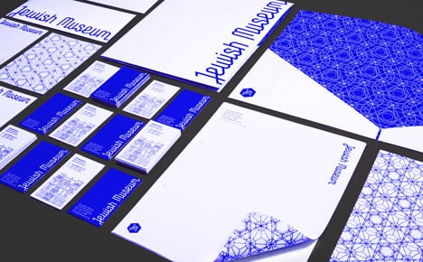
The Jewish Museum wanted "an engaging, exciting, contemporary branding that embodied the Jewish heritage and culture of the Museum."

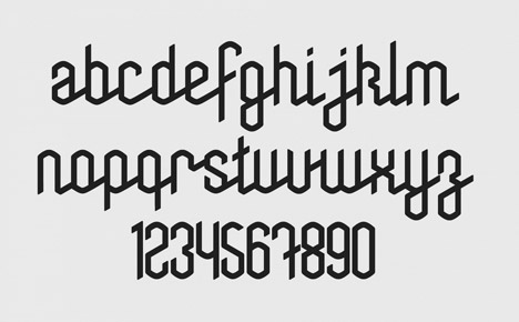
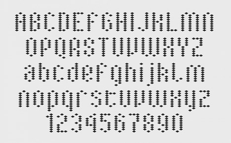
Sagmeister & Walsh researched the origins of the Star of David and discovered "sacred geometry" – a geometric system created from calculations using numbers considered to have spiritual significance – from which they were able to create a new identity.
Located in a seven-story mansion in the Upper East Side of Manhattan, the Jewish Museum is the preeminent museum in the United States devoted to Jewish art and culture, and one of the three largest in the world.
Their collection, distinguished by its breadth and quality, includes some 30,000 items.
The brief for Sagmeister & Walsh was to connect the historic and the contemporary, engaging multiple generations of visitors.
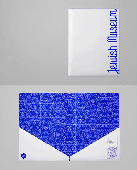
"When we were studying the Star of David, we learned that it was created using sacred geometry," said studio co-founder Jessica Walsh.
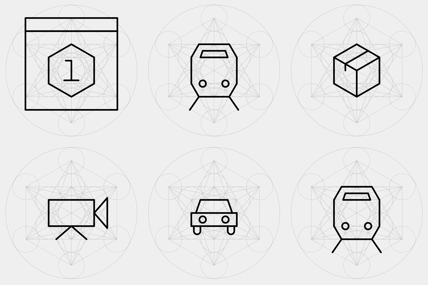
"The origin of this geometry goes back to the belief that the universe was created according to a geometric plan. Its roots are in the study of mathematics, and many forms in nature can be related to this geometry," explained Walsh. "This geometry was used in the planning and construction of much religious art and architecture."
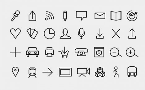
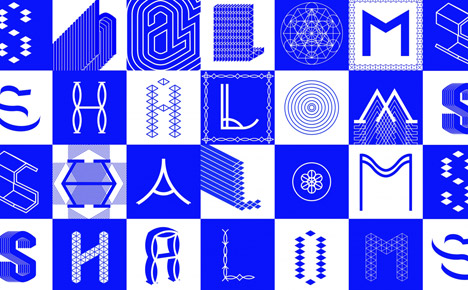
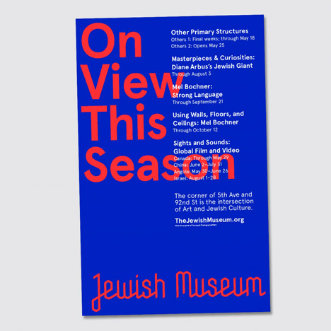
Using several grids that are considered part of sacred geometry, from the flower of life – a geometrical figure composed of evenly-spaced, overlapping circles – to tetrahedron patterns, Sagmeister & Walsh designed stationery, packaging, advertising campaigns, promotional materials, and a new website that will launch in June.
"The foundation of the brand is based on Jewish symbolism, but the end result is contemporary," said Walsh.

"We often create restrictions on our work which help guide us to a solution or concept. We do not find limitations like grids challenging, restrictions can actually help creativity thrive," she explained.
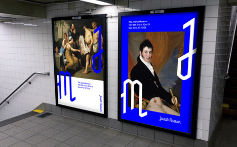
"If you can do anything, it's often difficult to focus and you can get lost in all the possibilities. When you have a set of limitations like a grid, it can be easier to be creative."
A vibrant royal blue permeates through all the collateral. "Blue is an important colour in Jewish history, and we opted for a contemporary shade," said Walsh. "Again, we wanted the branding to be based on heritage, but look contemporary."

To ensure any photography used in Jewish Museum communications fitted the new brand, Sagmeister & Walsh built a processing application that uses the same grid system to turn a photograph, or even a webcam stream, into bespoke Jewish Museum illustrations.
"This system invites surprise and flexibility across all media, while maintaining a unified visual language," explained Walsh.
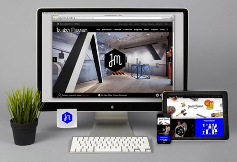
The brand identity is live across the Museum communications now and the website launches on 1 June 2014.