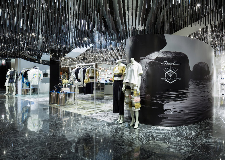
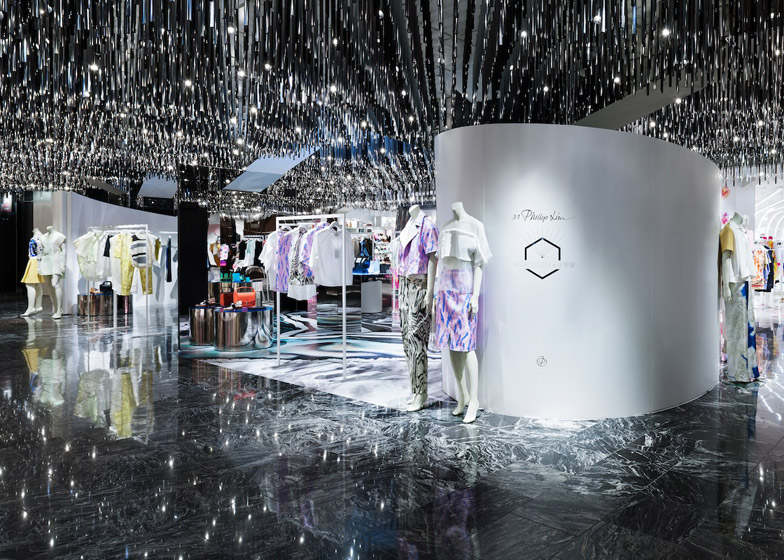
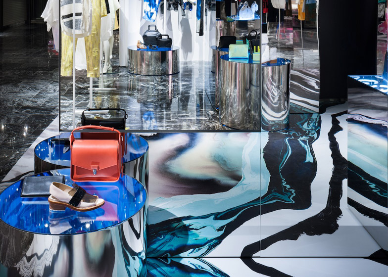
Japanese studio Schemata Architects has used mirrored surfaces to create a dizzying environment for this pop-up store in Tokyo, designed for fashion brand 3.1 Phillip Lim (+ slideshow).
The 68.2 square metre space, on the third floor of Isetan department store in Shinjuku, Tokyo, is enclosed between two curved structures – one for hanging clothes, and the other housing a stock room and fitting room.
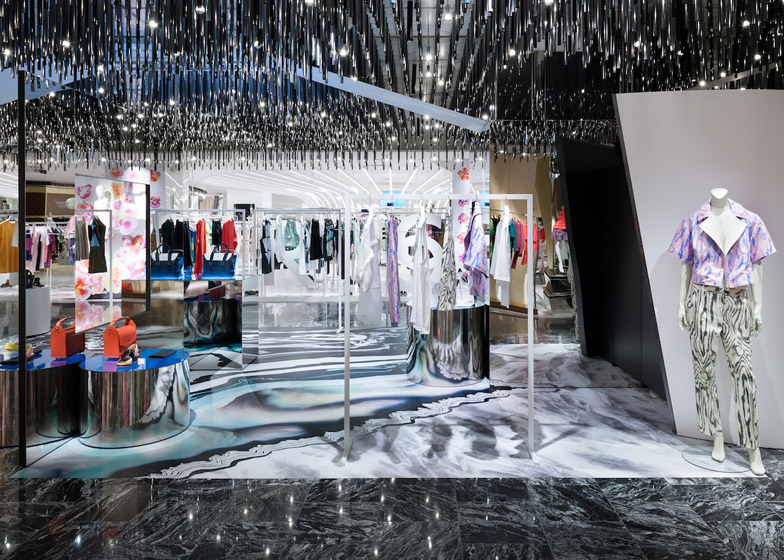
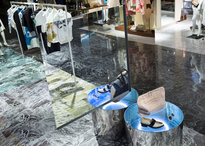
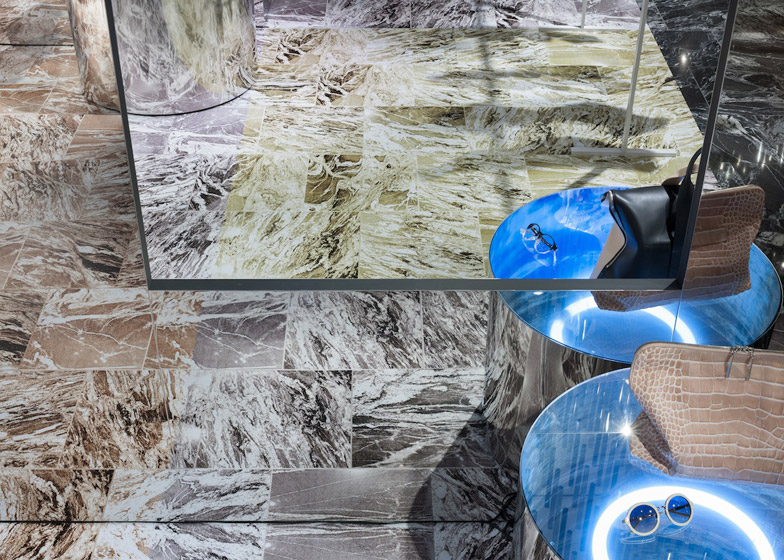
Between these, Schemata has arranged mirrored fixtures symmetrically, which create multiple reflections in the space. Two large square mirrors face each other in the centre, and mirrored circular display plinths are arranged between these.
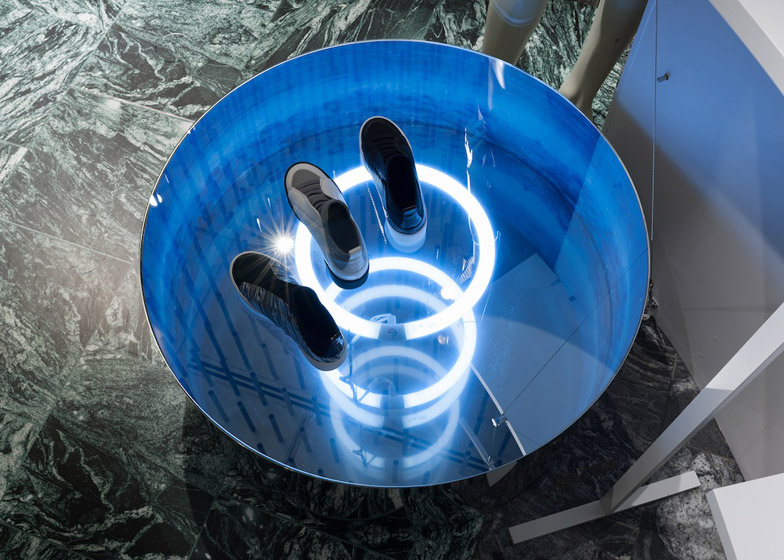
The glass-topped plinths also have coiled lights inside them, and the ceiling above is fitted with needle-like pendant lights, amplifying the reflective quality of the space.
The design responds to a conceptual brief from 3.1 Phillip Lim, which gave the architects a number of opposing words, such as youth/elegance, and luxury/pragmatic. Rather than interpret these as opposite forces, Schemata decided to fuse them together.
"First, we divided the space into two zones, to emphasise the relationship of A and B," explained studio principal Jo Nagasaka. "Then we connected the two zones using mirrors. When you enter inside the shop, real images and reflected images merge into each other to create a new relationship, that is A and B at the same time."
The design is one of five that Schemata Architects is designing for 3.1 Phillip Lim in the pop-up space over six months. Each design will reflect a different theme, ranging from nature to neo-industrial rave.
Other designers commissioned by New York designer Phillip Lim to create boutiques for his fashion brand include American studio Leong Leong, who designed a flagship store for Seoul, and Japanese studio Jamo Associates, who developed the Tokyo store.
Photography is by Takumi Ota.
Here is some more text from Schemata Architects:
3.1 Phillip Lim Microcosm
This is 3.1 Phillip Lim 2014 Pop- Up store at Shinjuku Isetan, which opens from April 2014 for six months.
This time the shop is located on the third floor of the department store, which had a space with a strong character. We attempt to make five renewals in 6 months, and at this stage we have done two renewals.
In this project, we focus on the brand philosophy of 3.1 Phillip Lim. Several sets of "almost" opposing words are given. "Almost" is the keyword that represents the wide scope of their design directions, and also it liberates their ways of thinking. The keywords are as follows:
Dynamic/Effortless
Youth/Elegance
Classic/Madness
Luxury/Pragmatic
Youth/Elegance
The last set of words is most important for him.
We translate the philosophy not into words but into forms in space. We interpret the words not in opposing relationship such as "A versus B", but re-interpret them as "A and B at the same time". And we expect that something new will emerge from the new relationship.
First we divide the space into two zones to emphasise the relationship of A and B. Then we connected the two zones using mirrors. When you enter inside the shop, real images and reflected images merge into each other to create a new relationship that is "A and B at the same time".
Title: 3.1 Phillip Lim Microcosm
architects: Jo Nagasaka/Schemata Architects
Project team: Masami Nakata/Schemata Architects
Usage: pop-up store
Construction: TANK
Floor area: 68.2 sqm

