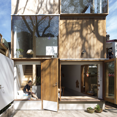
Alternating cubes of timber and glass cover the back of this Sydney house extension by Australian office Panovscott, offering a balance of light, shade, views and privacy.
Three by Two house was designed by Panovscott for a couple with two young children, who wanted to transform their dark semi-detached Victorian house in an inner-Sydney suburb.
"Their second child was due shortly when they approached us, so they wanted light, air, a place for the family to commune, and they wanted a great building," architect Andrew Scott told Dezeen.
The two-storey extension gives them a new kitchen on the ground floor, which opens on to the garden. Above, a bedroom and en-suite for the parents is set back slightly from the back wall to create a six-metre-tall double-height space at the rear.
"By pulling the bedroom back, the kitchen-diner below opens up to the light at the edge of the house," said Scott. "The void also allows the parents to be part of the life of the house when they are in the bedroom, while still giving them privacy. In a constrained fiscal and spatial environment, sometimes an exuberant gesture is crucial."
The western red cedar and glass sections on the rear facade act like blinkers, framing views of treetops while shielding the family from being overlooked. On the ground floor, glass doors and a timber panel fold back to open the house up to the garden.
Inside, a wall of the kitchen-diner has been covered with floor-to-ceiling cabinets made from kauri pine – a sustainable locally sourced plywood. For the flooring, a structural concrete slab has been polished to expose the aggregate, and then sealed.
"This room is conceived as a 'great room', based on the example of a medieval castle, in which a large space accommodated multiple uses at the centre, and more specific spatially constrained opportunities at the edge," said Scott.
The extension offers a bright contrast to the front of the long, narrow house, which is just over four metres wide and attracts scant light throughout the day.
A long corridor leads from this existing part of the house to the extension at the back. The entrance to the new space is tilted, intended to offer a glimpse of the light on approach but saving the full impact of the large space as a surprise.
An indentation where the extension meets the existing house also allows for a small courtyard, which ensures light comes deeper into the narrow space.
Photography is by Brett Boardman.
Here is some more text from Panovscott:
Three by Two House, Sydney, Australia
This project is the renovation of a house, one of two semi-detached single storey dwellings located in Sydney’s densely inhabited inner west. Broadly speaking it is about the making of a new whole by retention of one half of a structure and reconfiguration of the other.
The environ is an increasingly gentrified subdivision originating around 1880 and characterised by predominantly narrow east-west orientated housing parcels fronting a large public park.
Approach to the house remains via the formal front garden up three generous steps and on to a narrow porch below a low curved corrugated roof. Within, the front rooms have been retained with minimal intervention allowing the continued manner of dwelling.
A long hall leads past two bedrooms. The high ceilings, small windows and wonderfully lean vertical timber construction establish the character typical of a Sydney terrace. Cool in both summer and winter and dark even on the brightest of days, these spaces offer the initial experience of homecoming and become a counterpoint for the character of the rear addition.
At the end of the existing hall a small opening twists to the sky bringing gentle light though the upper level and into the centre of the long plan. The light washes down a 45-degree splayed plywood panel. Visible from the dark front rooms and immediately upon entry, it announces the differing quality of the spaces ahead. Moving towards this quiet light, the thin sliver of a brighter room beyond gradually widens with the shifting perspective. Shunted off the previous axial alignment, and past a discreet bathroom, the great communal room of the house is revealed. Light filled, this is a combined kitchen and dining space of slightly smaller area than the lean-to it replaces. Here the elegant vertical proportions and lean timber construction techniques of the front part of the house are reinterpreted.
Continuing the homecoming journey the room increases to six metres in height reaching upwards at its far end. The number and size of windows also increase gradually to this point allowing the internal space to expand horizontally as well as vertically and for the light levels to approach that of the external environment. Turning 180 degrees and up a narrow stair concealed behind a ply lined wall, the level above contains a master bedroom and en-suite, with a tiny window looking back across the roof to the park. This moment completes the journey within to the most private realm of the house.

