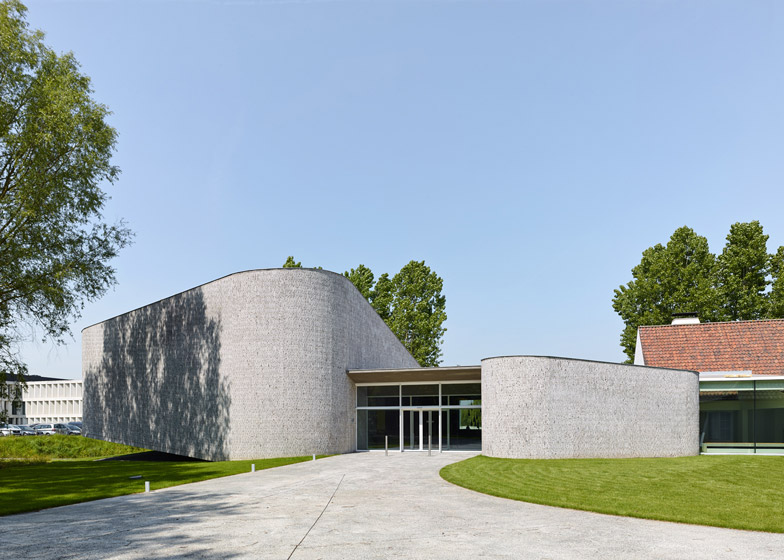
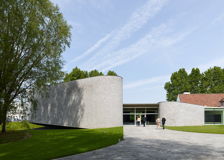
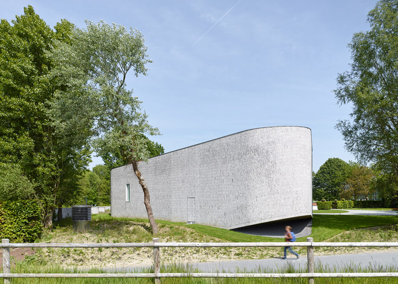
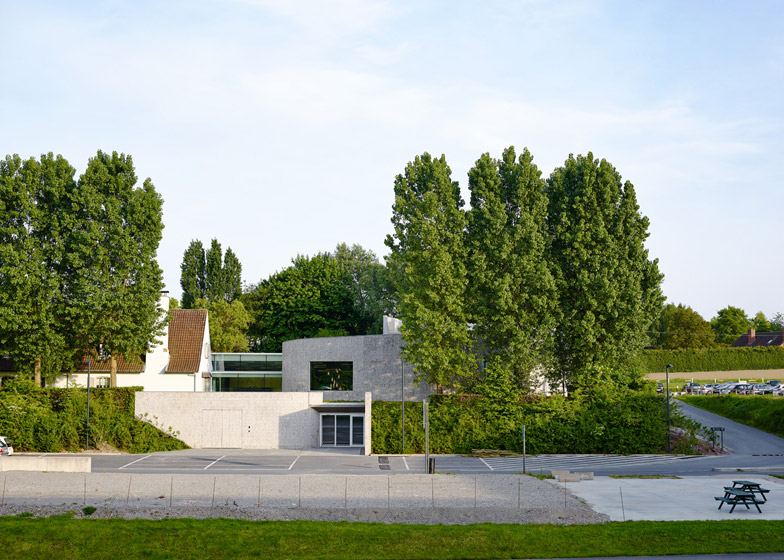
This triangular auditorium in Belgium by Dehullu Architecten features a facade of upright bricks and a rounded corner that lifts off the ground (+ slideshow).
Belgian architect Bert Dehullu designed the building to provide a lecture hall for AZ Groeninge, a teaching hospital in Kortrijk, as part of a complex of teaching rooms and conference spaces.
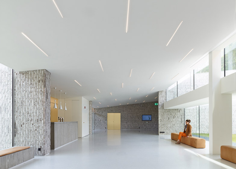
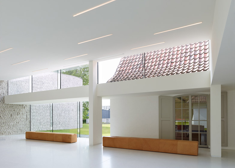
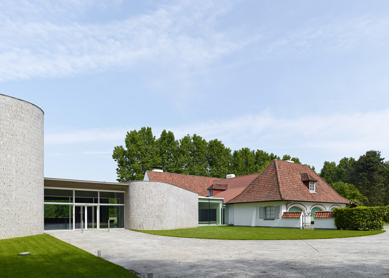
Mottled grey bricks were chosen for the walls, creating a gentle contrast with the white-rendered walls and tiled roof of the adjoining building – a converted villa that houses the rest of the facilities.
"The building is distinct, and has a gracious and optimistic elegance," said Dehullu. "It is a hide-out for the staff of the hospital, a place to be away from professional obligations, well integrated in the green surroundings."
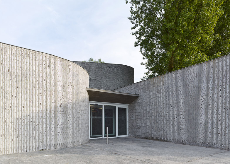
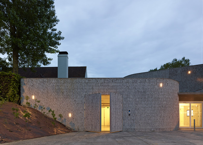
The architect chose to arrange bricks in a vertical pattern, rather than in a typical horizontal bond, to give a more natural curve to the facade.
"Because of the shape of the walls, it was the most logical way to place them," he said.
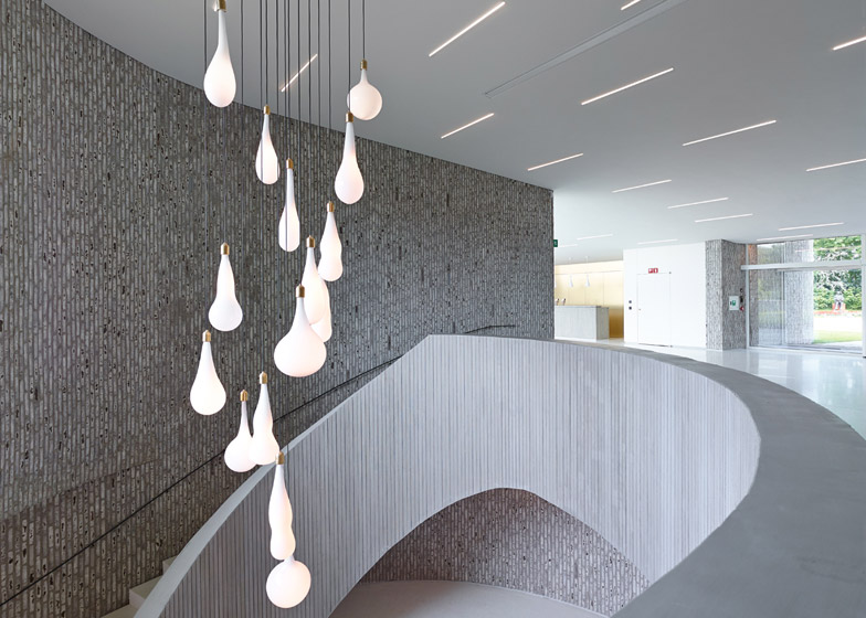
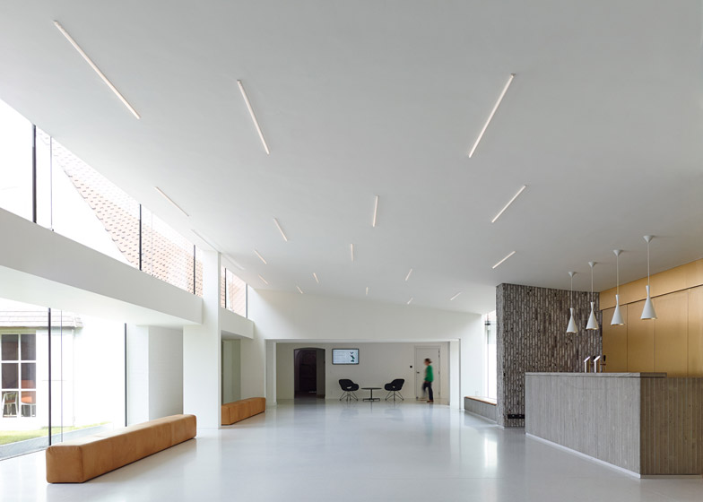
The brickwork is also left exposed inside, complemented by golden doors, white ceilings and a sculptural chandelier created by Dutch designer Pieke Bergmans.
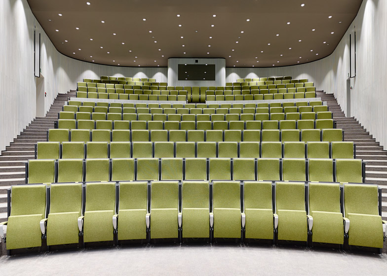
Arranged over two storeys, the internal space is connected by both the 230-seat auditorium and a grand spiral staircase. Part of the structure is sunken into the hillside, which allowed the architect to create entrances on both levels.
The hillside drops away suddenly in one corner, revealing part of the auditorium's underside.
Glazed walls signal the positions of the two entrances. The upper level features a generous lobby and bar, while the level below accommodates catering facilities.
Photography is by Dennis De Smet.
Here's a project description from Dehullu Architecten:
Auditorium Kortrijk
The auditorium is part of a meeting centre that is situated on the site of the general hospital of AZ Groeninge in Kortrijk, Belgium. The hospital itself and all of the infrastructure is designed on a strict cartesian grid.
Compared to the hospital the auditorium is only a tiny building, it is located in a corner of the site. It was the intention of the architects to design a building with its own identity, a building on which the cartesian grid was not imposed. It is a hide-out for the staff of the hospital, a place to be away from professional obligations, well integrated in the green surroundings. The building is distinct, and has a gracious and optimistic elegance.
The new building is an extension to an old "villa" that was transformed into a meeting centre with six meeting rooms. The new extension holds catering facilities and is equipped with high-end projection technology in the main auditorium. Also, due its location, it creates a double new entrance to the complex on two different levels. The slope of the main auditorium bridges these two different levels.
In the use of materials it is striking that the bricks in the facade are placed vertically. Because of the shape of the walls, it was the most logical way to place them. The use of the golden doors in the interior is a reference to the old villa. The hall with the main staircase is lit by Light Blubs, an artwork by the Dutch designer Pieke Bergmans.
The meeting centre can be used by approximately 300 visitors. In the main auditorium 230 people can be seated.

