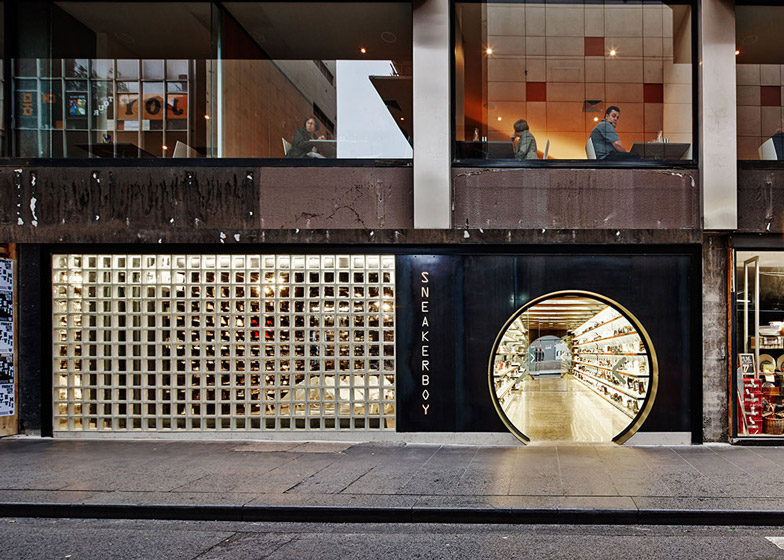
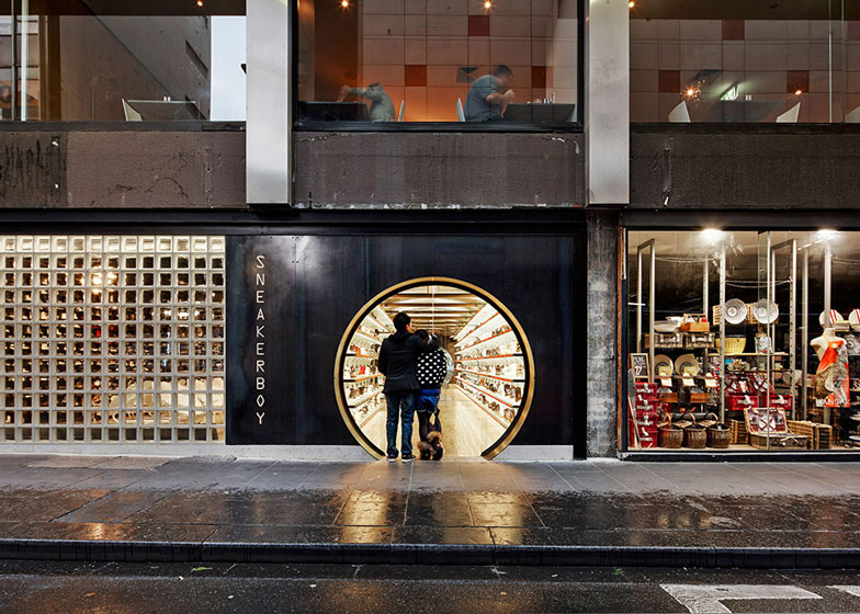
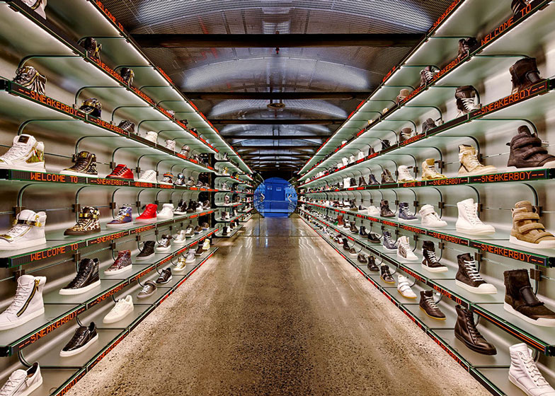
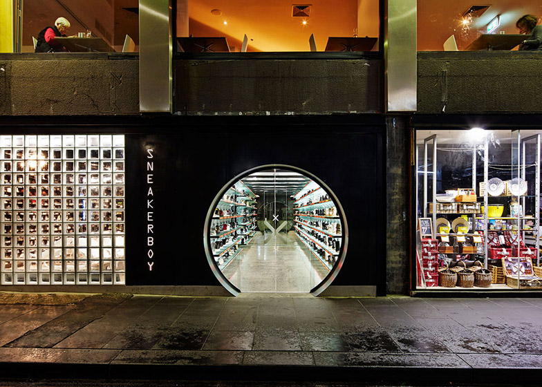
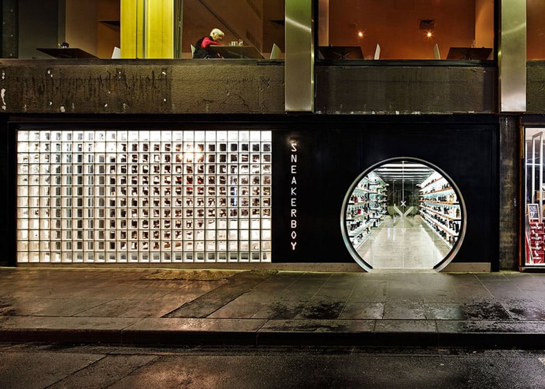
A circular doorway provides access to a passage lined with shoes at this futuristic sneaker store in Melbourne by local designers March Studio (+ slideshow).
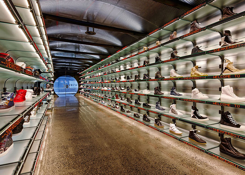
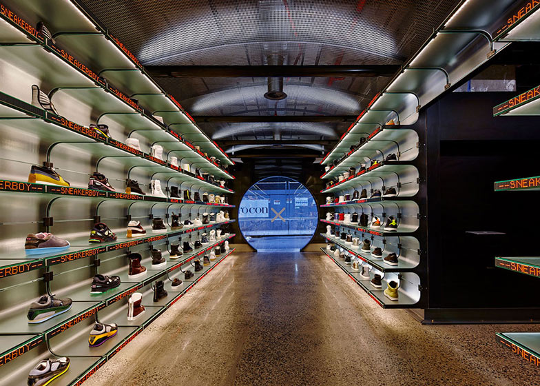
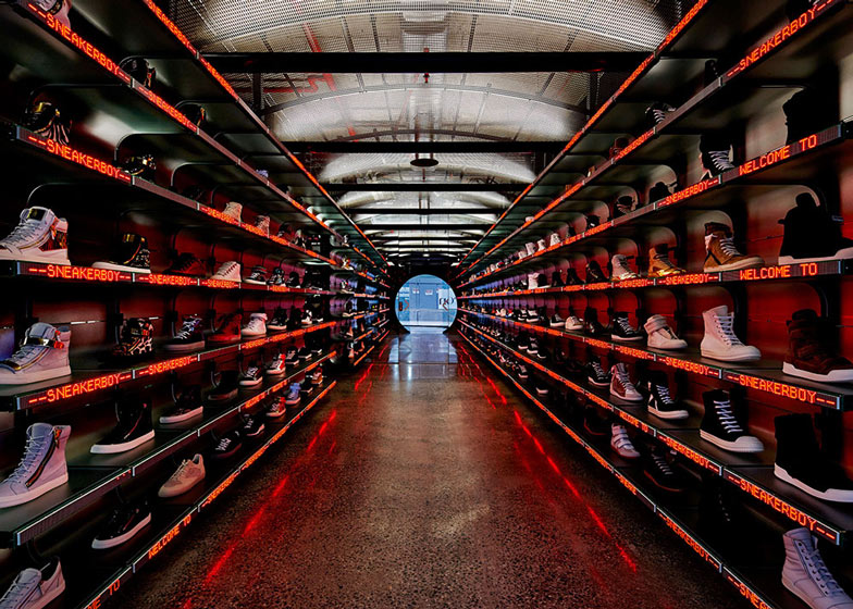
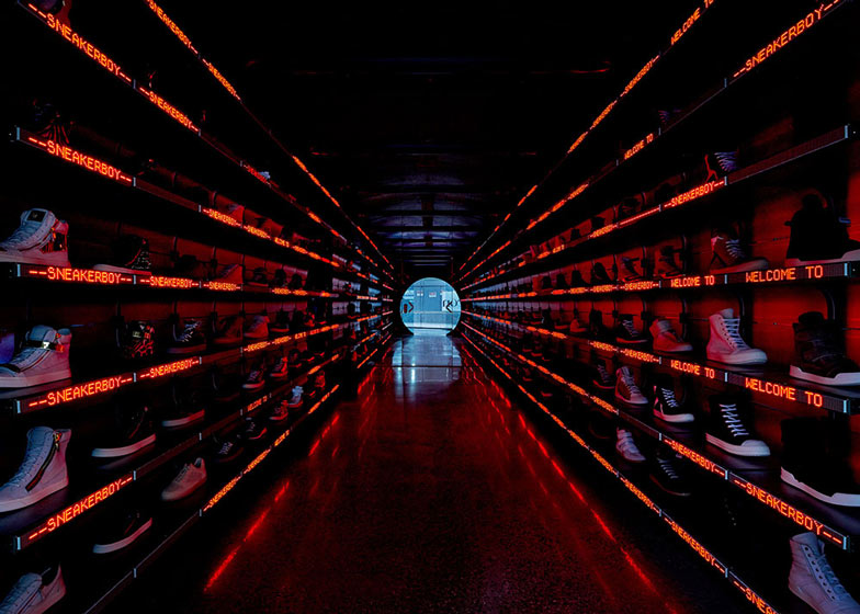
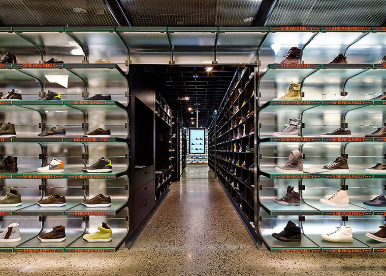
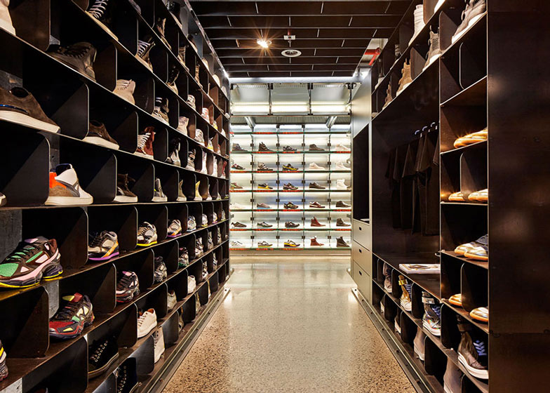
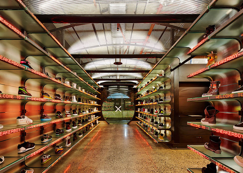
March Studio designed the Sneakerboy interior to resemble an underground train station complete with a tunnel-shaped interior, polished concrete floor and dimmable lighting.
The walk-in online store stocks a range of sneakers from high-fashion labels such as Balenciaga, Maison Martin Margiela and Lanvin to sporting brands such as Nike and Adidas.
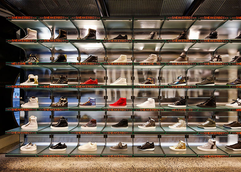
Rows of floor-to-ceiling shelving is divided into sections that each display a single sneaker.
Customers can scan the shoes with the Sneakerboy app for product information and sizing. They can then purchase the sneakers via their smartphone with a Sneakerboy ID, or using an in-store iPad.
Lengths of LED tickers with scrolling red text are attached to the edge of shelving on each side of the tunnel.
When customers purchase a pair of sneakers, the tickers respond to the online activity and display comments such as "sold out" or "just purchased in Melbourne".
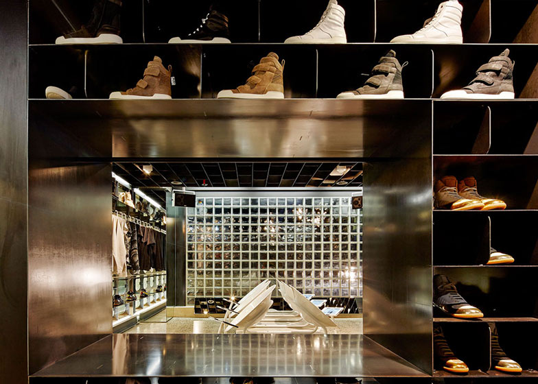
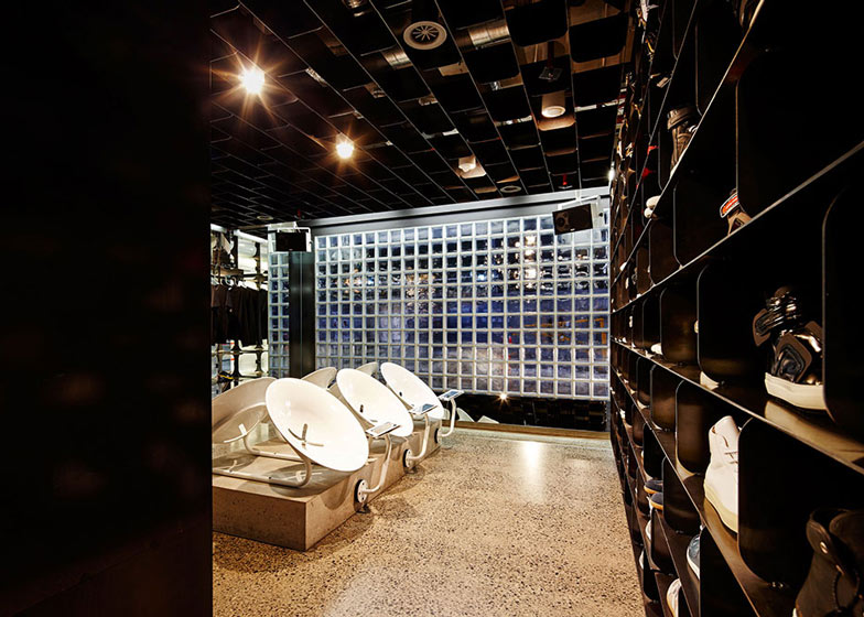
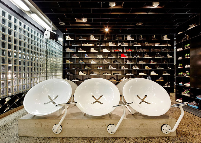
The store is divided into two areas: the long display space and a fitting room located off to one side behind a wall of glass blocks, accessed through a hinged door of shoes.
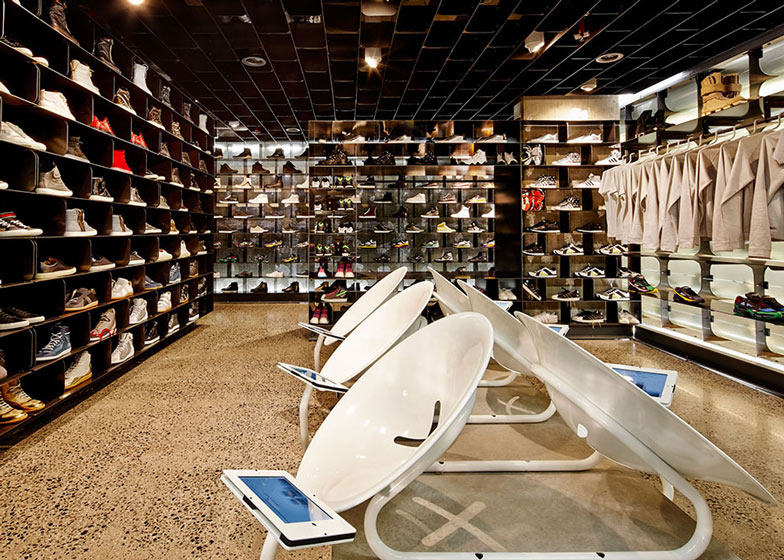
Steel chairs that look like large, curved buttons are positioned on a raised platform for customers to try on sneakers, with iPads located within easy reach to purchase the shoes.
The glass-block wall also backs onto the street, forming a section of the shop facade.
The remainder of the black-painted exterior has the word "Sneakerboy" written vertically on the wall, to one side of the circular entrance.
Other shoe stores we've featured include this boutique in Osaka with shoes displayed in mesh columns and a former butcher's shop in Barcelona filled with wooden pallets.
Photography is by Peter Bennetts.
Here's a project description from March Studio:
Sneakerboy
The way in which we shop has changed dramatically over the past few years. Yet as High Street shopping is replaced with the convenience of the online store, the experience of touching, trying, and smelling an object will never be replaced.
Whilst some of the larger chains are struggling to implement web based change, the new Sneakerboy concept store is taking it to another level.
The first of many to be rolled out, Sneakerboy Melbourne is at the cusp of this retail revolution. It is an online store you can walk in to; there is no stock, no cash, no till, and no product to take home. All that is needed to make a purchase in the store is a smart phone, (or one of the in-store Ipads) and a Sneakerboy ID.
The rest of the available space is dedicated to the range of shoes, which means Sneakerboy can boast a larger range of stock on a much smaller footprint.
The architecture and the branding of the store, (also designed at March Studio), follows this underlying business structure, and yet also brings the digital connectivity to the forefront.
Sneakerboy Melbourne consists of two main areas; the display area and the fitting room. These two areas are expressed in the façade, a large circular steel portal directs the customer to the entrance and into the viewing chamber, whilst obscure glass blocks create a private, fitting room bathed in natural light.
The display area is designed with the same retro futurism of an Underground station, a reference to the sneaker's rise to fashion in New York's transport strike of 1966. Illuminated curved glass shelves house the entire range of sneakers, a viewing canvas for 162 individual shoes, which can be dimmed and adjusted by changing the lighting.
Scrolling LED tickers under each sneaker display the shoe’s designer. Customers are invited to scan the product with the Sneakerboy App for pricing and sizing, and the LED's, a portal into the online store, can react and respond to online activity, displaying comments like "JUST BOUGHT IN SHANGHAI" or "SOLD OUT".
1200 metres of cabling, reminiscent of a server room, is exposed through the glass shelves rather than hidden away, a reminder of the hard wired nature of technology and connectivity.
Customers are invited into the fitting room to check sizing and to make purchases. Constructed from 300 blackened steel pigeon holes, the fitting room is conceived as a library, housing all sizes of all styles. 6 custom spun steel chairs with integrated iPad holders anchor the room and give the customers the opportunity to browse online and purchase whilst trying on.
Client: Sneakerboy
Architect and branding: March Studio
Location: Shop 21, Ground, 265-279 Little Bourke Street, Melbourne Vic 3000
March Studio team: Rodney Eggleston, Anne-Laure Cavigneaux, Julian Canterbury, Jack Crocker, Sam Rice, Jono Ware
Contractor: CBD Contracting
Engineer: Co Struct Engineering
Size: 70 sqm
Budget: Disclosed
Materials: concrete, glass, steel, LED tickers and sneakers

