Venice Architecture Biennale 2o14: the curators of the Belgian Pavilion visited 260 homes around the country, using their findings to produce a minimal recreation of common domestic architecture within their Venice biennale exhibition (+ slideshow + interview).
Architects Sébastien Martinez Barat, Bernard Dubois and Sarah Levy worked with curator Judith Wielander on the Interiors. Notes and Figures project, which focusses on the domestic interiors of Belgian homes to tell the story of the country's vernacular of the last century.
"The main idea was to take the theme Absorbing Modernity and to say, perhaps if we look at architecture from the inside not from the outside we can see new things," Martinez Barat told Dezeen at the opening last week, explaining how the project responded to the brief set by biennale curator Rem Koolhaas.
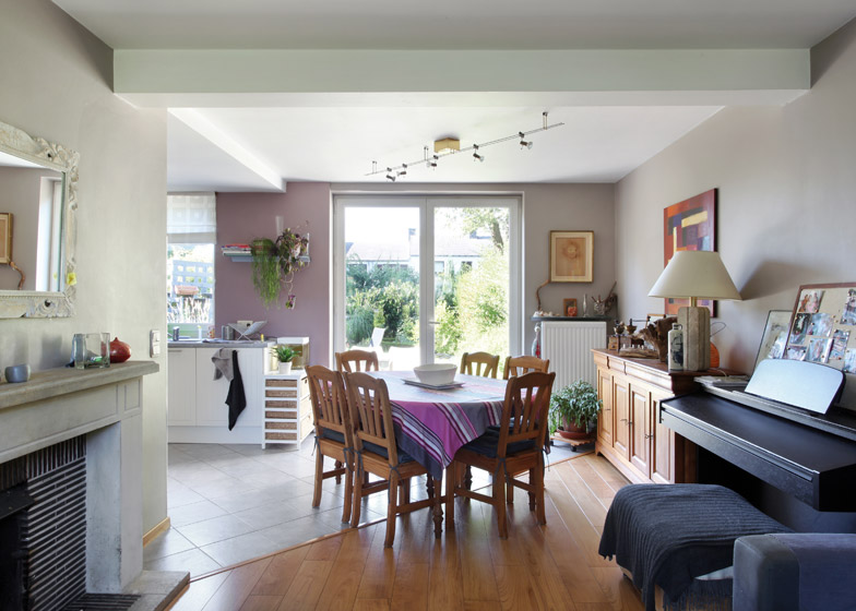
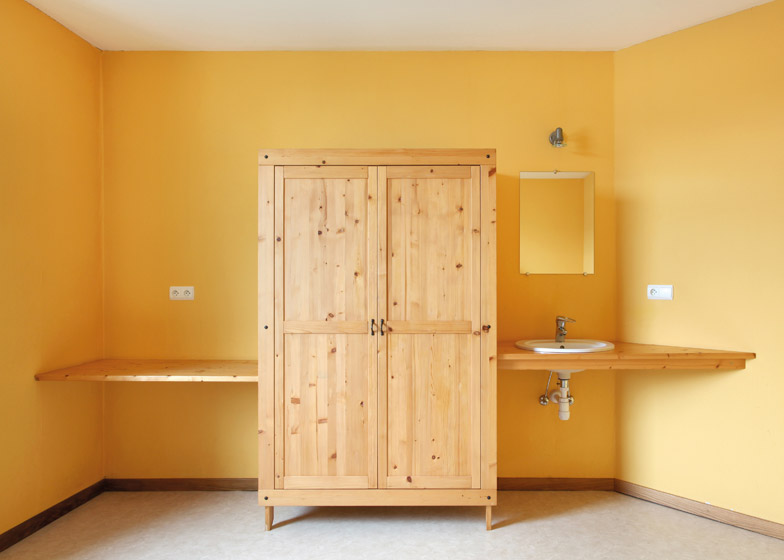
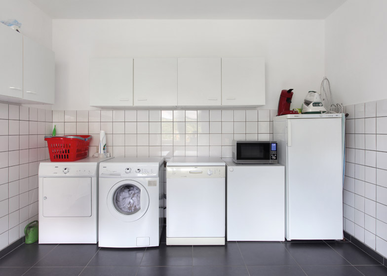
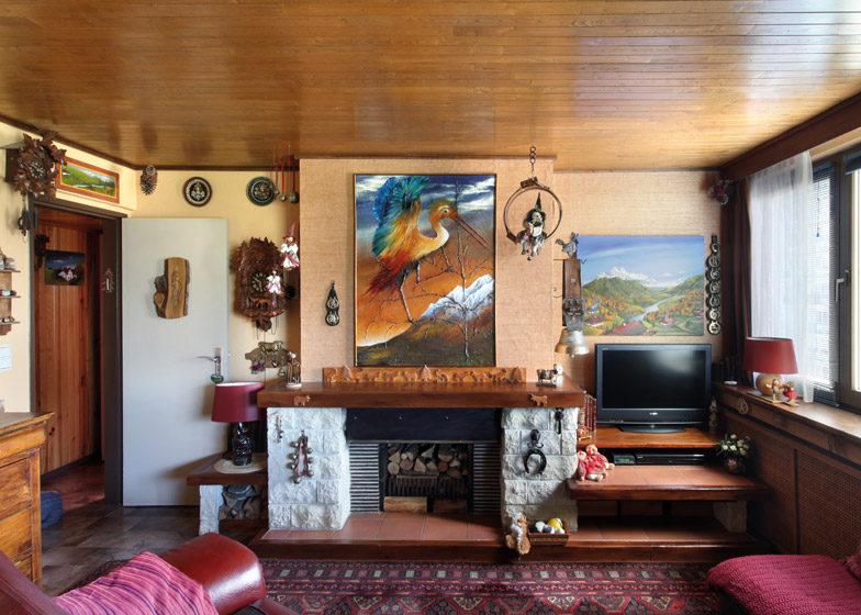
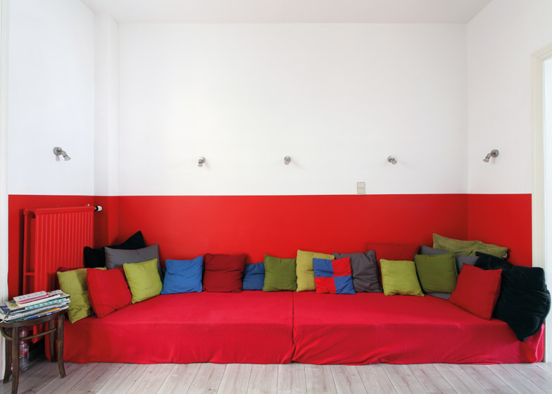
Over a period of five months, the team and photographer Maxime Delvaux visited 260 homes and produced around 1,200 photographs. They then analysed these images for patterns – eventually producing a catalogue of photos epitomising the modern Belgian residence.
"The idea was to have an overview, to come back after five months with enough photographs of interiors in order to give an account of how people live today in Belgium," said Levy.
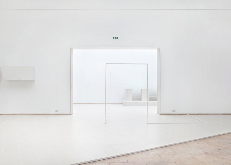
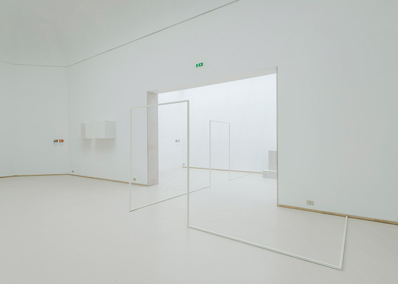
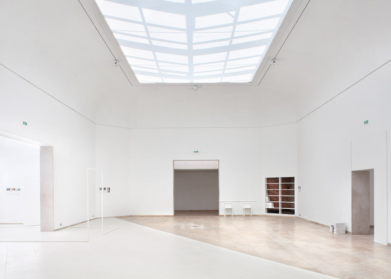
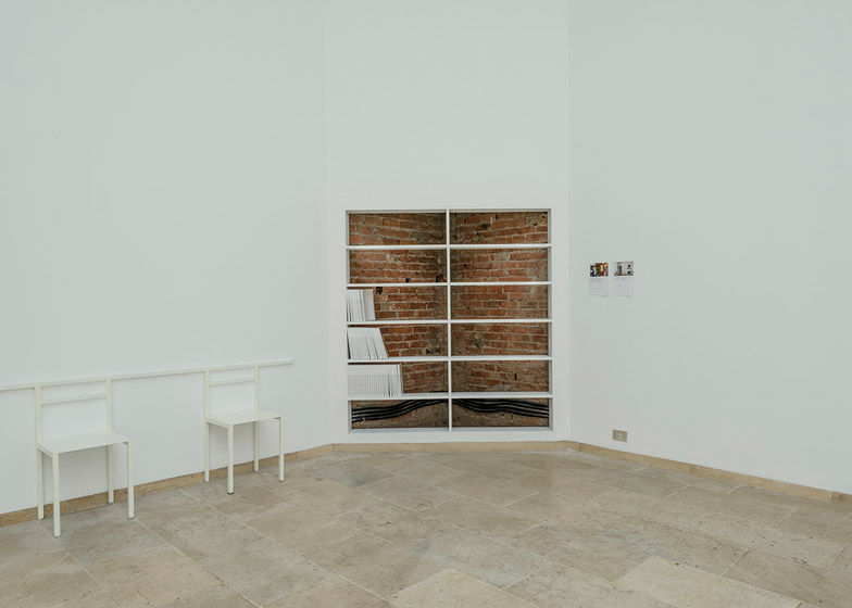
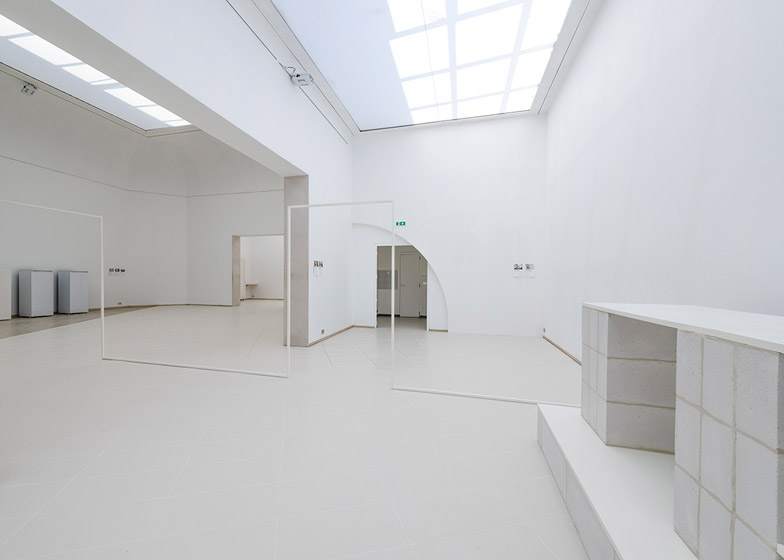
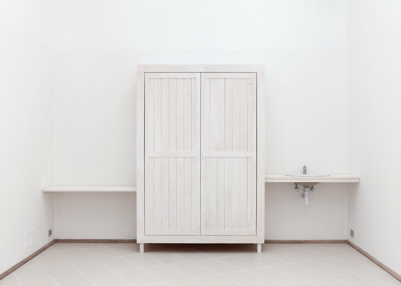
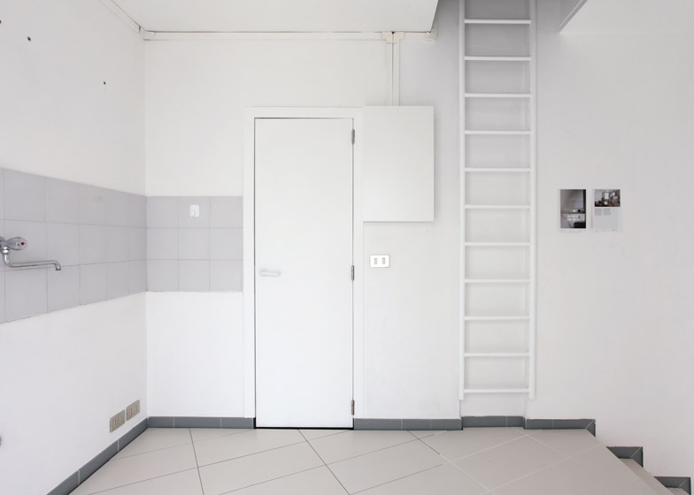
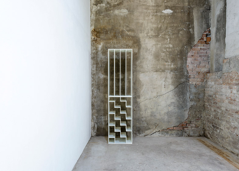
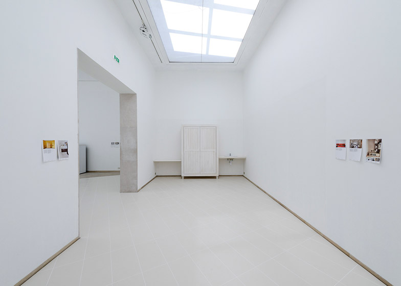
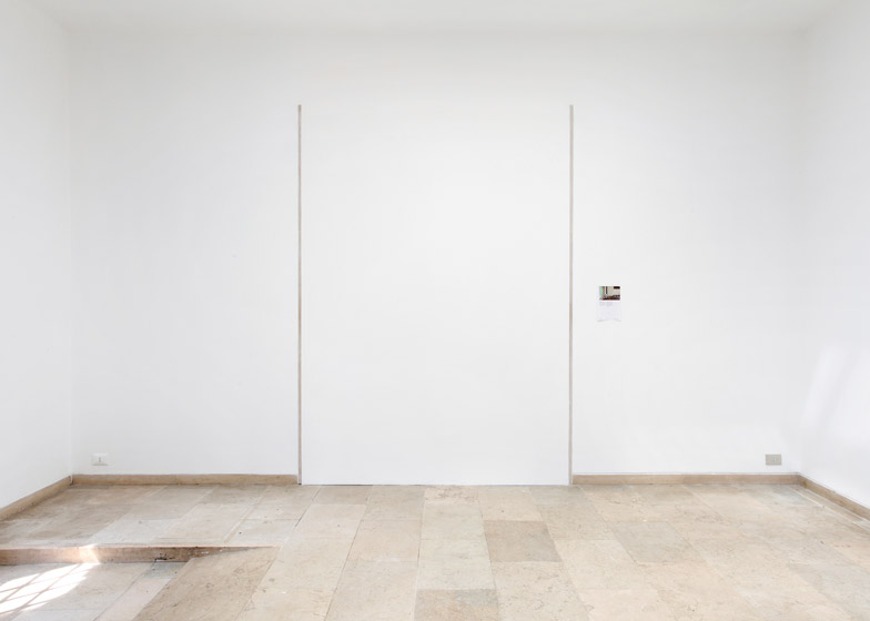
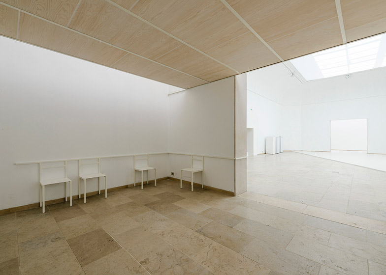
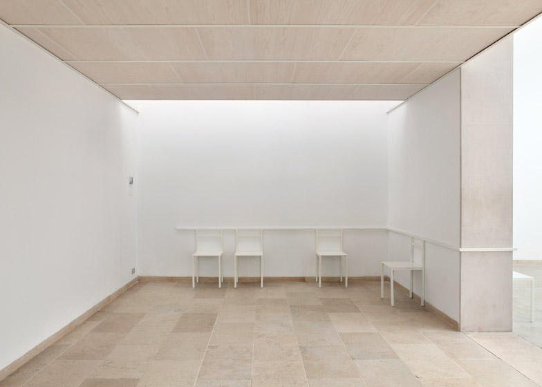
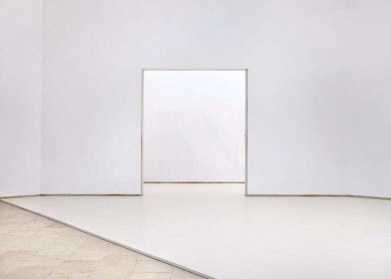
The team selected a few of these situations and recreated them within the interior of the Belgian Pavilion. Elements include a suspended ceiling that makes way for a skylight, changes in floor surface, a bookshelf built into a corner and wireframe storage rails.
"We didn't want to display documents about architecture, but to make architecture and to display architecture," said Martinez Barat.
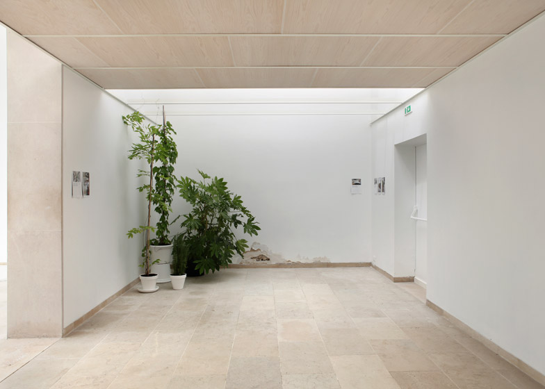
The team also made the most of the pavilion's existing features, such as an illegal extension at the rear that is revealed by a new window and a patch of crumbling plaster.
Each intervention is accompanied by a selection of pages from the catalogue, inviting visitors to make the connections themselves.
"It's a kind of game – there are a lot of little interventions and some of them are really hidden," explained Dubois.
"And there are also the pages of the catalogues so these are like the clues, the clues that get to what we are looking at. Some places it's really obvious, but sometimes it can be more tricky and more challenging," he added.
Read on for a transcript of our interview with the curators:
Amy Frearson: Can you explain the project you're showing in this exhibition?
Sebastien Martinez Barat: So we started the research one year ago, the main idea was to take the theme Absorbing Modernity and to say perhaps if we look at architecture from the inside not from the outside we can see new things. To have a really different point of view on architecture so we tried to perhaps mark the importances so that if we look at architecture from the inside perhaps we can say that the modernity is absorbed by the evident practices. So we were really focusing on the way of exhibiting, transforming, modifying, adjusting the interiors of the buildings that have been built but not for us. So how do you make your building who you are?
Sarah Levy: How do you transform it in order for it to encounter contemporary uses? And so we actually did a survey spending five months on the Belgian territory with a few criteria: geographical, historical, and typology. And so the idea with that was to have an overview, to come back after five months with enough photographs of interiors in order to give an account of how people live today in Belgium. So that's what we did. Of course we had to be able to enter the houses which really was the most important criteria, for people to let us in, and it happened quite a lot! At the end of the five months we had made about 260 visits and came back with more than 1,200 photographs and notes and sketches.
Amy Frearson: And how did you find and select people? Did you put out an open call?
Bernard Dubois: It was quite a long process, we looked really closely at the images to find similarities and differences. We really worked on it – all the material had to be manipulated. We lived with these pictures for a long time, so at the end we really focused on a short selection which are the 250 pictures in the publication.
Judith Wielander: It was also a very systematic way to photograph the interiors because we were always shooting with wide-angle distance shots, so we were able to read a particularity or also to take it out of context and this gave us the possibility to compare the images.
Sebastien Martinez Barat: It shows a lot of uniformity somehow because we went to very different places, met very different people with very different backgrounds, from all over Belgium. And we actually noticed that from the photos, the technique of the photos somehow erases those differences and helped us to really focus on what we were looking for, which is those figures that we tried to extract, to interpret, to understand, to show in the catalogue, and to use in the show. After doing the catalogue we tried to name all those things we encountered and we didn't have a name.
Sarah Levy: Because that's an important part, we didn't want to use an architectural vocabulary, the idea was really to be able to name exactly, precisely what we were looking at, but really extracting ourselves from the usually vocabulary that we use as architects.
Sebastien Martinez Barat: Yeah so those things now, having a name, we tried to use them as a project because the goal of this catalogue is to make some kind of manual, some kind of tool that we as young practitioners can also use in our work. And of course its not exhaustive, it could have been something else, but some figures we identified we tried to use in the exhibition and the way we did it is by intervention on the pavilion itself. So we didn't want to display documents about architecture, but to make architecture and to display architecture. And since we're talking about the interior, we had an interior in an existing building so it was the perfect occasion to do that.
Bernard Dubois: Also, what was really important, when we did the visit, we entered into the buildings and houses and we had to read the walls and read the space to understand the story of the building and the way the form of life began, so it's kind of a perfect circle. So you have to read the walls, the ceiling, the floor to look at the little details. And this feeling, we wanted to reproduce it here for the visitor. It's not an exhibition that you just look at pictures on the wall, but you have to make a kind of archeology of thinking "this is part of the show, this is a building, this is existing, this is an intervention". It's a kind of game – there are a lot of little interventions and some of them are really hidden. And there are also the pages of the catalogues so these are like the clues, the clues that get to what we are looking at. Some places it's really obvious, but sometimes it can be more tricky and more challenging.
Sarah Levy: It's actually the way that we want people to discover it, to be curious enough in order to research and search for every intervention and to understand what's really happening.
Sebastien Martinez Barat: Some of the figures we're showing here actually were not interventions at all, but we discovered them in the building, like a piece of wall that has been broken and that has been like this forever and cannot be repaired. These include the pavilion's illegal extension, which we showed using a window.
Sarah Levy: The window was actually new, we did it for the exhibition and usually you wouldn't even know that there is this little extension in the back. So playing up this link between what exists and what could be and what nobody knows about the building was really interesting.

