Möhn + Bouman Architects uses wooden fencing to update care centre facade
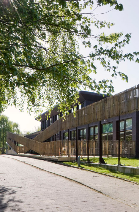
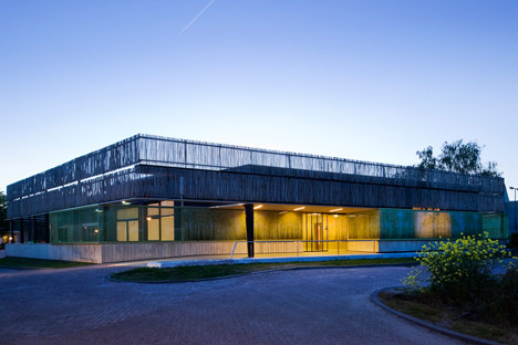
Dutch studio Möhn + Bouman Architects has given a facelift to an institutional-looking care centre near Rotterdam by covering the facade in fencing made from chestnut wood (+ slideshow).
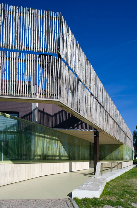
Care Campus is a residential centre for people with mental disabilities, and the two-storey building houses classrooms, treatment rooms and doctors' offices. Möhn + Bouman Architects was commissioned to refurbish the centre on a limited budget, so they used simple fencing to update the facade.
"There appeared to be no budget for a facelift, even though we and the client felt the building needed one. However there was money for safety features such as fencing, so that became our facelift," architect René Bouman told Dezeen. "Some parts of the fencing around the building serve a purpose, and others are used as cladding, and we like that ambiguity."
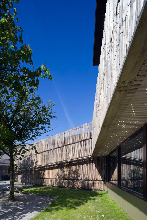
Möhn + Bouman, whose previous projects include an office wrapped in pre-rusted steel, used chestnut wood to reflect the building's setting, near rural land on the outskirts of the city of Schiedam – part of the Rotterdam metropolitan area.
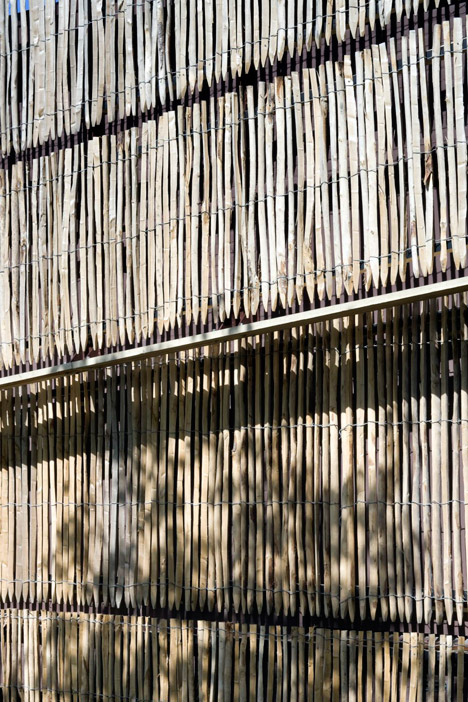
"The whole campus is a transition between rural and urban land, so we were looking for a natural material," said Bouman. "Chestnut wood is extremely durable and low-maintenance, and we liked its rougher texture."
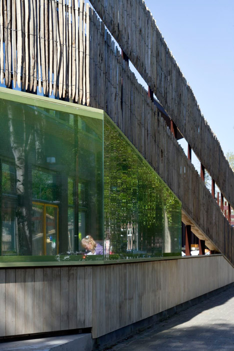
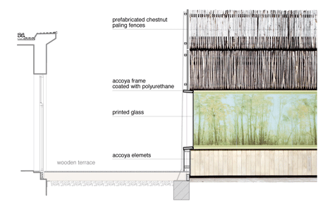
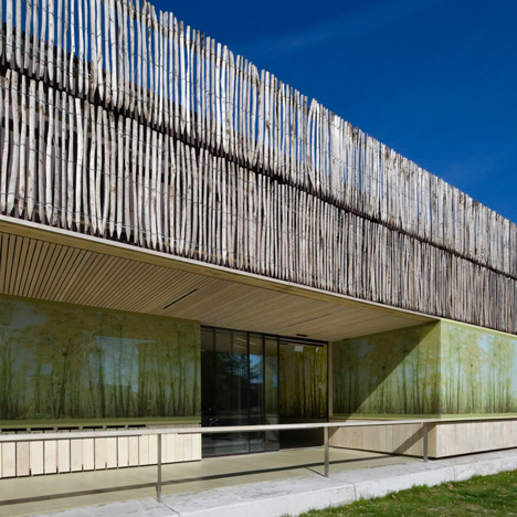
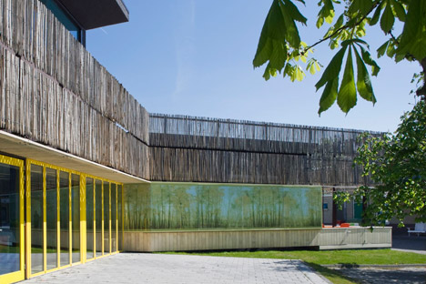
The rural theme continues on the ground floor facade, where the architects printed a large-scale photo collage of a coppicing wood by British photographer Carol Fulton on glass. The printed glass permits light through to the classrooms behind it, but also offers privacy. The image is continued inside on wooden wall panels on the ground floor.
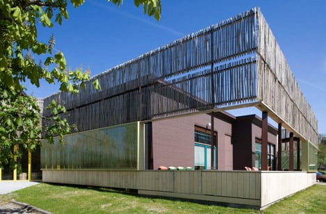
"It was very important that the refurbished building didn't feel institutional, so we tried to continue the rural theme throughout," said Bouman. "Because many of the residents have limited cognitive abilities, they also rely more on senses, so tactile and sensory elements were important in the design."
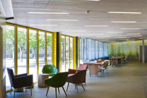
The yellow tint of the photo collage partly informed the building's colour scheme, which features bright yellow window frames at the entrance.
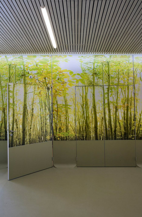
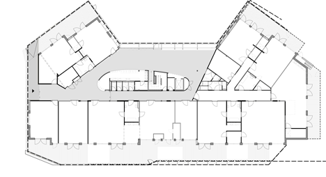
Möhn + Bouman completely stripped the interior in order to reorganise the layout, creating room for a lobby and restaurant on the ground floor. This floor also features a pod in the centre housing a kitchen and toilets, which is clad in the polyurethane – the same material as the floor.
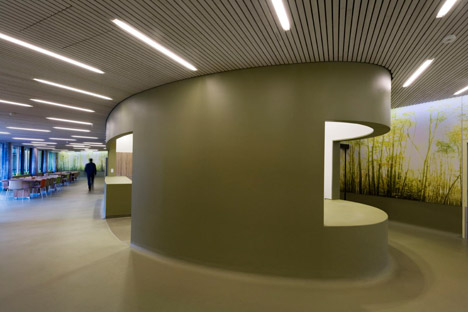
"We designed this as a kind of UFO-like structure, as a contrast to the natural materials, and covered it in polyurethane, which is durable, tactile and easy to clean," said Bouman.
The first floor has administrative offices and rooms for doctors, speech therapists and physiotherapists, and is accessed by a staircase with purple walls, which is designed to signify this level as a separate, more formal space.
Photography is by Sarah Blee.
Here is some more information from Möhn + Bouman Architects:
Care Campus, Schiedam, Netherlands
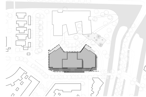
The project is part of a larger renewal of a small campus area for a community of people with disabilities. On the border of Schiedam and its rural surroundings, the campus comprises this newly renovated daycare centre along with a housing facility currently under design.
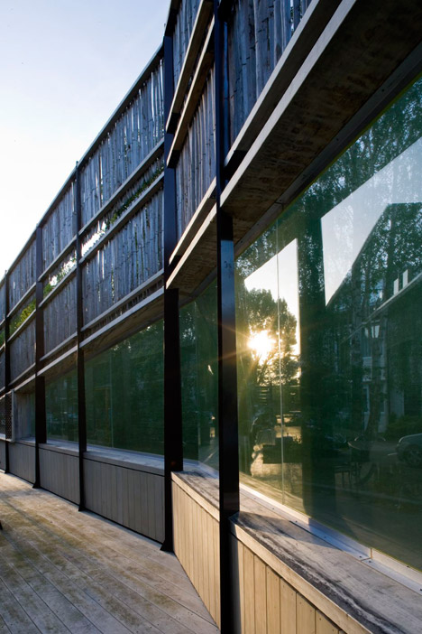
The centre has been stripped of unnecessary details and has been painted dark brown, and provided with high-quality wooden terraces on all sides, which in turn are wrapped by a wooden screen. In keeping with the local environment, the screen is constructed from chestnut wood and blends into the rural atmosphere. At entrance areas, the screen's shape adapts, and frames with printed glass cut into the wood, creating a sleek, modern contrast with the rougher, more agricultural material.
The glass prints, made by artist Carol Fulton, continue throughout the interior of the centre as they surround the new lobby in the heart of the building. They form a panoramic view of the coppiced chestnut grove, forming a visual association with the screens outside.
In the heart of the lobby, a polyurethane drop-shaped structure rises from the floor. This contains the main kitchen and the sanitary units, and the material creates another tactile contrast. Due to the cognitive constraints of the primary users of the building, the sensory experience of their environment becomes exceptionally important. Incorporating this aspect of the client’s need, along with staging spatial experiences, was the key theme in the design process, resulting in what maybe could be coined "performance architecture".
Location: Schiedam, Netherlands
Client: Ipse de Bruggen foundation
Area: 1460 square metres
Architect: Möhn + Bouman BV / René Bouman
Photographic artist: Carol Fulton
