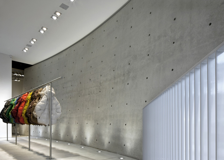
Japanese architect Tadao Ando has inserted a sweeping concrete wall into the new Milan store of fashion brand Duvetica.
During the renovation to create Duvetica's showroom on Via Senato, Tadao Ando added a seven-metre-high angled curving wall that runs from the front to the back of the space.
"The core of the project is a curved and inclined cement wall that divides the two floors vertically, imposing its presence in the window of Via Senato," said a statement from Duvetica.
The wall is patterned with the lines and holes created by the formwork used to cast the structure, and is illuminated with uplighting where it meets the two floors.
From the entrance in the large glass facade, stairs lead down behind the concrete wall to menswear and up past the atrium to womenswear, children's collections, offices and meeting spaces.
A grey and white colour palette for surfaces and furniture helps to highlight Duvetica's brightly coloured outerwear, along with specialised lighting.
Concrete floors run throughout the store and a table that Ando designed in the same material sits in the meeting room opposite the offices. Glass partitions divide these spaces, which are located at the end of the upper floor.
Ando designed the brand's Milan flagship store on Via Spirito Santo in 2011, which he has recently extended and renovated now the company has more space. The new space is due to open on 23 June.
Another Japanese architect working on retail interiors in Milan is Toyo Ito, who has designed a showroom for textile brand Kinnasand in the city.
Here's the information sent to us by Duvetica:
Duvetica and Tadao Ando
To celebrate the brand's tenth anniversary, the Japanese architect designs a new showroom and the extension of the flagship store.
For its tenth anniversary, Duvetica is opening a new prestigious showroom in via Senato 41/A, Milan. The 240-square-metre space is characterised by linear geometrical shapes, exposed concrete and essential elements. The core of the project is a curved and inclined cement wall that divides the two floors vertically, imposing its presence in the window of via Senato. Having moved the showroom to Via Senato, the flagship store in Via Santo Spirito 22, also designed by the Tadao Ando studio in 2011, has been enlarged and renovated, the interiors reorganized and the sales area extended to twice its original size.
The new executive showroom – Via Senato
Duvetica entrusted Tadao Ando with the task of intervening on the pre-existent space and redesigning its internal division. The main entrance in Via Senato features a wide window that reveals the two floors and the imposing wall that marks the showroom dividing its two levels. Situated in the welcome area, this inclined and curved wall in fair-faced cement, is 12 metres long, over seven metres high and 20 centimetres deep. The ground floor includes the welcome area and the colour range in the main room, along with the offices and the womenswear and child collections.
The lower floor is dedicated to the menswear offer. The restoration tried to maintain most of the original structure, reusing when possible the wooden coffered ceilings and the fixtures. As in all the Duvetica spaces, the predominant colours are grey and white, used for the industrial cement floors with quartz dredging, walls finishes in Venetian pressed marmorino, furnishings in pearl grey corian and grey coated natural wood. A cement table, designed by Tadao Ando, is placed in the meeting room opposite the offices. Lighting is designed to highlight the characteristics and the colors of the products on display.
The redesigning of the flagship store – Via Santo Spirito
The opening of the new space in Via Senato allowed Duvetica to expand the flagship store in Via Santo Spirito, converting the original showroom space to sales area. This transformation determined a complete restoration of the store extended to twice its original size and a reorganization of all the areas. The top floor that includes sales and welcome areas, has been enlarged by including part of the previous storage section which has now become the menswear offer space. The basement displays the womenswear and, for the first time, the Boy & Girl collection.
All the spaces feature light grey industrial cement floors and walls finishes in Venetian polished marmorino. The furnishings, also designed by the Japanese architect, present a minimalistic style that exalts the store’s architecture, echoing the structural colors with pearl grey corian tables, parapets and metal components in painted steel and clothing racks hidden in the walls. The LCD touch screens represent a striking technological feature, allowing the customer to view all the models on offer as well as the available colors. The screens also show videos of the Duvetica collections, projected inside the store and on the shaped screens in the window.

