Rem Koolhaas: I wanted my biennale to "disconnect from contemporary architecture"
Venice Architecture Biennale 2014: in the third part of our video interview with Rem Koolhaas, the Dutch architect claims the "architecture biennale was becoming very similar to the art biennale" and says he chose to eschew contemporary architecture to set his curation apart.

The theme Koolhaas set for the national pavilions at this year's Venice Architecture Biennale was Absorbing Modernity. Nations were asked to look back at the past 100 years of architecture in their country and focus on a period "where the process of modernisation was at its most acute".
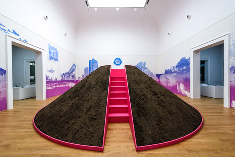
"I wanted to disconnect from contemporary architecture because I thought the Architecture Biennale was becoming very similar to the Art Biennale," Koolhaas says. "There was a kind of blur and it seemed interesting to me to change that and focus on architecture as an agenda."
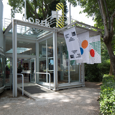
Koolhaas picks out the Japanese and Korean pavilions as outstanding exhibitions at the Biennale this year.
"One thing that you're able to see is that the nations actually took it seriously," Koolhaas says. "There are a number of pavilions that are to my eye sensational. For instance, the Korean pavilion where South and North Korea have collaborated together. The Japanese pavilion is also extremely intense."
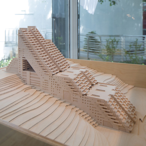
Korea's exhibition, which went on to win the Golden Lion award for best pavilion, aimed to demonstrate the potential of a unified Korea by bringing together almost 40 projects looking at both North and South Korean cultures.
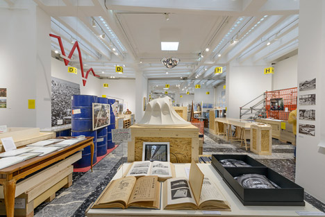
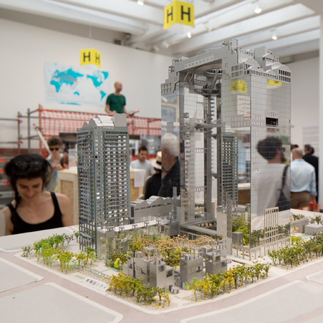
Japan chose to focus on the economic slump of the 1970s as a defining period for Modernism in Japanese architecture.
"I called it 'Absorbing Modernity' not as a grateful acceptance of a different condition," Koolhaas explains. "But rather, in the same way that a boxer absorbs a blow from an opponent, very much aware that it is typically an enforced process."
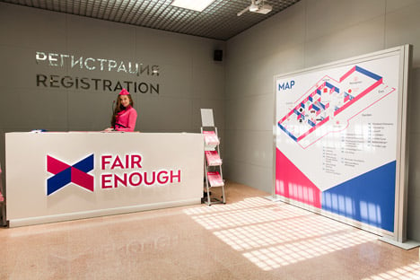
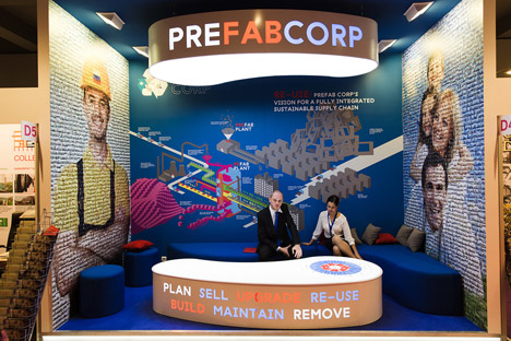
Other pavilions featured in the movie include the Russian pavilion, which is dressed up as a trade fair where 20 fictional companies present examples of modern Russian architecture as products and concepts for sale, and the British pavilion, which combines pop culture with a focus on postwar panning and social housing.
Follow Dezeen's coverage of the Venice Architecture Biennale »
