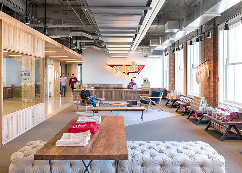
Exposed brick walls, an old-fashioned general store filled with sweet jars and vintage memorabilia including a cash register and a fluorescent sign feature in Yelp's headquarters in San Francisco by Studio O+A (+ slideshow).
San Francisco's Studio O+A, who also designed the Facebook headquarters and head office for Evernote, created the multi-storey office space for online city guide and directory company Yelp.
The company relocated from a smaller suburban office to one of central San Francisco's oldest high-rise buildings – a 1920's 26-storey Art Deco structure by local architect Timothy Pflueger.
With Yelp occupying the second to 14th floors, the brief for Studio O+A was to create the feeling of a tech company "campus" and encourage people to interact with each other despite being spread out across multiple floors.
"Key to our design for Yelp was the concept of a vertical campus – an all-encompassing, self-contained community stacked on multiple floors," explained Studio O+A.
"As with most multi-story occupancies, the design challenge at Yelp was to facilitate group dynamics so that people interact with each other even though they work on different floors," said the studio.
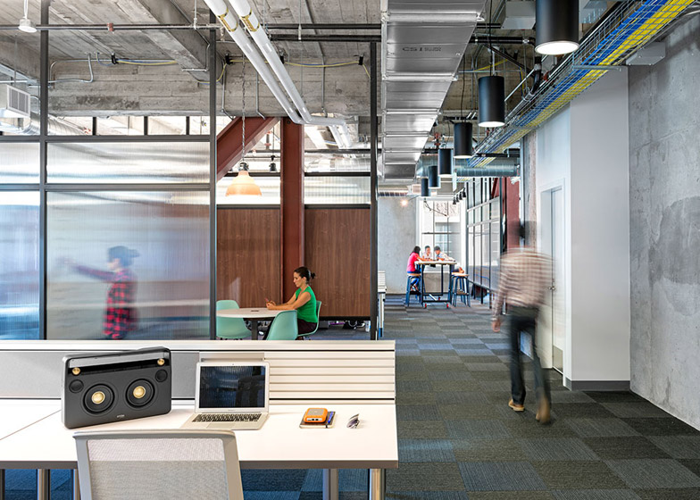
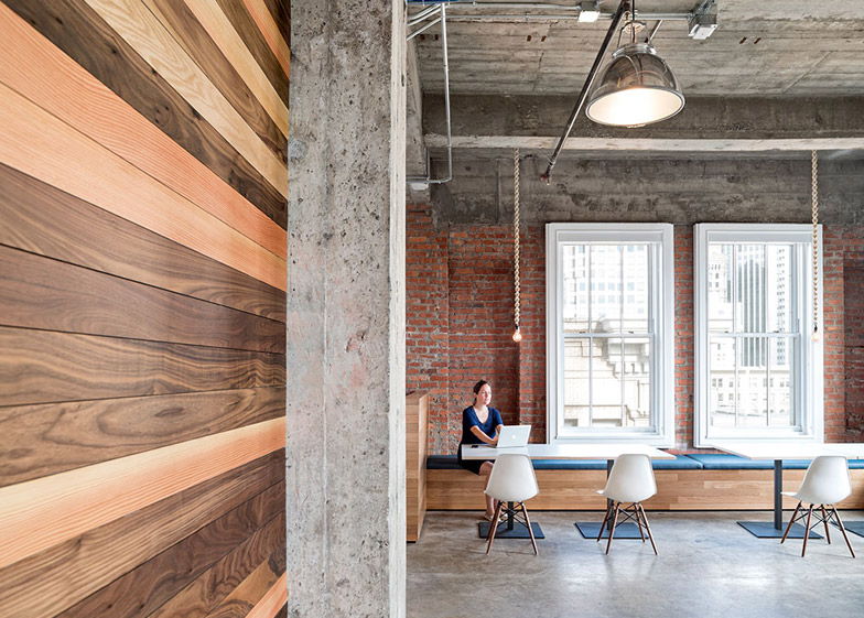
Existing partitions and doorways were knocked out to make a series of open-floor spaces, creating a warehouse-style interior finished with exposed brick walls and concrete ceilings.
The studio then added a series of common areas that were spread out through the building, including a break room with a concrete floor and wooden window seats on the fifth floor and "semi-private pods for chess or chatting" on the 11th.
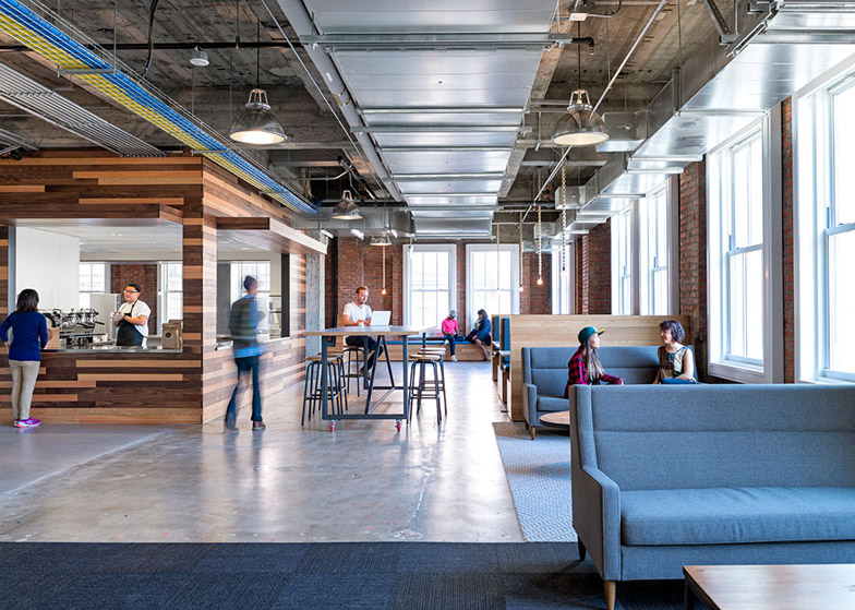
A free coffee bar lined with wooden panels is located in the centre of the eighth floor, with bench-style seating with bar stools and cushioned booths filling the rest of the floorspace.
"Each floor’s common areas thus become common to the company at large and not just to those whose workstations occupy that level," explained the practice.
The main reception and lobby area was also moved to the ninth floor to encourage visitors and staff to move up through the building. Designed to resemble an old-fashioned general store, gold lettering is painted on the window of a wooden partition and sweet jars and company merchandise are arranged on shelves.
At the opposite end to the reception area, two smaller rooms named The Library and The Tool Shed are decorated to reflect their names and provide private meeting spaces for visitors.
The studio also re-used elements of the original interior of the building throughout the project, including reclaimed doors, doorhandles and frosted and fluted glass panels.
Other features include handwoven lengths of chunky rope with lightbulbs attached, strung from the ceiling in the bar area, and black steel tube lights with bulbs on each end that criss-cross over the ceiling of the break room.
Photography is by Jasper Sanidad.
Here's a project description from Studio O+A:
Yelp! Headquarters
As tech companies take root in urban locations where space is limited, the collegial spirit of Silicon Valley finds new modes of expression in high-rise buildings and converted industrial facilities. Key to our design for Yelp was the concept of a vertical campus– an all-encompassing, self-contained community stacked on multiple floors.
Yelp moved its HQ from a smaller site in San Francisco to a classic Financial District high-rise. As with most multi-story occupancies, the design challenge at Yelp was to facilitate group dynamics so that people interact with each other even though they work on different floors.
In other words– how do you create a neighbourhood in a tower?
One way is to give each floor a destination that will appeal to all the floors. At Yelp we placed a fully-equipped coffee shop on the 8th floor, a break room with window seating on the 5th, and semi-private pods for chess or chatting on the 11th. Each floor’s common areas thus become common to the company at large and not just to those whose workstations occupy that level.
In a high-rise campus the central gathering place is vertically central. Yelp’s reception area is on the 9th floor, with other departments above and below. To make the reception worthy of a trip up or down in the elevator, O+A created a "General Store," a modern pop-up improvisation on Yelp's place in the new world of commercial entrepreneurship. Taking our cues from another era of commerce when candy was sold in jars and signage was gold-leaf painted on a window, we created a lobby with the layout of a retail operation. The layout, but not, in fact, the function—none of the "merchandise" on display is for sale and the vintage cash register at the reception desk is strictly for show. Guests, however, may help themselves to the candy.
Echoing this nod to the past, is the placement throughout Yelp’s entire campus of finely-crafted doors reclaimed from offices that originally occupied the site. Many of these doors include fluted or frosted glass panels and door-knobs from another era. Combined with the exposed brick that is prevalent on every floor of Yelp's HQ, these touches lend the weight of history to a design that is looking determinedly forward.
Perhaps the smoothest juxtaposition of old and new occurs in the coffee bar. The brick walls and abundant natural light of the seating area give the space a SOMA café texture, while the kitchen includes the most modern artisan hot beverage facilities. Access to the bar storage and service areas is through a blind door that appears to be a smooth, wood wall. Custom lighting in this area is suspended from rope fixtures individually hand-woven. With local coffee companies like Blue Bottle and Sightglass rotating baristas in the bar, the theme of handmade, top-quality production is repeated in every detail of the space. Because of it, Yelp's employees will always have a free latte at their fingertips—and a unique space to drink it in.
Architect: Studio O+A
Project Team: Primo Orpilla, Denise Cherry, Verda Alexander, Perry Stephney, Clem Soga, Steve Gerten, Elizabeth Guerrero, David Hunter, Alma Lopez, Renee Laput-Mendoza, Sarunya Wongjodsri, Jeorge Jordan, Olivia Ward, Kroeun Dav, Chase Lunt, Amie Zemlicka, Maleesa Pollock, Will Chu
Location: San Francisco, CA
Client: Yelp
Gross square footage: 106,000
Contractor: Novo Construction
Consultants: MEP Consultants: Amit Wadhwa and Associates
Structural Engineers: Vaziri Structural Engineering
Key materials (type/brand)
Carpet: Flor, Burmatex, Prestige Mills, Vorwerk; Fabric: Maharam, Camira, Textile Mania, Momentum Textile, Anzea;
Furniture: Mash Studios, Herman Miller, Restoration Hardware, Urban Outfitters, Modernica, Ohio Designs, Thrive Home Furnishings, Gus Modern, Room and Board, Blu Dot, CB2, West Elm, ABC Carpet and Home, DWR, White on White, Anthropologie, At -95, Y Living, Inmod, Organic Modernism, Phase Design, Fatboy, Pagethirtythree, All Modern
Lighting: Nora, Rich Brilliant Willing, School House Electric, Lithonia, Pinnacle, Focal Point, Lightolier, Omega Revelation, Roll and Hill, The Malder Company, Tom Dixon, Phillips Capri, Workstead Paint: ICI/Glidden, Ideapaint MDC Wallcoverings, Benjamin Moore;
Tile: Heath Ceramics, Dal Tile


