Scratches across Feroz wine label visually communicate the taste
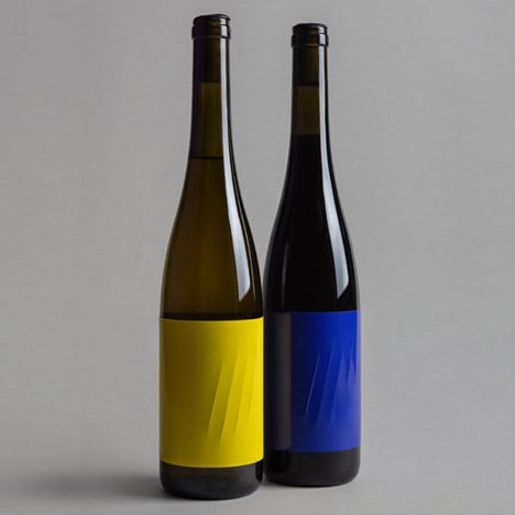
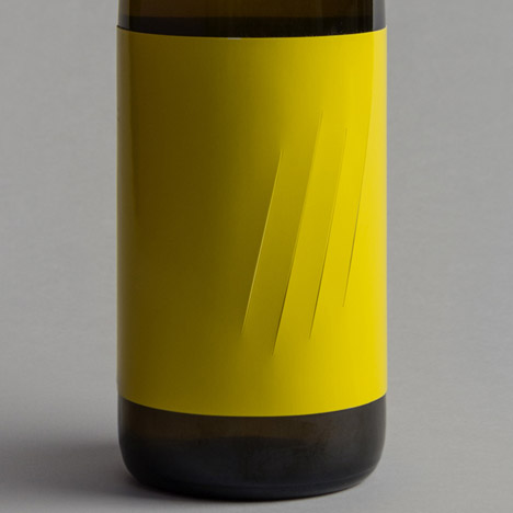
Claw marks slash these wine bottle labels designed by Spanish agency Franziska Studio to represent the degree to which the strong body of the contents "scratches" the throat.
"At swallowing when you notice the strong body: it 'scratches' you from inside," said Franziska Studio, who designed the labels for the Feroz wine produced by David Rodríguez Vineyards.
Feroz - meaning "fierce" – is an artisanal wine from the Valdeorras region of Spain, described as having a "pleasant fruity smell" but a very strong body.

"Once you taste the wine, you understand everything," Franziska Studio's Javier Morón Belso told Dezeen.
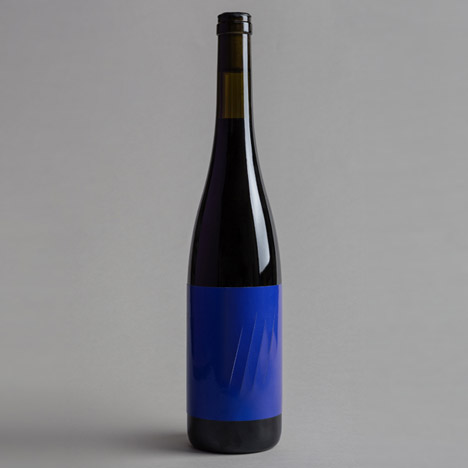
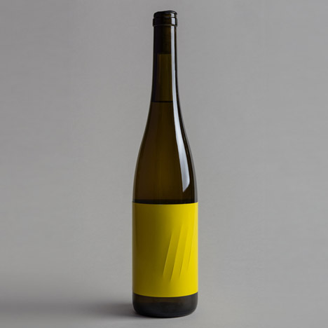
The company communicated this with a series of four slashes across the high-density paper of the block colour label.
"We took the decision to design something that looked like it had done by an animal or a dangerous being," said Morón Belso. "We chose the scratches, four rows that run through the paper, to act as a label and a signature. It doesn’t need more explanation. It is Feroz."

The labels were printed on a conventional press the studio usually uses for editorial projects and applied to the bottles by hand, with care not to glue down the openings made by the scratches. The heavy weight of the paper meant industrial glue was required.
The only text on the label is printed in a small typeface and reads: "He gave a blow. Howled, but nobody listened to him, the sheep were already immune, they were not afraid of a poor wolf lost in their city."
Morón Belso explained: "The public reacts differently. Some remain silent, waiting for the bottle to tell them something else. Others love it for its forcefulness and synthesis."

The bottles were created in a limited edition of 1000 with yellow labels for white wine and 1000 with blue labels for red. They are available from shops and restaurants in Valdeorras and will soon be sold at selected outlets internationally.
Other alcohol-related designs include Zaha Hadid's curvaceous wine bottle for Austrian winemaker Leo Hillinger and Nendo's packaging for coffee-flavoured beer. See more design for drinking »