Melbourne architect Clare Cousins and her team have created themselves a shared office space, where interior fittings are picked out in black or white to distinguish between the different areas of its two occupants (+ slideshow).
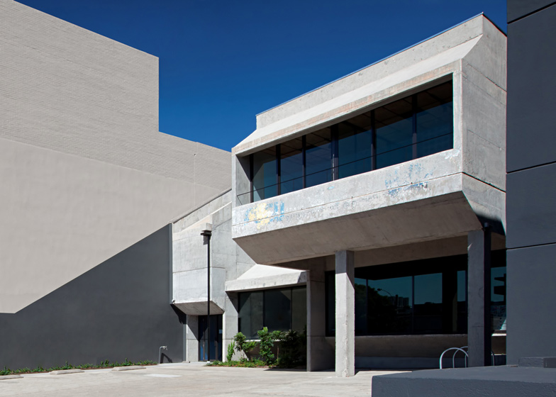
Clare Cousins Architects – who also recently overhauled a Melbourne apartment – shares the Blackwood Street Bunker office space with a construction firm, who helped restore the angular concrete exterior of the 1970s office block to its original finish by removing layers of custard-yellow render.
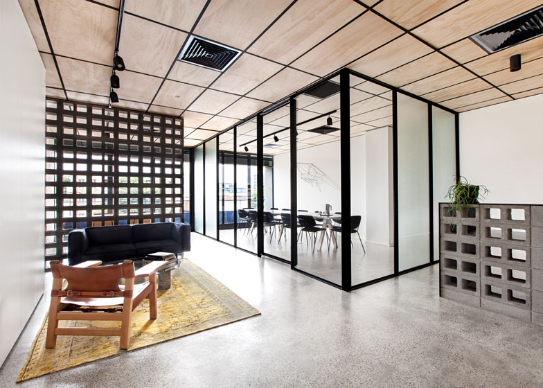
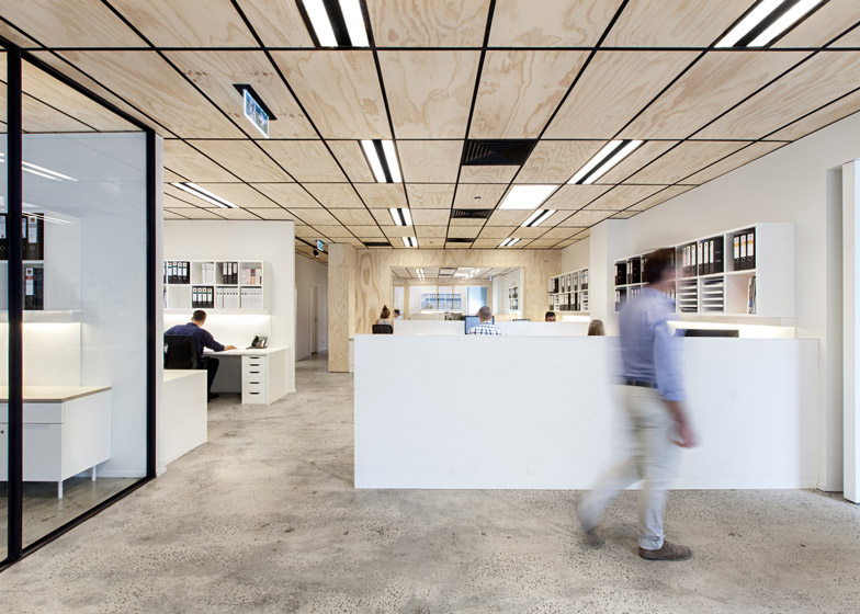
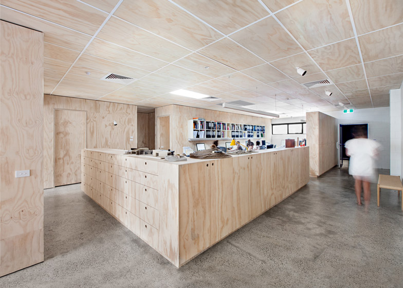
By remodelling the original layout, which was divided into two distinct parts filled with windowless cubicles, the architects created an open-plan interior with features such as furniture and the ceiling grid coloured to subtly differentiate the spaces occupied by the two companies.
"Retaining the shell and reusing parts of the original fit-out, the challenge was to create a non-corporate environment that would evoke a sense of authenticity and capability," said the architects.
The two companies wanted to retain the community feel of their previous shared office, so the architects focussed on creating communal areas that can be used by staff from both firms.
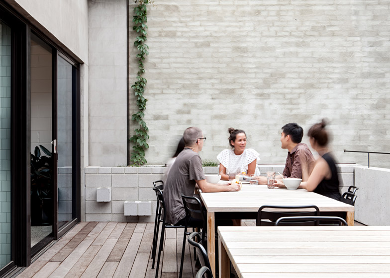
Separate entrances on either side of the building lead to the main office spaces of the architects and the builders, which converge at a shared kitchen, breakout area and external terrace.
Sliding doors integrated into the glazed walls of the kitchen and an adjacent meeting area lead out onto the decked terrace that provides the main social area.
"The deck is the heart of the shared concept with both offices and the kitchen and breakout space opening onto it through large banks of operable glazing," added the architects. "These shared facilities benefit both organisations professionally, socially, and spatially."
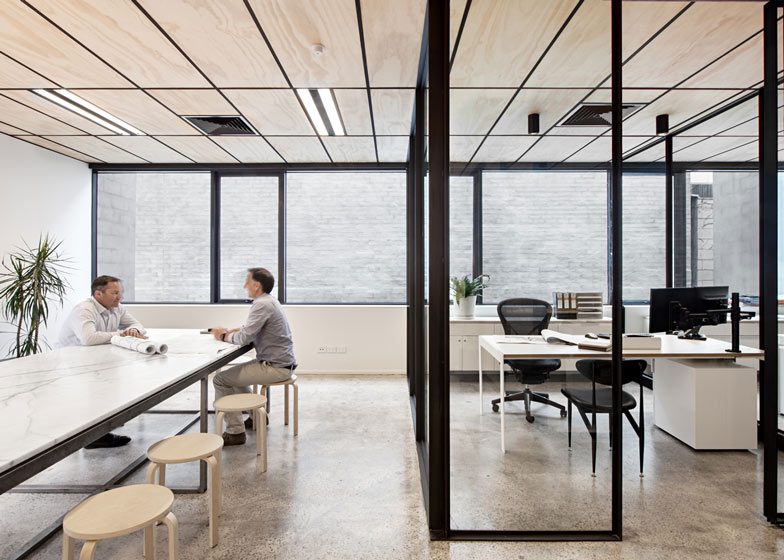
Spaces requiring acoustic segregation within the builder's office were created using glass partitions that retain light and views, while skylights were installed to introduce additional natural light.
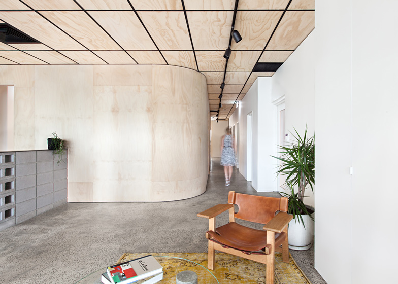
White-painted walls combine with light plywood ceiling panels and joinery to enhance the bright feel of the spaces.
An injection of colour is introduced to the otherwise monochrome scheme through bright orange and blue painted stairwells that mark the entrances of the two firms.
Materials, such as the plywood used to create cabinets and full-height walls that separate public and circulation areas from the workspaces, were specified in an untreated state to lower their cost and ecological impact.
Photography is by Lisbeth Grosmann.
Here's a project description from Clare Cousins Architects:
Blackwood Street Bunker
Through the combined effort of its new occupants; a construction company and an architecture studio; this 1970's office block has been given a new life. Located in North Melbourne, and hidden under a layer of custard-coloured render for several decades, the Brutalist materiality was revealed after 8 weeks of painstaking labour chipping off the suffocating crust.
Retaining the shell and reusing parts of the original fit-out, the challenge was to create a non-corporate environment that would evoke a sense of authenticity and capability. Critical to both organisations is the effect that the work environment has on those who use it. It responds firstly to the needs of the staff, engendering a healthy office culture. Secondly, the space presents a considered representation of the two businesses that befits a variety of clients and visitors.
While rarely collaborating professionally, these businesses had previously shared a building and were keen to retain and enhance a sense of community. Unlike many shared studios which co-habit an entry and front-of-house amenities, this 440m2 floor-plan works in reverse.
Separate entries and offices lead through to a generous shared zone including kitchen, breakout-space and deck. The deck is the heart of the shared concept with both offices and the kitchen/breakout space opening onto it through large banks of operable glazing. These shared facilities benefit both organisations professionally, socially, and spatially.
This project transformed two highly-disconnected spaces, divided into small windowless consulting rooms, into a light-filled, open-plan office. Inverse trims - black for builders, white for architects - are reflected in the refreshed ceiling grid, fittings and furniture and offer a subtle point of difference. Glazed partitions in the builder's office provide acoustic privacy, while maintaining visual connections through the space. Joinery defines circulation paths creating discrete separation between staff and visitors.
Sustainability statement
The decision to invest in this formerly unloved building has provided a sustainable alternative to its likely demolition. Composed from a limited palette of untreated materials, the design approach practically solves the requirements of a modern office. Construction detailing is highly considered while remaining understated and cost effective. The highly resourceful project was completed for $1200/m2 including base building and exterior works. As a stand-alone project, the architecture studio fit-out was achieved for $50,000; or less than $500/m2.
Existing west facing glass was removed and set back to enable manually controlled vertical shading to be installed. Large areas of new operable glazing provide the opportunity for generous cross-ventilation, minimising use of mechanical systems and providing staff with increased control of their thermal environment.
Seven double glazed skylights have been installed to inject natural light throughout the first floor plan, significantly reducing the need for artificial lighting. Sensored lighting picks up the shortfall.
Generous shared spaces including kitchen, breakout-space and deck reduce the overall floor area occupied by each co-habiting businesses. Smaller spaces lead to reduced energy consumption and increased social interaction.
New ceiling insulation and external shading devices significantly reduce heat loads. Bike racks, showers and lockers encourage alternative modes of transport. Loose-fit furniture, largely recycled from the previous site, allows for flexibility now and in the future.

