Mecanoo integrates public workspaces within banking centre for Rabobank
This pale brick building for Dutch financial services company Rabobank has been purposefully designed by architecture studio Mecanoo to "not look like a bank" (+ slideshow).
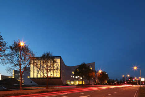
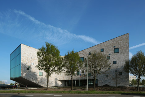
Located in Sittard, one of the southernmost cities in the Netherlands, the Rabobank Westelijke Mijnstreek Advice Centre was designed by Mecanoo to consolidate several of the banking cooperative's branches, creating a centrally located advice centre and office building.
With an irregular shape that lifts its head at one end, the building was conceived as a public space that would not only accommodate 320 employees, but also offer a workplace for the bank's many self-employed customers.
"The bank should not look like a bank," said Mecanoo, which is led by Dutch architect Francine Houben. "The intent underlying the design is the development of a cooperative bank extending its arms invitingly to society."
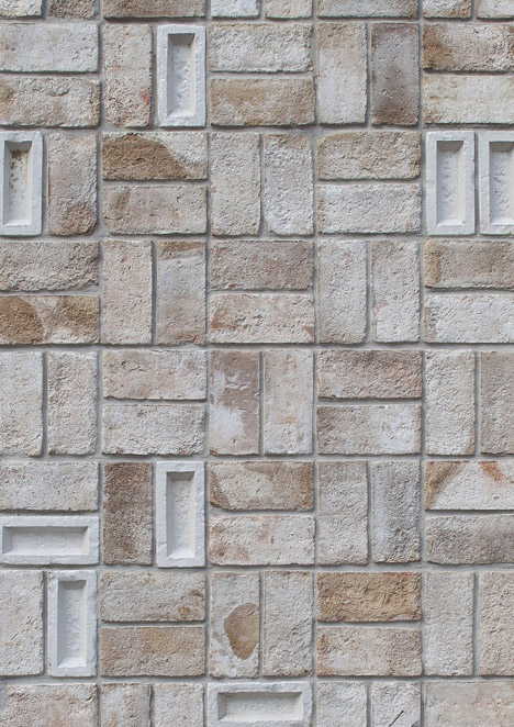
The exterior walls feature a pale beige brickwork, created by mixing yellow clay with marl. The design team added a glazed layer to a random selection of these bricks, and arranged them in a square grid.
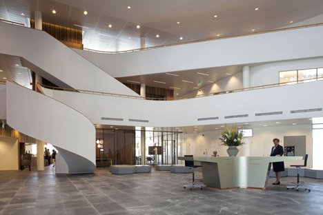
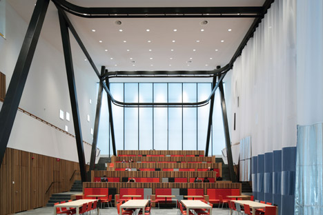
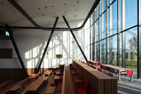
A grand four-storey-high foyer provides an entrance to the building. It opens out to a large public auditorium that functions as a workplace, despite not being part of the original brief from Rabobank, who has previously commissioned an interior with cardboard meeting rooms.
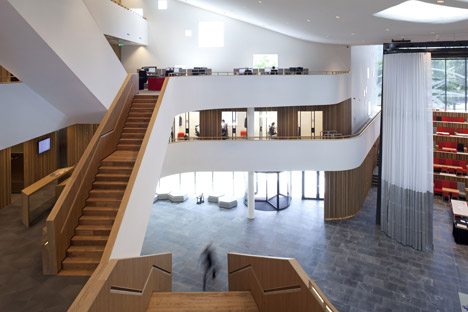
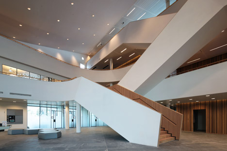
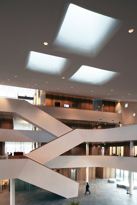
As people enter, they are faced with a series of staircases and mezzanines designed to resemble a "white ribbon". According to Mecanoo, these encourage occupants to take the stairs instead of the lifts.
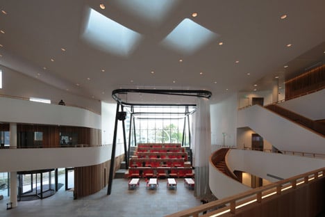
"You can survey, in one glance, the whole building and your curiosity is further ignited for activities on the upper floors," said the team.
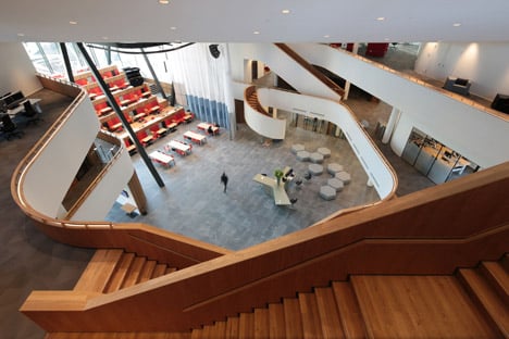
Brushed oak panels add texture to the walls. A slate-grey tiled floor helps to creates a continuity between the indoor and outdoor spaces, while skylights overhead are recessed within curving orifices.
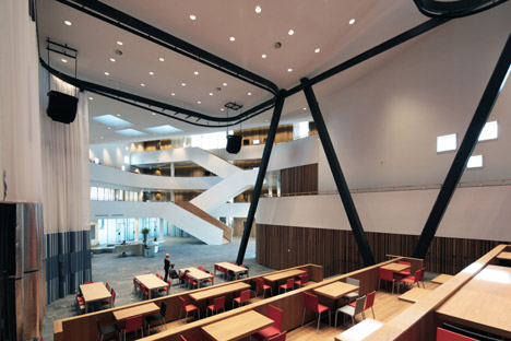
Mecanoo also installed a bespoke silver and blue curtain, designed by Dutch designer Petra Blaisse. Suspended from a 60-metre-long-track, this allows the space to be reconfigured to suit different activities.
A restaurant is located on the ground floor and is open to both staff and the public, but the levels above are only accessible to employees.
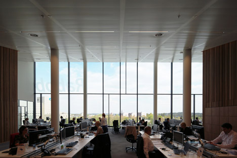
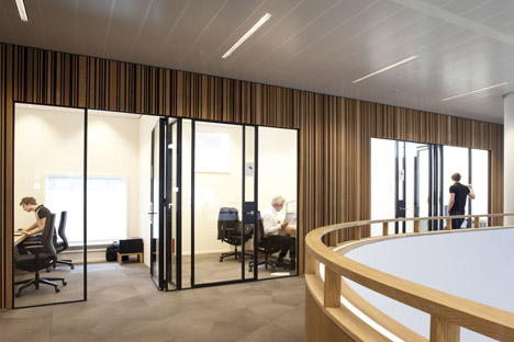
On the first floor, a call centre is partitioned off by glazed screens. The rest of the space accommodates different workspaces, from individual booths to large meeting areas.
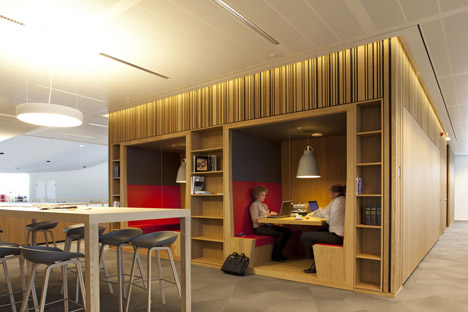
Mecanoo explained: "Here you can choose whichever workplace suits your demands: a small room for concentration, a more spacious room for working in a team, a large zigzagging table where you can informally work and chat, as well as open areas for meeting and exchanging ideas, individual work stations along the mezzanine, niches in the oak wall and both small and large conference rooms for gatherings."
In the last year Mecanoo has also completed the largest public library in Europe. In an interview with Dezeen, Houben said that libraries are the "most important public buildings".
Photography is by Mecanoo, unless otherwise stated.
Read on for more information from Mecanoo:
Rabobank Westelijke Mijnstreek Advice Centre
Sittard is located in the rolling landscape of Limburg, the province of the bronze-green oak and the soft yellow marl. The cooperative Rabobank wanted to combine smaller branches within a large centrally-located advice centre near Sittard station. With input from its 320 employees, the Rabobank defined her dream for the new advice centre: accessible, facilitative of a collaborative and knowledge-sharing environment for both employees and customers, inspiring of new initiatives, and with a natural appearance. The bank has a large number of entrepreneurs as its customers, including many self-employed. Customers of the bank, many of whom are of self-employed – they too should be allowed to make use of the building. And, the bank should not look like a bank.
Tactile
The intent underlying the design is the development of a cooperative bank extending its arms invitingly to society, located on a small hill. Upon entry under the curved ceiling with sculptural skylights, you can survey, in one glance, the whole building and your curiosity is further ignited for activities on the upper floors. These are designed as staggering terraces that meander around the loft as a white ribbon. They invite you to take the zigzagging stairs and not the elevator.
The focal point of the central hall is the auditorium which, remarkably, was not in the original brief. In this area, Mecanoo designed a staircase tribune that accommodates flexible workspaces. Brushed-oak panelled walls that wrap the interior of the building form a unity with the material of this tribune and its workspace furnishings. The brushed oak panelled walls in the building form a unity with the tribune and furniture.
Here, a transparent curtain with different shades of silver and blue designed by Petra Blaisse of Inside Outside runs on a 60-metre long track that winds above the tribune. Diverse spaces and atmospheres can be created by altering the position of the curtain parts. Silver squares in it reference the playful square windows in the building's facade. It consists of special masonry of yellow clay to which marl which has been added. The white-yellow mottled bricks are here and there interspersed with stones with a glaze layer in the small hole, creating a tactile facade.
Flexible working
The entire ground floor including the restaurant is open to the public. Both employees and customers can use the workplaces in the auditorium, just as in a modern public library. The upper office floors are only accessible to staff via a pass system on the first floor. Here you can choose whichever workplace suits your demands: a small room for concentration, a more spacious room for working in a team, a large zigzagging table where you can informally work and chat, as well as open areas for meeting and exchanging ideas, individual work stations along the mezzanine, niches in the oak wall and both small and large conference rooms for gatherings. To provide a high quality acoustic environment, the call centre has its own space on the first floor with a beautiful view. A glass separation ensures that it is visually connected to the rest of the staff.
Sustainability and indoor climate
The advice centre is rated BREEAM Very Good. The bank is connected to The Green Network in Sittard, which makes use of residual heat from the Chemelot industrial zone. The building has energy-saving installations, high insulation and triple glazing. Climate ceilings control ventilation, heating and cooling through radiation without moving air. In addition, the building has a flat panel air conditioning system facing south. In warm weather a transparent screen automatically drops in front of the glass facade. The screen reflects the solar energy, while the heat of the sun between the facade and the screen is mechanically extracted so that the auditorium remains pleasantly cool. Plenty of daylight is obtained through the numerous skylights and the large transparent facades.
Client: Rabobank Westelijke Mijnstreek, Sittard
Structural engineer: Bartels Ingenieursbureau B.V., Eindhoven
Electrical and mechanical engineer, acoustics, building physics and fire safety consultant: Nelissen Ingenieursbureau B.V., Eindhoven
Light consultant: Studio Rublek, Schiphol
City council consultant: LPB Sight, Nieuwegein
Technical landscape consultant: Plangroep Heggen BV, Born
Costs consultants and project management: Duckers & de Cock, Eindhoven