Glass triangles animate facade of Wingårdh's auditorium for Karolinska Institutet
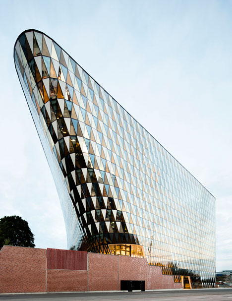
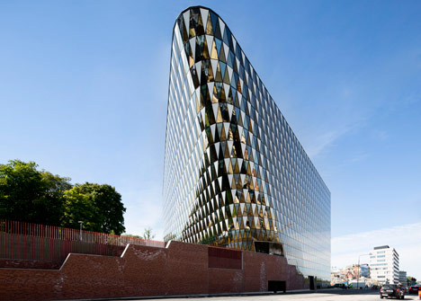
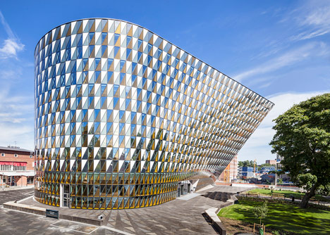
Swedish architecture firm Wingårdhs has completed a university auditorium in a Stockholm suburb with a patterned glass facade that twists and leans over the adjacent street (+ slideshow).
The building was designed by Wingårdhs to provide Karolinska Institutet with a 1000-seat auditorium, along with offices and a faculty club on its campus in a developing part of the city.
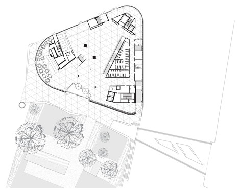
The roughly triangular plan was influenced by the auditorium's location at the intersection of a newly constructed road and a pedestrianised thoroughfare that links the university with a hospital being built nearby.
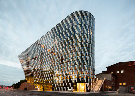
This prominent location led the architects to create a bold design with one corner projecting towards the new road, providing a striking landmark that responds to the local planning committee's request for a counterpoint to a nearby listed building.
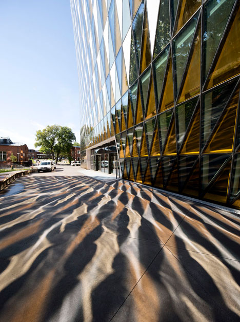
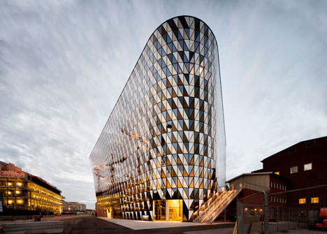
Rounded edges create a homogenous exterior surface that presents an equal visual frontage to both the new street and the pedestrianised thoroughfare.
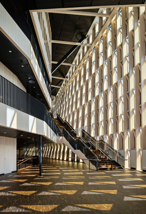
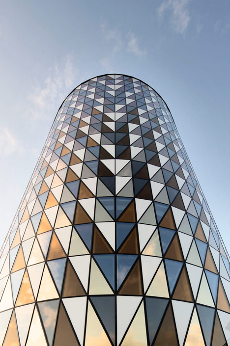
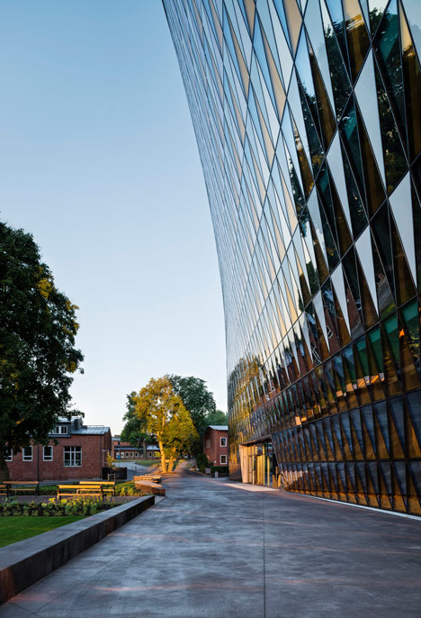
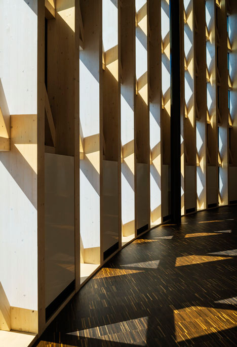
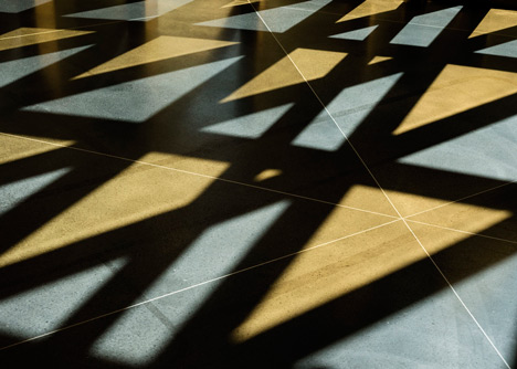
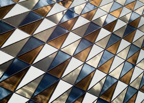
Triangular glass panes covering the facades cast a tessellated patterns of light on the internal floors and reflect light onto the surrounding paving.
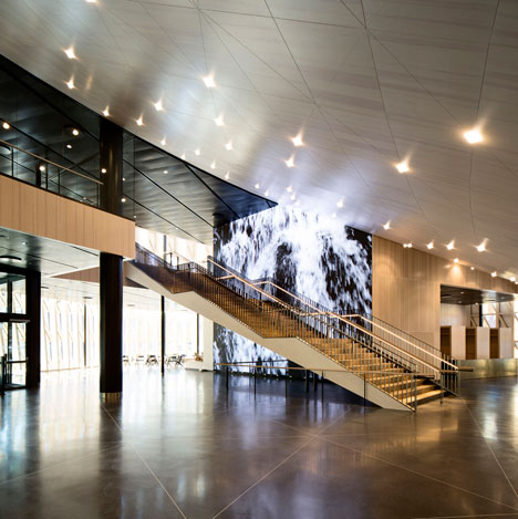
The matrix of glazed segments incorporates different finishes that ensure suitable levels of transparency, insulation and shade inside the building.
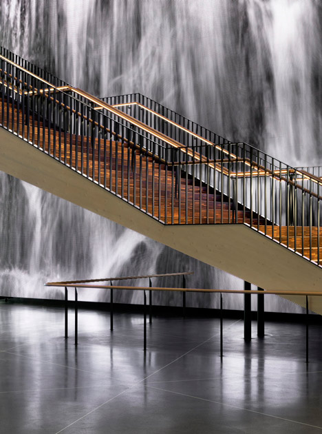
A main entrance facing the public pathway is supplemented by additional doors onto the street, which may be utilised once the pavement outside is completed.
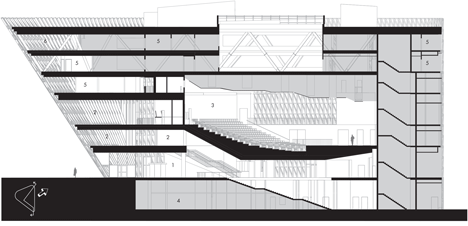
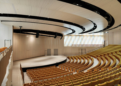
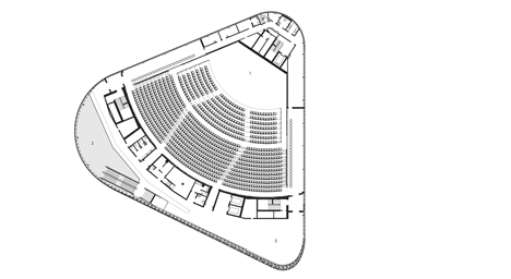
At the heart of the building is a V-shaped auditorium, whose shape also informed the facility's angular outline. The layout of the auditorium was designed to optimise acoustics and sight lines towards the stage from the gently banked seating.
On the ground floor, a large open entrance hall accommodates a reception area and a cafeteria situated in a light-filled corner.
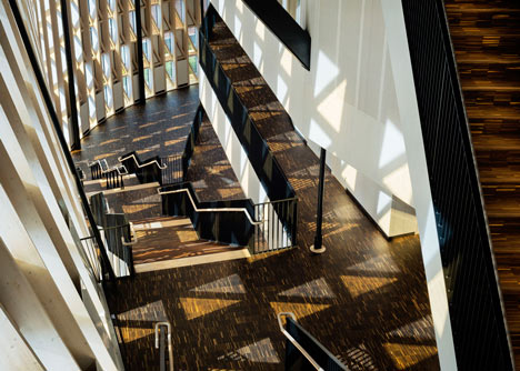
A staircase ascends beneath the sloping ceiling that supports the seating of the auditorium and leads to a foyer level providing access to the stalls. Offices are situated on the upper floors, with the faculty club located at the pinnacle of the projecting corner.
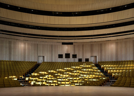
A wooden framework helps to give the interior a Nordic feel, with fir used for walls and ceilings as well as for structural elements.
Photography is by Patrik Lindell unless otherwise stated.
Here's a project description from Wingårdhs:
Aula Medica
Strange enough, no large auditorium was built at Karolinska Institutet when its campus was created in the 1940’s. Yes, there were intentions, but the medical university expanded in numbers as well as ranking without any possibility to assemble neither students nor scientists in large numbers. In the beginning of the new millennia, a donation finally made it possible to complete the compound with the venue it needed so long.
An auditorium at a university, or aula to use the word of the classical languages, goes beyond the task of a lecture hall. Its ceremonial roots in the church and the architectonic heredity in the theatre, makes the aula today's secular society's most solemn and ritual space. It is not only a tribute to science and education, but also a site for strong collective experiences.
The significance of the aula both for academia and for the society at large, calls for a protrude setting in the city. That is why the project for an aula at Karolinska Institutet moved from a remote site behind existing buildings to the exposed location where it is being built today. Wingårdhs' involvement began with a proposal in an invited competition in 2001. The entry was selected for further development, and as the site later altered, the client's choice of architect remained.
The new location for the building is congenial with its position in the academic society as well as in the emerging cityscape. The building protrudes over the intersection between Solnavägen, a thoroughfare that is about to be transformed into an urban street, and the pedestrian axis that will connect the university with the extensive hospital currently under construction next by. The proximity to its large complex called for an expressive form, and discussions with the antiquary authorities created a clarifying distinction to a listed building nearby.
These geometries – the street 5,5 meter below the crossing pedestrian axis and the V-shaped auditorium – denominated the plan. The urban pattern called for a building that treated the street with the same respect as the main entrance toward the walkway. If Solnavägen shall be a street with a human presence in the future, entrances close to the pavement are of crucial importance.
If the relation to the city is guided by a wish to adapt to an urban pattern, the plan of the building is generated by the auditorium. For a large aula of today, where lectures with images and performances on the stage demand good sightlines and acoustics to each and every seat, the V-shaped seating have proved to be the most efficient. It has not always been like that. The shape of the hall has changed by changing objectives. For KI, we believed that an arrangement where the speaker and the audience could meet on an equal basis, mirrored the academic society of today best. That is also why the level of the auditorium entrance is equal with the stage, as well as with the middle section of the dividable plenum. An auditorium at Nobel Center shall be equally accessible, but differences in size and mood may call for a different plan. The optimal solution is never static.
Daylight, efficiency and energy consumption (the aula has reached the "silver" level of sustainability) have been some of the key criteria when planning the aula, but the most visual statement will always be the inclined facade.
The twisted elevation is made entirely of flat glass panes; a geometry made possible by the triangular pattern that encloses the entire building. A variation of different panes handles the demands for insulation, transparency as well as shade without compromising the uniform character. In the interior, the wooden framework is as striking as the geometry. An ambition to provide a "Nordic" atmosphere to the setting, have called for an extensive use of fir in structures as well as surfaces.
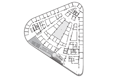
The 1000-seat auditorium dominates the building that also hosts facilities for administration and a faculty club. These are located on top of the hall, which was made possible thru large trusses. The entire structure stands on three legs, located together with stairs and elevators in each corner. The retracted supports have enabled uninterrupted spaces indoor as well as continuity in the outer form. Variation will arise from shifts in light, as architecture always has.
