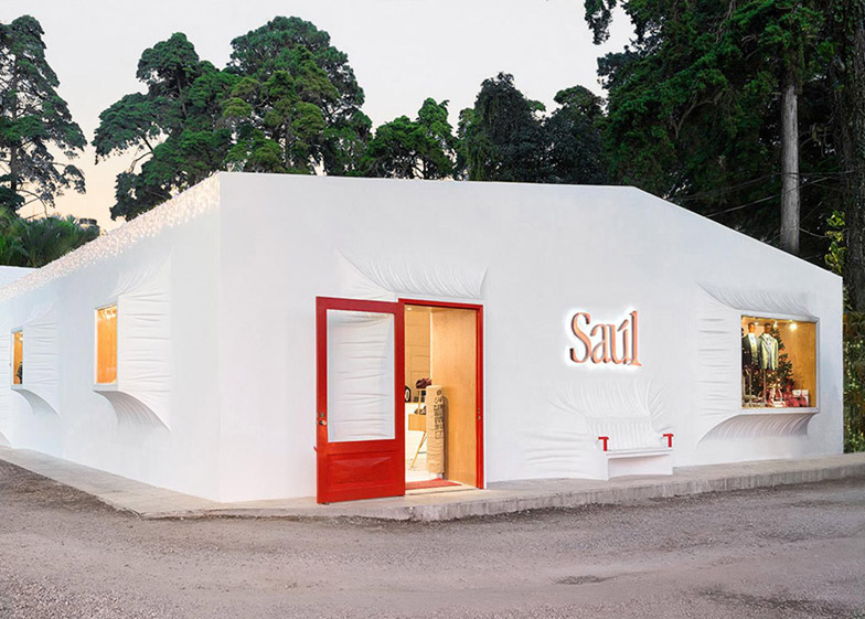
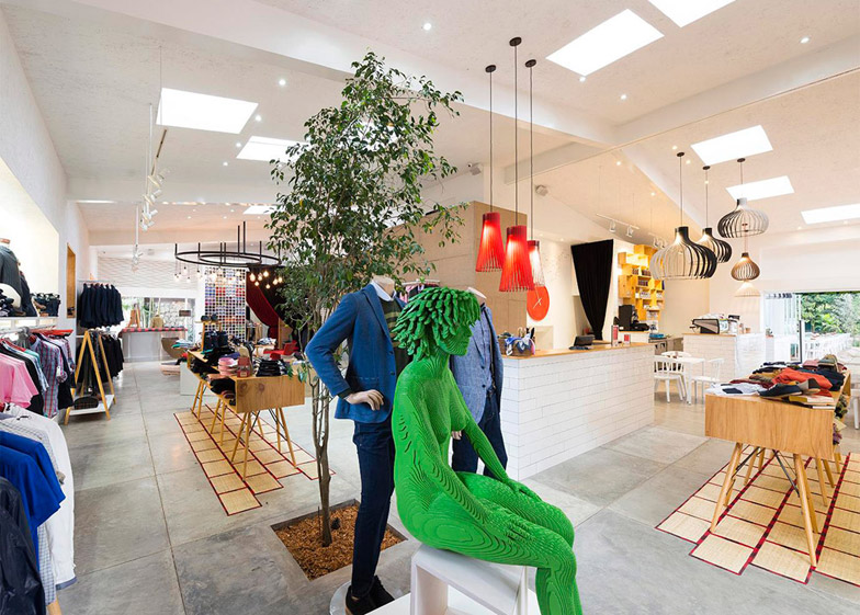
Doors and windows have been stretched out from the facade of this shop and cafe in Guatemala City by local studio Taller KEN (+ slideshow).
Taller KEN wanted to incorporate local cultural references into its design for the Saul E Méndez menswear shop in Guatemala City's Zona 14, creating a retail and dining environment that draws on everything from colonial homes to Mayan dresses.
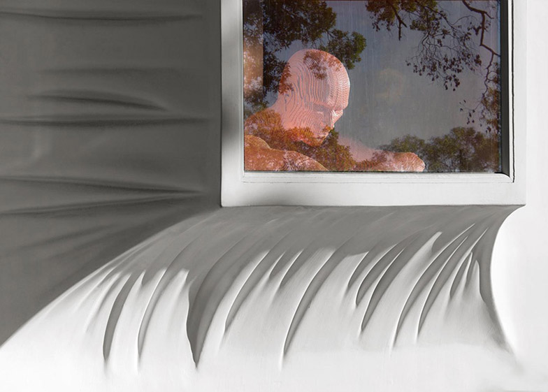
The building's rectilinear white facade is interrupted by openings that extend outwards from the walls, as if the surface is made from a stretchy fabric.
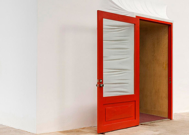
The wrinkled details are achieved using moulded fibreglass panels, with a smooth plaster finish helping to blend the three-dimensional surfaces into the facades.
"One of the characteristics of the Spanish colonial architecture preserved in Guatemala is the deep ornamental window niches," the architects told Dezeen.
"We made a play on this by pushing the windows to the exterior and, as a result, created an interior space for display."
The main entrance is announced by a bright red door, while the armrests of a bench moulded into the facade next to it are also picked out in red.
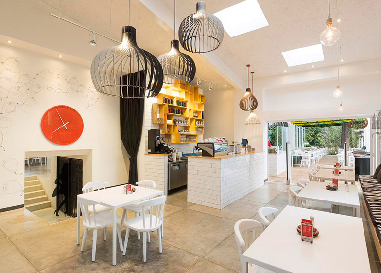
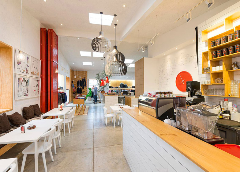
Concrete block walls are finished internally with white painted chipboard panels, while the floor is polished concrete, offering a bright and neutral backdrop for the colourful products on display.
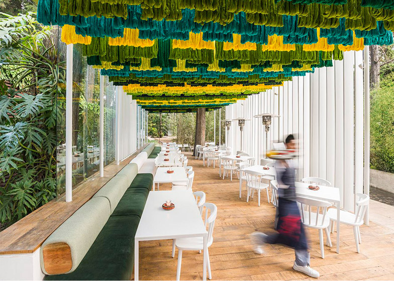
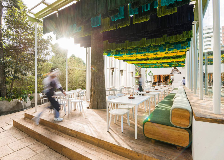
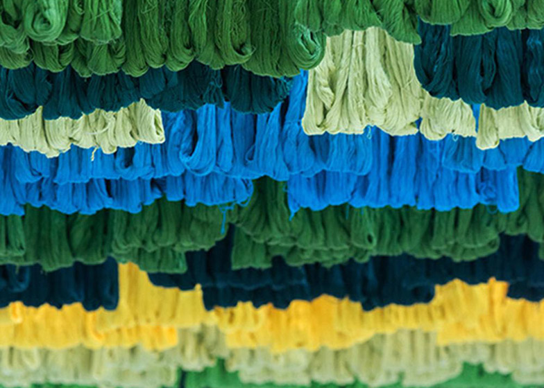
Above the outdoor terrace that extends from one end of the L-shaped structure, the designers suspended colourful threads that are used by locals to make clothing.
These threads are suspended in a similar fashion to the way they are hung to dry after dyeing.
"To create a space that felt natural, bright, and colourful we referenced the natural production techniques still used by indigenous people in Guatemala," the architects explained.
"The palette of greens and yellows blends with the surrounding vegetation."
The canopy also functions as a sun shade, and the sound absorbing quality of the thread helps to improve acoustics in the dining area.
Bathrooms are decorated with black and white photographs and mismatched geometric patterned tiles to create disorientating spaces.
"They create an unexpected experience, like a fun house or a maze, where you don't know where the spaces end," the architects added.
Photography is by Andres Asturias.

