Le Meridien hotel redesign by Neri&Hu features glass boxes and bronze columns
Shanghai studio Neri&Hu has completed its largest project to date – a total exterior and interior overhaul of a hotel in Zhengzhou, China, featuring a new facade resembling a pile of glass boxes and an entrance surrounded by a forest of bronze columns (+ slideshow).
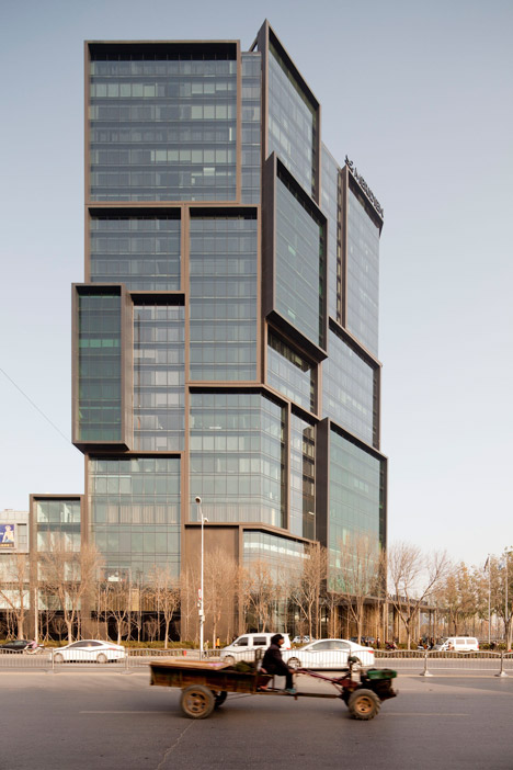
Architects Lyndon Neri and Rossana Hu developed the redesign of the 25-storey Le Meridien hotel around the concept of an "archive" for artefacts relating to the cultural history of Henan Province.
This is expressed on the interior and exterior through use of materials and patterns appropriate to the region, as well as in the arrangement of spaces.
"The archive seemed like the one metaphor that could carry through all aspects of the design, from building to interior to artwork to finish," Rossana Hu told Dezeen.
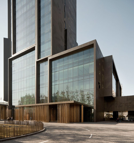
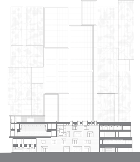
A series of projecting glazed boxes added to the original concrete shell give the hotel's facades a more varied aesthetic than the neighbouring monolithic tower blocks. Perforations pattern the solid side walls of the boxes, depicting the leaves and flowers of the Henan wild rose.
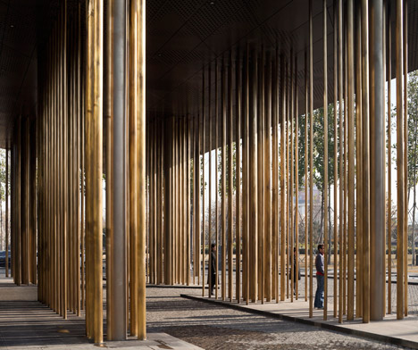
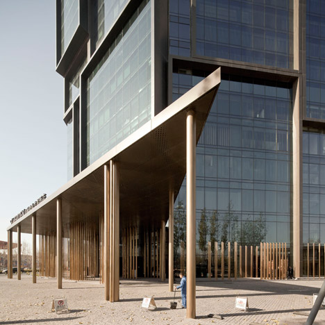
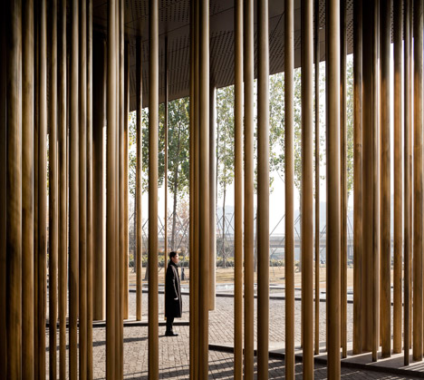
At the base of the building, canopies raised on clusters of gleaming bronze poles shelter the approach to the hotel's main entrance.
A five-storey podium accommodates public functions that include a lobby, restaurants, a ballroom and a health club. The main tower rises up from this structure, creating 350 guest rooms.
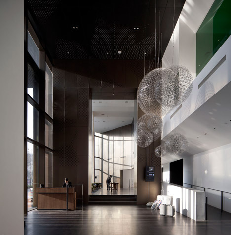
At the centre of the podium is a grey sandstone-clad atrium featuring rows of irregularly spaced openings that reference the limestone surfaces of the nearby Longmen Caves, where famous Chinese Buddhist art is carved into the walls.
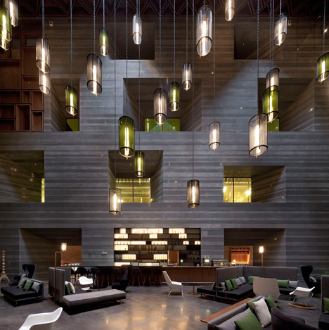
The deep apertures provide a visual connection between the various public spaces positioned around the atrium, while skylights allow natural light to filter down into the space to enhance its cave-like appearance.
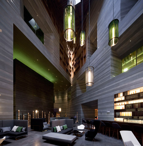
Groups of wooden boxes frame spaces near the top of the atrium, continuing the visual language of deep reveals. These also recur in other public spaces, including on windows in the events space and as frames for mirrors in the spa.
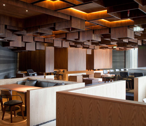
In the hotel's Japanese Restaurant, walnut boxes of different heights cover the ceiling and descend in places to enclose private dining areas.
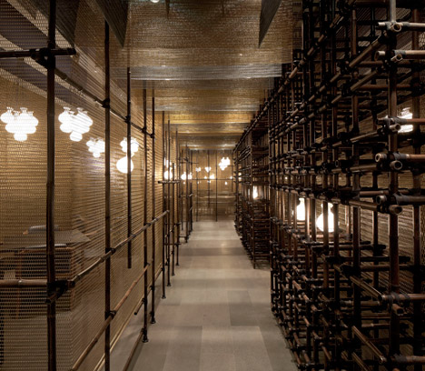
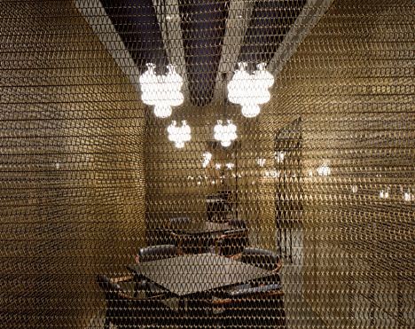
There is also a Chinese Restaurant, where private dining areas are shrouded by metal mesh surfaces, suspended behind a framework of bamboo scaffolding.
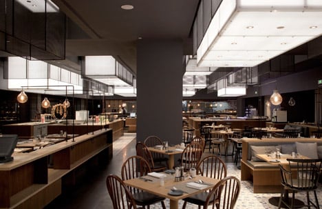
An all-day-dining restaurant below the Chinese Restaurant features black mesh boxes that project downwards from the ceiling, surrounding light boxes that illuminate the tables and buffet stations.
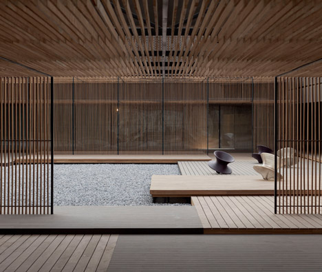
White pebbles cover a roof garden on top of the podium, with decked seating areas around the periphery connected by corridors lined with slatted timber walls.
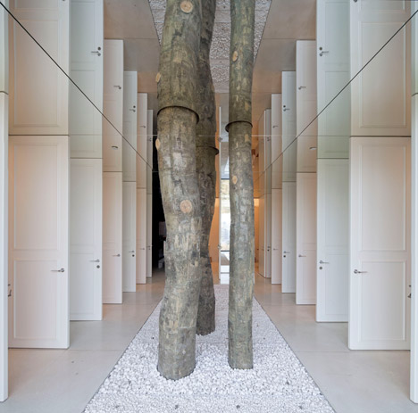
Bathrooms on the same level are concealed behind rows of white doors, accompanied by tree trunks that emerge from a pebble-filled trough on the floor and appear to penetrate the mirrored ceiling above.
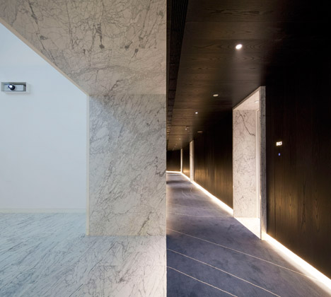
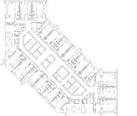
Guest rooms and the surrounding circulation areas are decorated in a monochrome palette. Three-storey atriums interrupt the floor plan on each level and provide spaces for art installations.
Neri and Hu, whose previous projects vary from a 300-room hotel in China's oldest city to a design gallery in a former colonial police station, describe the Le Meridien hotel as the most extensive interdisciplinary project they have been responsible for since founding their studio in 2004.
"It's much more efficient [to manage the entire project], and an overall coherence was within our control to manage," Hu told Dezeen. "We were able to oversee all aspects without having to fight with an outside consultant who may not see the same design vision."
Photography is by Pedro Pegenaute.
Read on for a project description from the architects:
Le Meridien Zhengzhou
In their design for Le Meridien hotel, Shanghai-based firm Neri&Hu envisions a new landmark for Zhengzhou, the capital of Henan province. Henan, once the ancient political, economic and cultural centre of China and home to many Emperors, today welcomes the international traveler. To showcase Henan's history through its arts (of literature, nature, food, Theatre, and Pattern) the architects conceived of the building as an "archive" of new and old artefacts that becomes a point of discovery for residents and travellers alike.
Externally the archives are expressed as cantilevered stacked boxes, each carefully composed with subtle ins and outs to break down the bulky proportions of the original structure, while offering a dynamic visual counterpoint to the neighbouring buildings. To differentiate the volumes the glass front of the each box is a slightly different tint of green and the negative space between boxes is clear glass. The sides of the boxes are clad in black and coffee coloured metal panels textured with perforations patterned after the local Henan wild rose. Two floating canopies supported by a cluster of bronze poles leads the visitor to the main entrance.
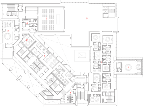
The 25-storey building consists of a 5-storey podium of public functions and a tower of 350 private guest rooms. For the podium, inspirations are taken from the nearby historic Longmen Caves, one of the finest examples of Chinese Buddhist art carved into limestone cliffs. The architectural expression of excavation and carving is most strongly experienced in the various openings surrounding the central atrium that visually connect the public spaces across multiple floors. Skylights above pierce the space with shafts of natural light that highlight the sedimentary pattern on the grey sandstone clad walls. Green tinted windows and an extensive custom designed chandelier installation fill the high space with a diffusion of light and colour.
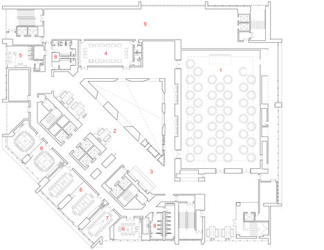
Near the top of the atrium, the cave is represented by a more delicate articulation of dark timber boxes which fold down onto the walls. These wood boxes are a recurring architectural feature, a filigree of organic lightness juxtaposed against the heavy stone. In the Pre-function area the entire ceiling and wall is dominated by the folding waffle boxes arranged irregularly but rigidly at the same height. Certain boxes become windows looking across the atrium space, and in the Spa a few boxes become inset mirrors.
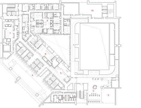
The timber coffer is perhaps most spectacularly realised in the Japanese Restaurant where the entirety of the ceiling of walnut boxes is constantly shifting in both height and size, several of the largest drop down low enough to form semi-private dining rooms. The ground beneath mimics the pattern of the ceiling above, and like an undulating landscape, it is populated by oak platforms of various heights, some meant to be occupiable by diners. A zigzagging path of white terrazzo carves its way through the leftover space as the main circulation. Extending from interior to exterior, the language of wood boxes continues seamlessly onto the Roof Garden, which is occupied by the very skylights that light up the atrium.
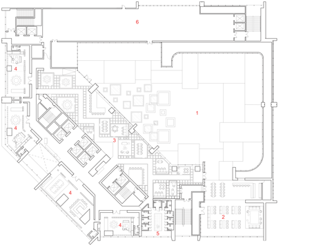
The hotel features two more restaurants which are visually connected vertically with strategic cuts in the floor. The Chinese Restaurant Private Dining Rooms are a series of black mesh volumes which then extend down into the All Day Dining Restaurant through the cuts. From below they appear as floating light boxes which illuminate the culinary delights laid out on the buffet stations below. The floors and walls of the All Day Dining are clad in custom designed tiles that combine the classic look of Delft blue ceramics with the traditional brush stroke of Chinese painting, while incorporating a Kungfu motif inspired by the proximity of the project to the renowned Shaolin Temple.
The jewel of the hotel is the Ballroom which is conceived of as a hanging cage draped with gold metal mesh and crystalline pendant lights, a theatrical celebration of opulence. The walls slope inwards near the top of this room and allow space for a path to be carved out, serving as another unique feature of the hotel. The Poetry Walk functions as both a running track for the fitness-motivated guest, or a casual strolling path complete with scenic landscape views. This looping track slopes gently upwards culminating in a panoramic outlook towards the Roof Garden and then descends back into the subterranean where it links up with other Health Club facilities.
The core concept of the guest room design is a contrast of light and dark. The living and sleeping areas are defined by a palette of grey walls and a stained timber wainscot, while the minimal bathrooms are clad exclusively in white subway tiles and enclosed by a glass panel etched in white with the same floral motif as the exterior. To break through the endless repetition and monotony of typical hotel elevator lobbies and room corridors, the entire guest room tower features a series of three story atriums, spaces reserved for art installations. Each atrium represents a different theme such as Myth, Nature, or Culture, and takes advantage of the verticality to give each guest room floor a unique fragment of the story.
This is the most extensive and largest scale inter-disciplinary design project Neri&Hu has undertaken, including: a re-design of the architecture from its previous concrete shell, full interior design from guest rooms to public spaces and restaurants, custom furniture design, signage design, landscape concept, and a few of the art installations. Through exploring different scales, textures, materials, and spaces, Neri&Hu created a showcase of archives by various ways of framing. Working closely with the client and the contextual references, Neri&Hu has curated a not only a spatial journey but a narrative sequence to serve the traveler and their experience of the city.