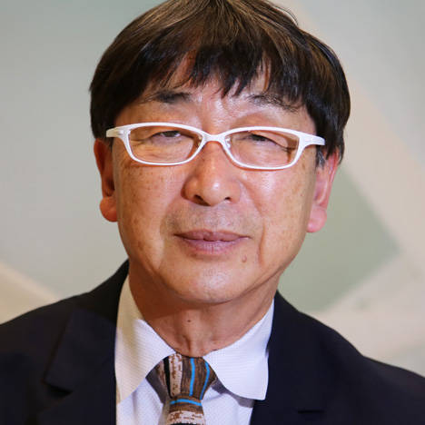
Toyo Ito wanted delicate textiles to "float in the air" in his Milan showroom for Kinnasand
Movie: Japanese architect Toyo Ito says his showroom for textile brand Kinnasand was designed to complement the company's "very delicate transparent and semi-transparent fabrics" in this video interview filmed in Milan.
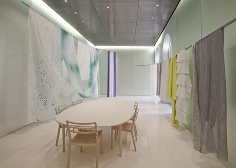
Launched during Milan design week in April this year, the 2013 Pritzker Prize-winning architect's showroom features frosted glass walls on three sides and floor-to-ceiling wooden doors on the fourth.
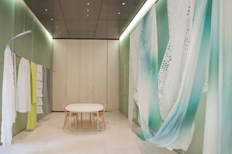
Ito explains that he chose materials he believed would complement the delicate nature of many of Kinnasand's fabrics.
Dezeen Book of Interviews: our new book, featuring conversations with 45 leading figures in architecture and design, is on sale now
"A lot of Kinnasand's textiles are very delicate, transparent, semi-transparent and light," he says. "It's like the are floating in the air. I didn't want to interior of the space to overwhelm the fabrics."

He continues: "Considering these factors, I chose to use reflective glass. However, I didn't want the reflection in the glass to be too strong, so I chose a material that would create a softer and deeper reflection. I wanted to create a soft feel in the space."
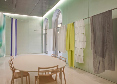
The only product displays in the showroom consist of two curved metal poles suspended from the ceiling, over which fabrics can be draped so that they "float in the light."

Ito says it was the delicacy of Kinnasand's fabrics that convinced him to design the showroom. "I had a visit from Kinnasand," he recalls. "They arrived with suitcases full of textiles. They were opening a showroom and asked if I would be interested in designing the interior."
"Most of my work is architectural and I don't usually work solely in interior design. But I saw the textiles Kinnasand brought and I thought they were brilliant. So I decided I wanted to design this space."
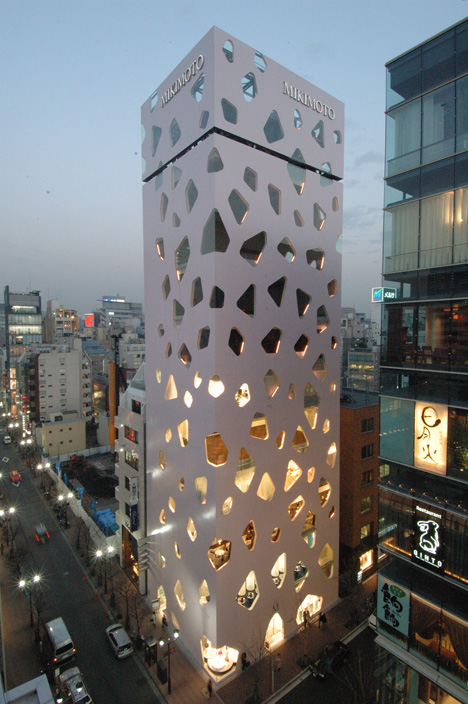
Some of the fabrics on display in the showroom bear a resemblance to the patterns and structures Ito has used in his own architecture, he says.
"I think the fabric behind me really suits my style of architecture," he explains. "Like my Mikimoto building in Ginza, it has got a very simple surface with several differently-sized holes. I would like to use a similar fabric in my own architecture."
