Cedar cladding frames an extension to The Runners House by AR Design Studio
A timber-clad box frames a new living area added to the heart of this house in Winchester, England, by local firm AR Design Studio (+ slideshow).
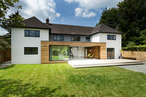
The owners of a typical English three-bedroom house asked AR Design Studio to enlarge the property and reorganise the confused interior layout to make it perform better for family living.
"The original house didn't make sense for the way the client wanted to live," Laurie Scott of AR Design Studio told Dezeen. "They wanted a big central space where the family could hang out together, with everything else radiating off that."
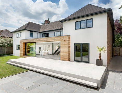
The architects removed an existing conservatory and added a new wing to transform the original L-shaped plan into a U-shape, which wraps around a large open-plan room that now occupies most of the ground floor.
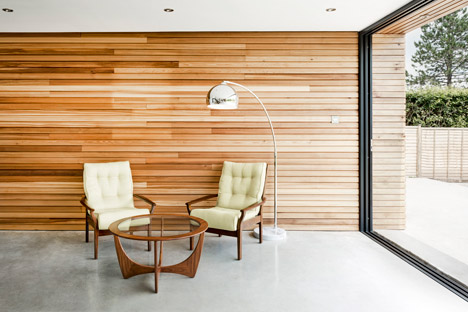
Viewed from the back garden, the space between the two wings is surrounded by a rectangular wooden frame that extends outward slightly from the edge of the house and continues along a portion of the internal walls.
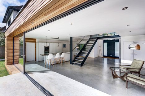
"The timber box unites the hard element of the two wings and the main body of the house with the softer element of the garden and acts as a transitional space," said Scott.
A concrete plinth was constructed outside a series of sliding doors to create a seamless connection with the interior flooring.
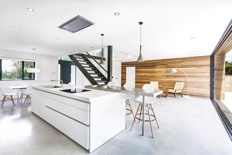
A double-height entrance at the front of the property opens onto the expansive kitchen, dining and living area, which looks straight onto the garden through the glazed doors.
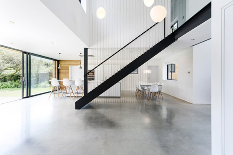
The kitchen area, with an island unit and breakfast bar, is separated from a dedicated lounge space by a steel staircase featuring poured concrete treads that match the flooring on the lower level.
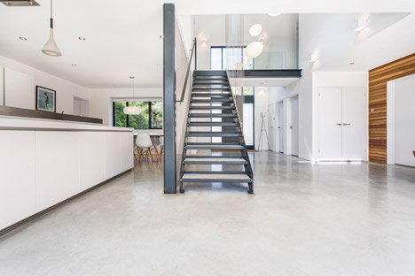
The staircase is flanked by steel tension wires, providing minimal balustrades. Gaps between the stairs further reduce the visual weight of the structure.
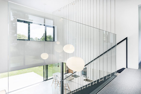
A glass-balustraded bridge connecting the master bedroom suite with the children's bedrooms crosses the entrance and is intended to accentuate the height and brightness of this space.
The architects specified Ludovica and Roberto Palomba's softly rounded Gregg pendant lights for Foscarini in the double-height area to create the impression of "being up in the clouds".
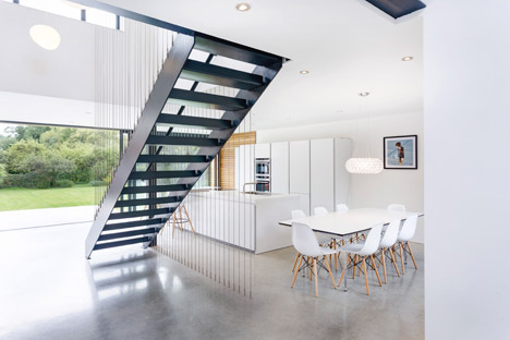
"There's this tongue-in-cheek space with the cloud lights and the glass balustrade that accentuates the lightweight airy feeling you get from being high up with a view down to the rest of the house," added Scott.
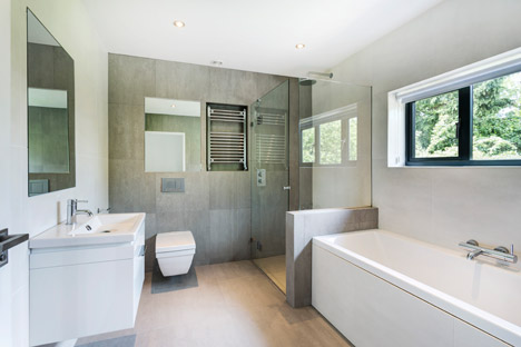
Existing rooms throughout the property were refreshed and a bathroom looking out towards the garden is among the rooms created in the new wing.
The project is one of several completed by the architects on the same street, and was named The Runners House because of the owners' passion for jogging.
Photography is by Martin Gardner.