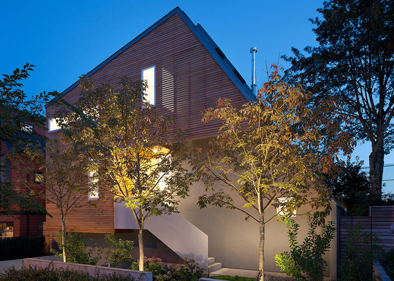
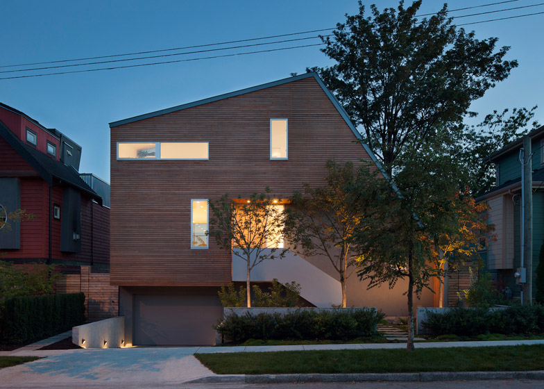
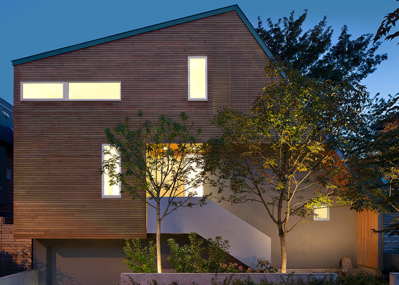
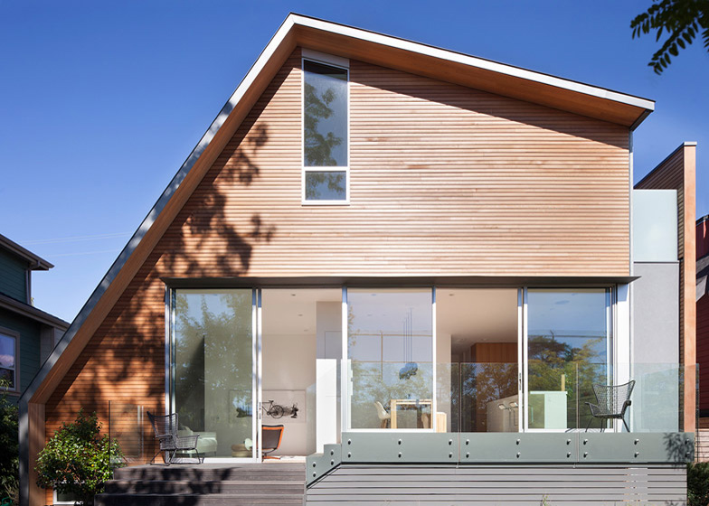
This cedar-clad Vancouver house by Canadian studio Splyce Design features a lopsided roof that follows the line of the staircase (+ slideshow).
Splyce Design was influenced by modernist homes when designing East Van House, built in a culturally and architecturally diverse neighbourhood of Vancouver for a single professional.
"There are several houses in the area that reflect the diversity of the community, and this house fits into that context," architect Nigel Parish told Dezeen. "There are elements designed to relate to the size and materials of its neighbours, but it reflects an architecture that has been tailored to the needs of the client."
The three-storey home occupies a shorter plot than is normal for the area, so Splyce Design built up into the roof to maximise internal space and designed a long slope on one side to fit the staircase beneath.
"The off-set, asymmetrical roof worked well in accommodating the stairs, and created some unique spaces inside," said Parish.
The basement has a garage, utility room, wine room, and a bedroom and bathroom for guests.
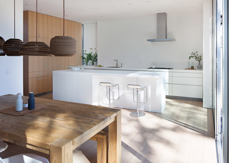
The ground floor houses the main entrance from the street, which leads to an open-plan kitchen and dining area at the back, and a living room and terrace. These areas face south, attracting natural light throughout the day.
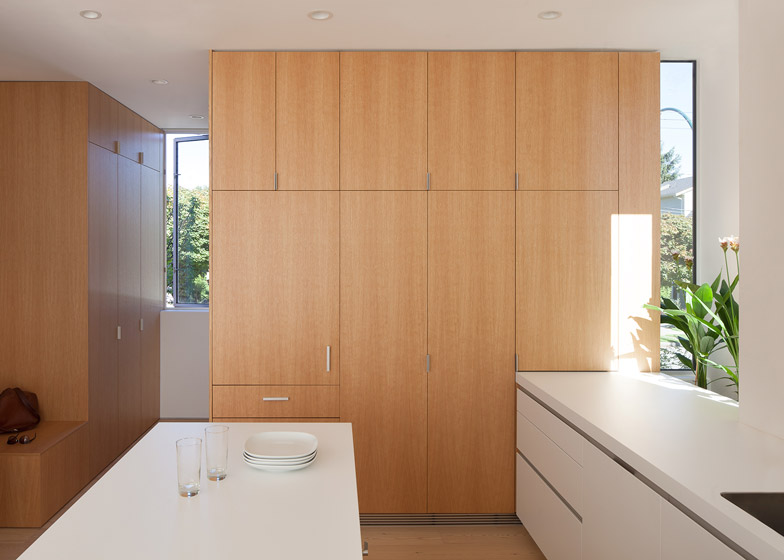
The kitchen has floor-to-ceiling white-oak storage units concentrated along one surface in order to keep the side wall free of overhead cabinets. The storage unit closest to the entrance steps down to provide a seating box, which also doubles as a spot to drop off bags.
On the kitchen's side wall, a recess with windows has been left behind the counter-top, designed to bring light deeper into the house and provide space for plants.
"We were allowed to have a bay window, and this was our interpretation, with windows on the sides instead of directly in front," said Parish. "We saw this as a space to grow herbs or have seasonal flowers throughout the year, and during the day it provides additional light."
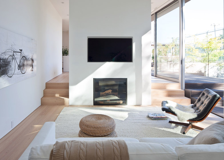
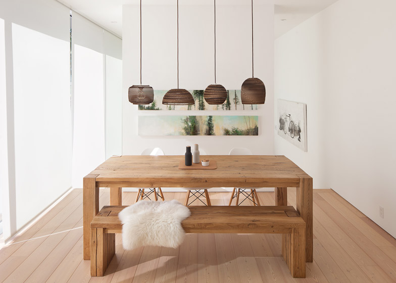
At the back of the house, the dining area and living room are set at different levels and separated by a fireplace.
"The split level allowed us to get the living space closer to the garden, and also defined the different spaces within the larger whole," said Parish.
A reading nook around the corner from the living room leads back to the front entrance, offering a circular route around the ground floor.
"There are no dead-ends in the house, and given the relatively small floor plate, this makes the space feel larger," said Parish.
The top floor has a study and a bedroom, with a west-facing rooflight that frames views of the sky and trees from the bed.
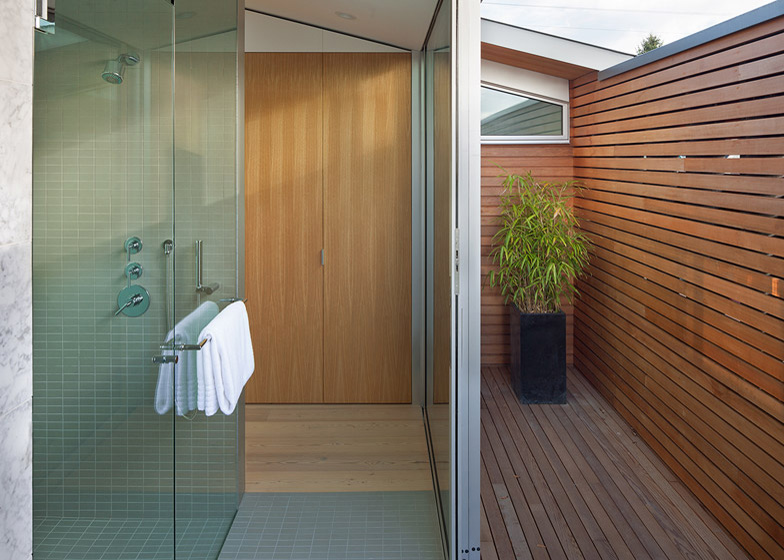
A dressing area has been added behind the bedroom, with a corridor of wardrobe space that leads out to a small terrace.
A bath and shower have also been added behind the bedroom, with the bath and its adjacent wall built in marble to contrast the timber used throughout the rest of the house.
Stairs between the three floors are at the north-facing front of the house, which is the darkest part of the building. Open stair treads, glass balustrades and a rooflight at the top of the stairwell have been added to increase the flow of natural light here.
"The tall stair volume adds to the sense of expanse in the house. People are often surprised it's only 2,300 square feet [213.67 square metres]," said Parish.
Larch has been used for the flooring throughout the house and western red cedar forms the external cladding.
"Western red cedar was our favoured choice, because it is grown locally in our forests and sustainably harvested," said Parish.
Splyce Design has previously designed a house with a cantilevered dining room.

