Jonathan Tuckey Design has refurbished the interior of a semi-detached house in London and added a dining room extension with a latticed wooden ceiling (+ slideshow).
A young couple occupy the 1930s house in Doyle Gardens with their two children. They asked London-based Jonathan Tuckey Design to improve the configuration of the ground floor rooms and enhance the connection between the interior, the garden and a park on the opposite side of the road.
"The ground floor plan was, from the front parlour back, congested and dark and offered no means of accessing the back garden," project designers Ryuta Hirayama and Peter Youthed told Dezeen.
"Our aim was to create a layered relationship between the interior and the south-facing garden."
Existing partition walls were removed to turn what was previously four separate rooms into a series of interconnected spaces that allow views through from the front of the house to the garden at the back.
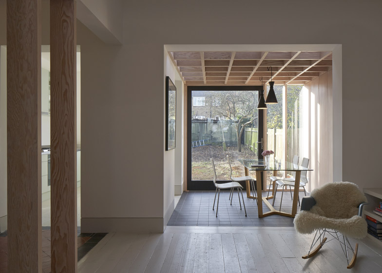
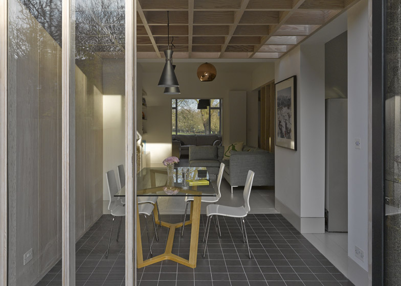
At the rear of the property the designers added an extension alongside the kitchen that houses a new dining room looking out onto the garden.
The boxy self-contained room is distinct from the rest of the open floor plan and creates a more formal space that can be used for family dinners and parties.
"We thought that having broken open the cellular condition of the existing plan we should counterbalance this by creating a dining space with a clearly defined character," explained the architects.
An enlarged opening connects the room with the living area, while a tiled floor and a wooden framework covering the ceiling help to distinguish it from the adjoining spaces.
The dimensions of the cube-shaped space were established by planning regulations, while a tight budget determined the use of Douglas fir for the structure.
The wooden beams above the dining table recall traditional coffered ceilings made using square structural panels.
A gap between the roof and the upper storey of the existing house lets light filter down and provides views into the kitchen from the children's room above.
Part of the glazed end wall of the extension swings outwards to link the interior with a deck that juts out into the garden.
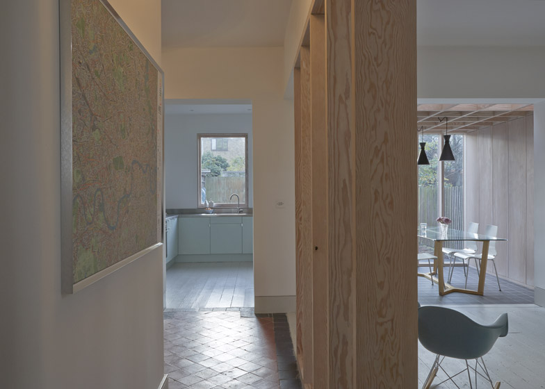
The clients asked for original materials – uncovered when existing surfaces were stripped back – to be retained and incorporated into the design. This included a mosaic tiled floor in the hall next to the entrance.
A wooden screen was inserted between the hall and the living area to represent the position of the original partition wall.
Made from the same timber as the framework in the extension, and with identical gaps between its panels, the screen also emphasises the contrast between the old and new flooring.
Photography is by James Brittain.


