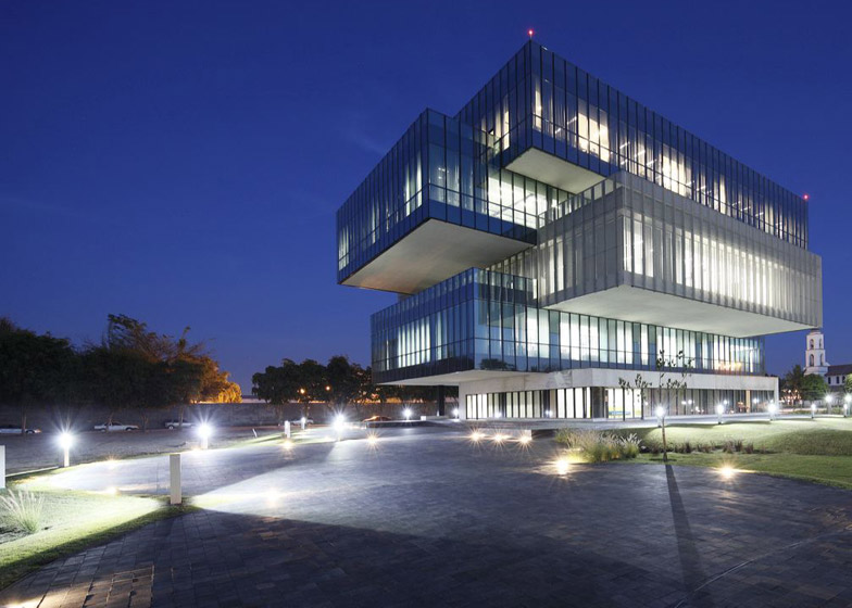
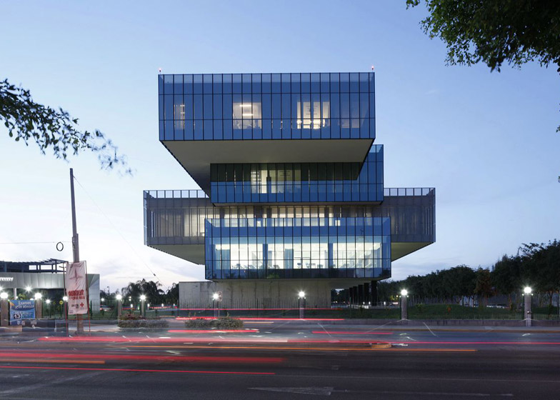
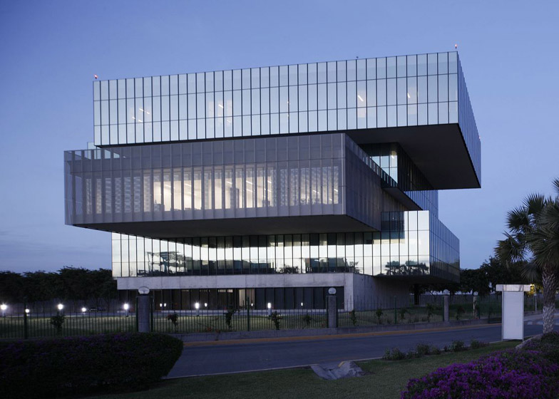
A stack of large glass boxes forms this biotechnology facility at a Mexico university by Tatiana Bilbao (+ slideshow).
The Bioinnova building was designed by Tatiana Bilbao for a site on the edge of the Monterrey Institute of Technology's Culiacán campus in the Mexican state of Sinaloa.
As well as providing academic facilities, the building accommodates commercial enterprises, with rentable office space and opportunities for students to engage in live research projects.
Initially the university proposed a straightforward five-storey block, but Bilbao convinced the board that separating the different levels and shifting them to create cantilevered forms would result in a more iconic and practical building.
"The client wanted large open-plan rectangular floor plates that could be divided flexibly, so we did that but we moved the floors to create a structure that's more of a living building," Bilbao told Dezeen.
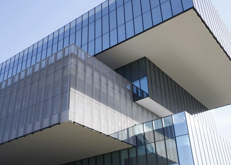
The staggered arrangement of identical rectangular volumes results in passive solar shading on the levels below and also creates outdoor terraces that the architect describes as "liveable spaces, in contrast to corporate buildings that are just enclosed structures with glass all over them".
At the base of the building, a publicly accessible level is wrapped in concrete to emphasise its role as the foundation which supports the counterbalanced forms above.
"The building is designed to be like a tree, with strong and heavy roots that grow into the central concrete core containing the vertical circulation, and the rest of the levels projecting out like the branches of the tree," added Bilbao.
In the middle of the stack, one of the floors is rotated 90 degrees to give it a distinct appearance. This level houses an incubator and accelerator where students are provided with office space and support to help them connect with potential employers.
The exposed surfaces of the incubator level's facades are covered with a metal mesh that adds an extra level of solar protection.
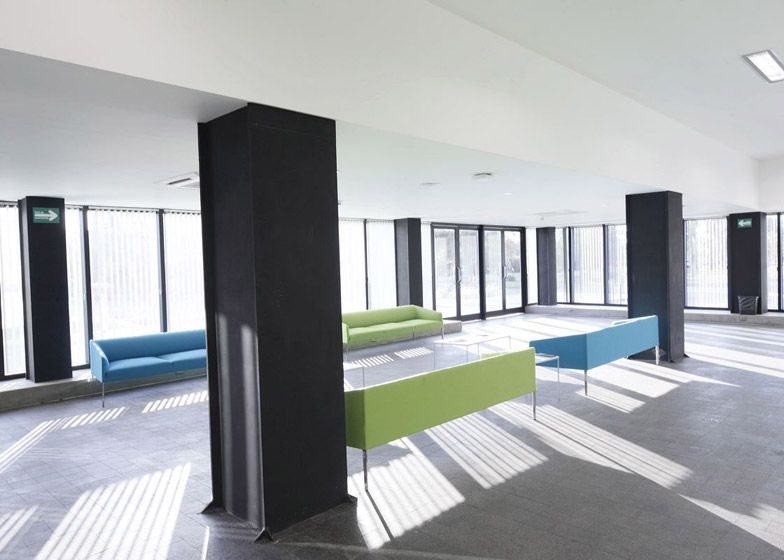
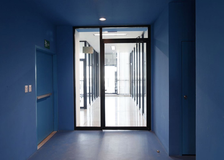
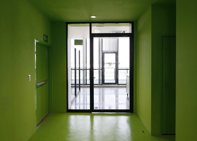
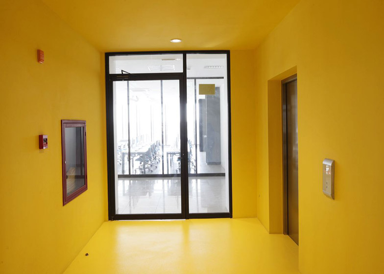
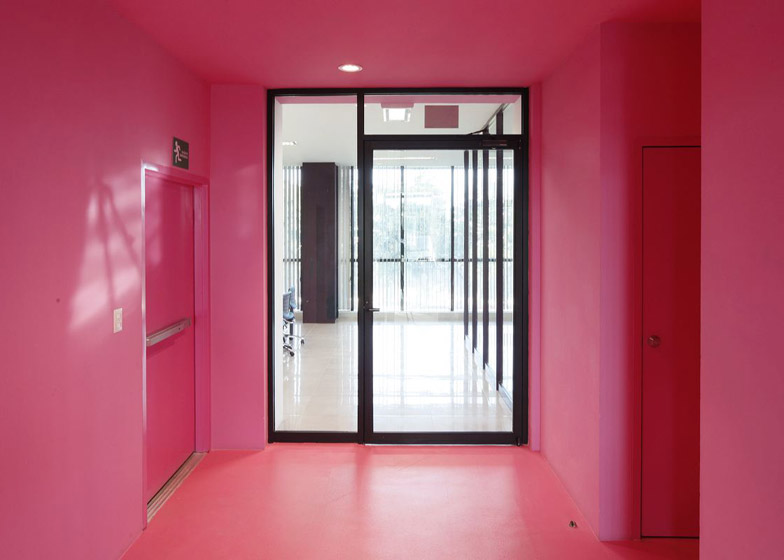
Circulation areas are painted in different bright colours on each floor to aid navigation within the building.
In response to the client's desire for the building to emphasise the relationship between the institution and the city, Bilbao proposed locating it as close as possible to a busy adjacent street.
The architect also convinced the client to position the gated entrance to the campus behind the building so members of the local community can use facilities including a conference room and auditorium housed in the lower levels.
Photography is by Iwan Baan.

