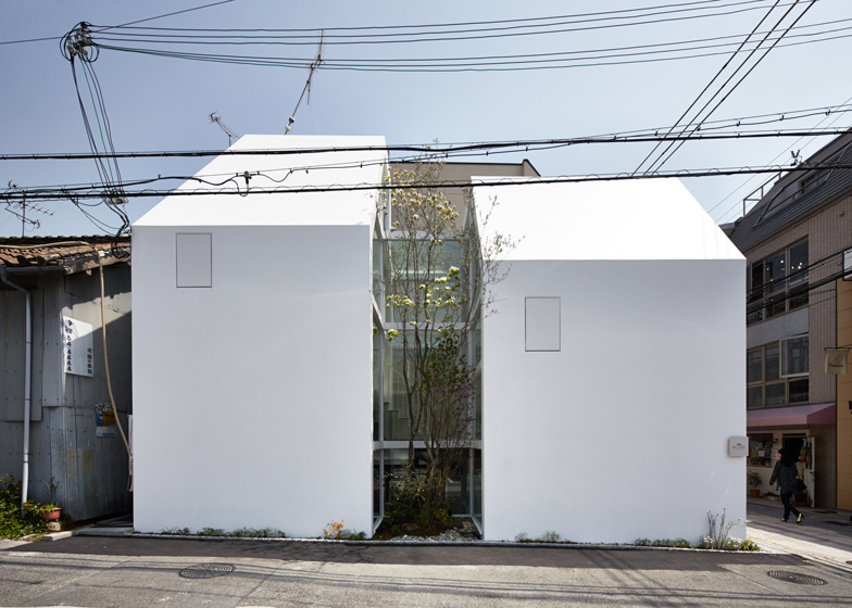
This cafe and sweet shop in Okamoto, Japan, was designed by architect Yuko Nagayama to look like two separate buildings with a small courtyard and tree sandwiched in the middle.
Named L'Espoir Blanc, which is French for The White Hope, the asymmetric structure was designed by Tokyo-based Yuko Nagayama to look like a pair of matching white houses – one to welcome customers and a second to accommodate back-of-house facilities.
The small courtyard sits within a recess along the western elevation, making the building appear as two structures when it is actually just one. There are no windows on this facade, creating a pair of monolithic surfaces.
"Two white houses make a kind of tunnel running from the north to the south, with walls in the west protecting the shop from strong sunlight," said Nagayama, who also recently completed a patisserie with an apartment floating overhead.
Both the front and rear facades are glazed, as are the walls surrounding the courtyard. This allows visitors to look right through the building, and ensures the interior is filled with natural light.
"Seen from the street in front, an unobstructed view of the sky above the Mount Rokko comes through the full-scale glass window," said Nagayama, explaining how the nearby mountain range influenced the design.
"There is no other building with such an open-minded structure elsewhere along this street."
Another benefit of this glazing is that the courtyard and tree are visible from almost everywhere inside the structure, as well as from the street in front.
Thick horizontal beams divide the shopfront up into a grid of five stripes that hides the edge of the floorplate behind. The first two sections frame the ground-floor sweet shop, while the three upper panels sit in front of the double-height cafe, located on the first floor.
Nagayama used different varieties of white and pale-coloured paint to give a textured and multi-tonal appearance to the walls and furniture in both of these spaces.
The shop also features a glass cabinet displaying the sweet treats – known in Japan as Wagashi.
"Ceilings, walls, floors, tables and even chairs are painted with the special white, reminiscent of a delicate touch of a picture surface," said the architect. "The interior and furniture has become a vast bowl for sweets."
Floor levels at the rear of the building differ from the arrangement at the front. The shop kitchen is partially sunken into the site, bringing the counter in line with the ground surface. The cafe kitchen can be found on the first floor, while a second storey creates an additional cafe seating area.
Photography is by Daici Ano.

