
"Might be the ugliest bike I've ever seen"
Comments update: four bikes by prolific designer Philippe Starck were unveiled at bicycle trade show Eurobike, sparking one of the more amusing conversations on Dezeen last week.
The bikes, all designed to incorporate batteries to provide additional pedal power for riders, were each customised for different environments and came with matching accessories. But it was the Snow model's furry coat that caught the most attention.
"Finally, a bike that's custom made for the modern viking! The helmet says it all!" wrote Classico. "I like the gloves, but the rest of the accessories would make you look like some kind of neo-Viking waste man," agreed SirBlazeMore.
But Bart's succinct description won the most up votes: "Bike disguised as a bike. Might be the ugliest bike I've ever seen." Read the comments on this story »
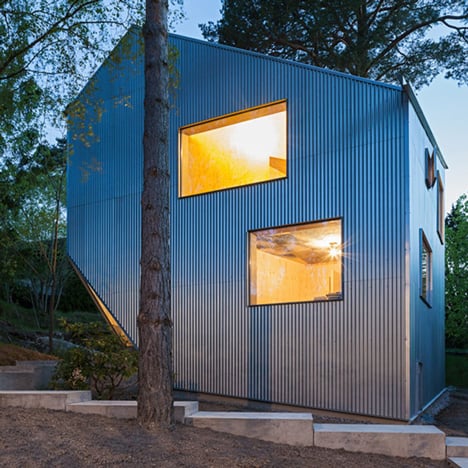
Not so cheap? A project called Happy Cheap house by Swedish architect Tommy Carlsson triggered a series of debates over what counts as cheap, whether a corrugated iron roof was better than shingles and if a plywood-lined interior was really desirable.
"On what planet is €180,000 cheap?" asked Wat. "Any first world country, if built by legal workers, paid a market price wage with full benefits (provided either publicly or privately)," retorted Hailexiao.
"Leaving aside the cost, which is very far from happy or cheap, I must comment on the monotonous plywood," wrote Arjay Cee. "If that is meant to be 'a vision of a better world,' then utopia can go to hell." Read the comments on this story »
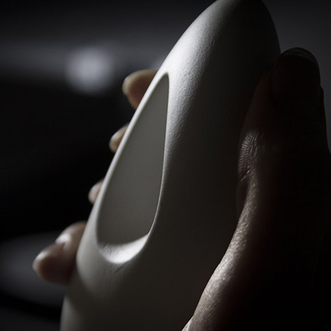
Calming stone: one of the most popular products that appeared on Dezeen was a device designed to help manage panic attacks and anxiety, which the designer claimed offered a viable alternative to medication.
"If this does work, surely those suffering with anxiety will develop a dependence on it, meaning that they will feel anxious if they don't have it on them at all times?" asked Doubter. "I suffer from panic attacks and I would much rather be dependent on something which enables me to live my life than limit myself to only what I can do unaided," responded Sarah Betts.
"When so much time, energy and resources are used in the pursuit of copying nature to such a degree that you wonder if it would not be better to simply pick up an actual pebble," suggested Elliott Morgan. Read the comments on this story »
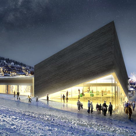
BIG trouble in Park City: BIG, the architecture firm run by Bjarke Ingels, had its second design for the Kimball Art Centre rejected in Park City, Utah, for failing to fit in with the area's traditional architecture. The decision was met with mixed reactions on Dezeen.
"So if I should be so bold and translate for the city. 'You Bjarke Ingles are a famous architect and we want you to design a building exactly like every other building that is here in this town,'" wrote Dbz123. "Pity the planners were looking at the plan upside down. Why do we employ them?" asked Rank Frank.
But Brian thought the planners were right to reject the proposal. "I think it is not BIG's best work, nor should it be built," he wrote. "At least his first proposal actually had some historical meaning behind it and not just a small lift of a skirt. This project has potential to be one of Utah's architectural landmarks but not at this rate." Read the comments on this story »
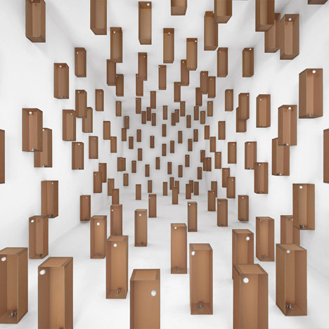
Little boxes: and finally, videos of three installations by Zimoun made from cardboard boxes met with unanimous approval from Dezeen's often cynical readers.
"Just listening to the sound is pleasing in a minimalist, ambient music sort of way. Brilliant all round," wrote TFO. "I usually baulk at stuff like this, but there is something intensely satisfying about it," agreed Chris MacDonald. "Perhaps the randomness, almost white noise like sound produced. Somehow very soothing." Read the comments on this story »