Bow House by Edwards Moore has a narrow middle that frames a patio
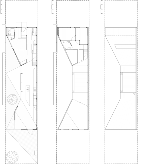
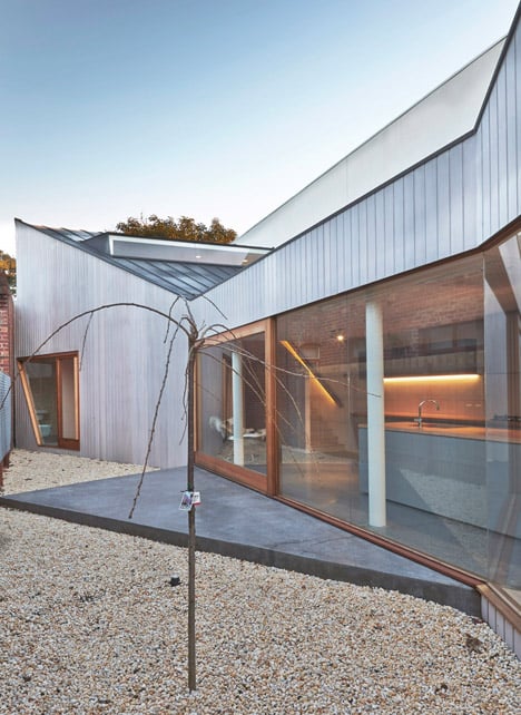
This Melbourne home by local studio Edwards Moore narrows down to less than four metres at its centre to make room for a narrow patio along the southern boundary (+ movie).
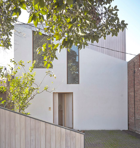
The two-storey family residence, named Bow House because of its shape, was designed by Edwards Moore to replace a single-storey brick house that formerly occupied the site in Melbourne's Richmond neighbourhood.
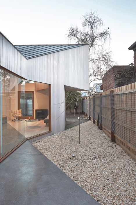
The street-facing western facade stretches across the full seven-metre width of the plot, but the building becomes steadily narrower to frame a south-facing outdoor dining area that receives sunlight throughout the day.

"The form of the house responds to its rectilinear orientation by maximising the path of the sun and creating an internal private aspect for its inhabitants," said Ben Edwards, who founded Edwards Moore in 2009 with colleague Juliet Moore.
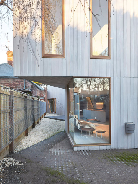
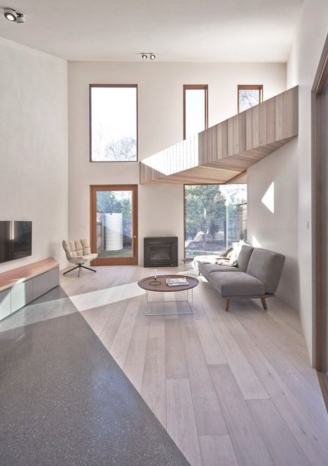
The house has two storeys at the front but only one at the back, creating a double-height living and dining area that can be opened out to the garden by sliding open a series of storey-high windows.
"The double-height volume above the living area acts as the culmination of the transition from the street to the privacy of the garden oasis," explained Edwards.
A triangular mezzanine is suspended over one corner, creating an area for display.
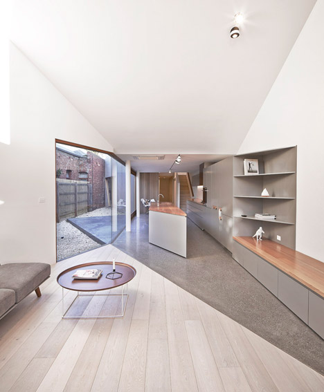
The floor surface changes from timber to concrete in the kitchen to differentiate this space from the rest of the interior. Heating is under the floor, and the surface also extends out into the garden to outline an al fresco dining space.
The architects, whose past projects include a brick house with a translucent roof and a glowing art studio, used timber cladding inside and outside the building to further connect the various rooms with the garden.
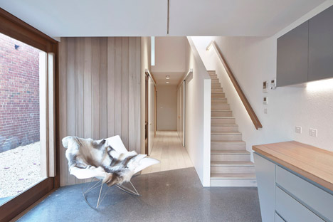
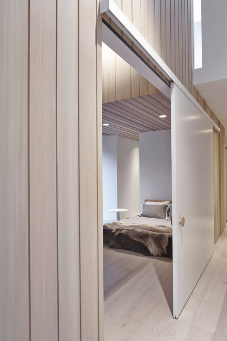
"Vertical timber lining runs both externally and internally to blur thresholds between interior and exterior, adding warmth and tactility," said Edwards.

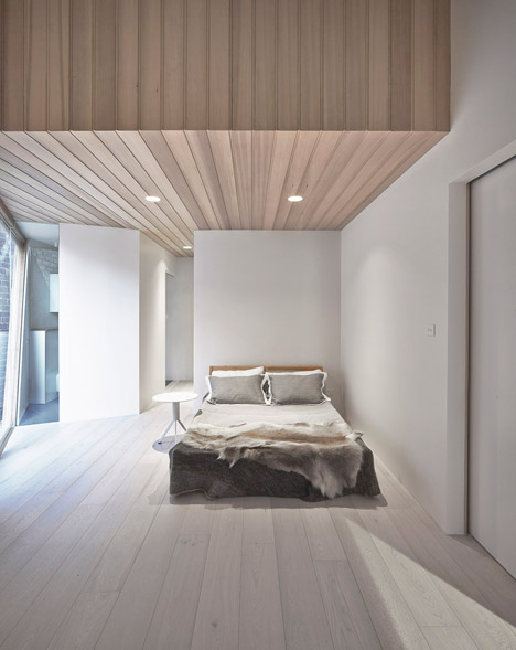
The master bedroom sits alongside the entrance with an en suite tucked in one corner, while two additional bedrooms are located upstairs.
The top floor landing doesn't have any windows, so a skylight was put in overhead to bring in morning sunlight.
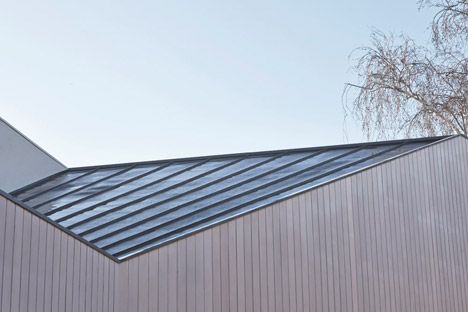
Zinc was used to cover the roof, which angles to match the shape of the courtyard.
Photography is by Fraser Marsden. Video is by Nalu Productions with audio by DJ Neu Girl.
