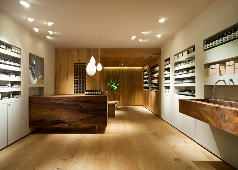
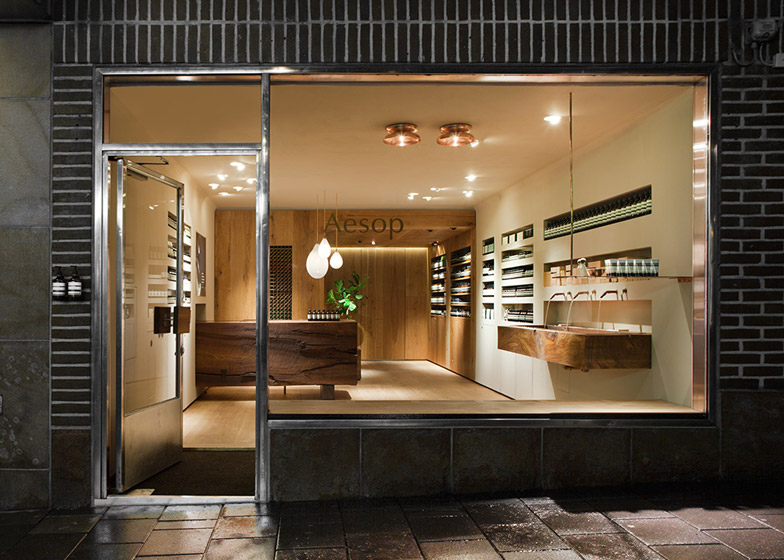
Behind a tiled and metal-framed shop front, skincare brand Aesop's Stockholm store by local firm In Praise of Shadows features pale oak floorboards that contrast with the roughly hewn elm fittings (+ slideshow).
In Praise of Shadows combined warm beige plasterwork with a range of wood finishes to create a "rich tactile experience" for Aesop Bibliotekstan.
"Old wood and plaster shapes a store space divided in two, the open and the intimate," said architect Fredric Benesch.
The Swedish studio listed Nordic film-makers Ingmar Bergman and Lars von Trier as influences for the project, as well as Japanese philosopher Jun'ichirō Tanizaki, whose essay In Praise of Shadows the firm is named after.
"In this essay, Tanizaki praises traditional Japanese architecture and aesthetics and brings forward the qualities of materiality, patina and tactility," said the architects.
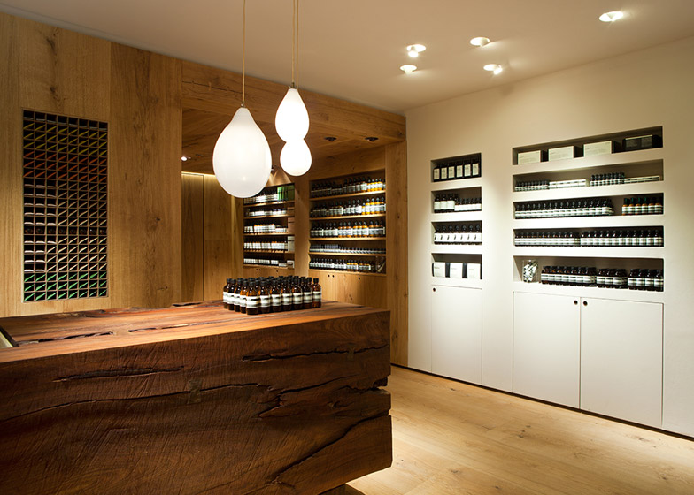
Rows of recessed shelving displaying the brand's skin and hair care products line the walls of the shop.
A pair of copper lampshades above the shop entrance illuminate a sink and reference the copper tubing of the solitary window display shelf.
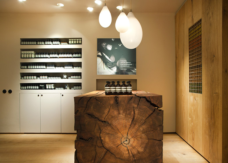
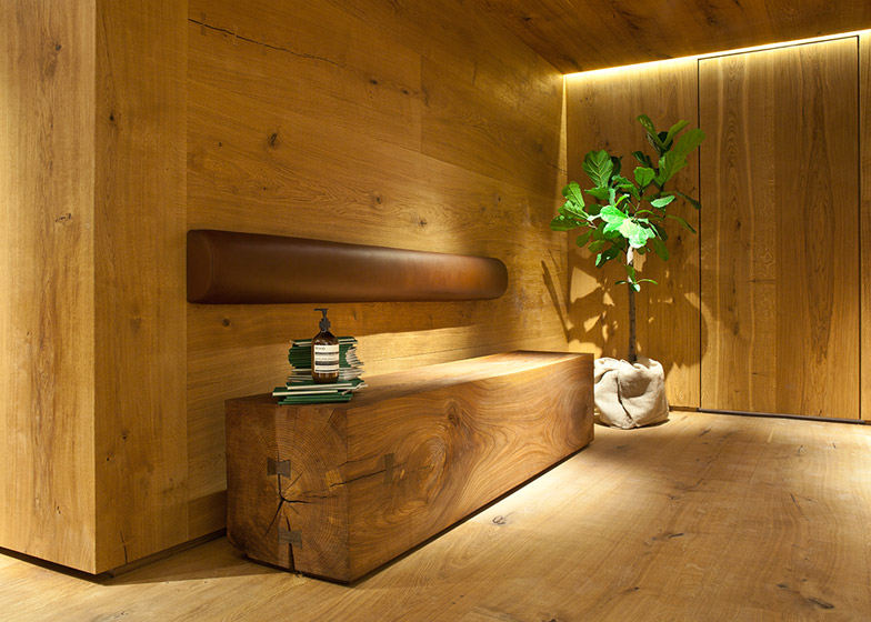
Large blocks of gnarled elm wood form the sales counter, bench and sink.
The pieces, by Lies Marie Hoffman, were dissected from the trunk of a diseased tree felled from Stockholm's Djurgården National Park.
Oak butterfly joints in the pieces prevent the cracks in the wood from widening.
"These massive, simply hewn forms also provide textural contrast with the smooth beige plaster wall, and timber floor, walls and ceiling," said the architects.
"The contrast of the timber's controlled shape and uncontrolled structure is very important to us. The drama lies in the contrast."
Beyond the sales counter the plaster walls switch to wood, creating an oak-panelled seating area. A strip of brown padded leather fastened to the wall forms a backrest for the elm bench.
The partition that backs this alcove hides the back offices, kitchen and toilet from the shop floor and contains a "hidden door" that aims to blend in with the wall. Pale oak floorboards run through both areas, unifying the space.
Aesop Bibliotekstan is the second of the brand's stores to have drawn design inspiration from Tanizaki's philosophical essay.
Japanese firm Simplicity revealed their design for the Kyoto store that features translucent fabric walls earlier this year.
In an interview with Dezeen, Aesop founder Dennis Paphitis said all his stores had to be unique as he was "horrified at the thought of a soulless chain". Others completed this year include a felt-lined shop in Shepherd's Bush by French architects Tolila+Gilliland and a converted bakery designed by Henry Wilson Studio in Sydney.

