Brutalist buildings: Preston Bus Station by Building Design Partnership
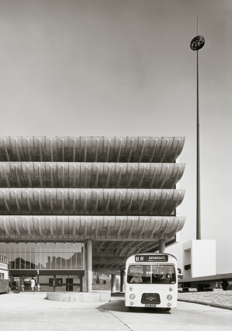
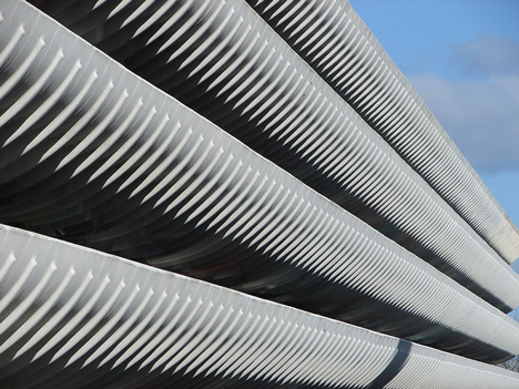
Brutalism: four rows of sculptural concrete fins make up the brazenly brutalist facade of Preston Bus Station in Lancashire, England – the next project in Dezeen's series.
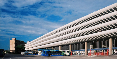
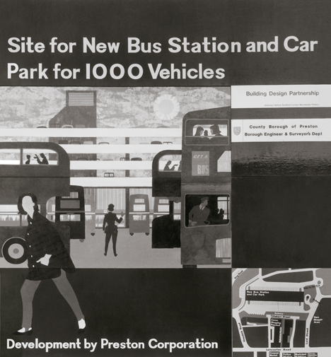
Completed in 1969 by Keith Ingham and Charles Wilson, a pair of architects working for British firm Building Design Partnership (now known as BDP), the 170-metre-long structure became the largest bus station in Europe and a poster child for the Brutalist style.
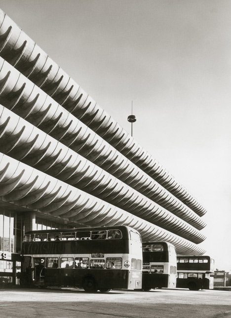
The colossal scale of the structure – it boasts 40 gates for double-decker buses on both its east and west sides – is seen as both the building's greatest feature and, by some, its failing. It faced demolition in 2013, following reports that a much-needed renovation could cost as much as £23 million due to the size of the project. But its popularity amongst both local residents and architects led to a heritage listing that blocked any future redevelopment of the site.
"Preston Bus Station encapsulates that rare period in the recent but now long distant past in which we as a nation took pride in lavishing time and money on creating collective spaces of quality and equality up and down the country," said architecture critic and broadcaster Tom Dyckhoff, "even for the most mundane of activities, such as catching a bus or eating a pie in the station's cafe."
"I think architecture is at its most meaningful and heroic when it celebrates like this the seemingly ordinary and everyday bits of time that connect us all," Dyckhoff told Dezeen.
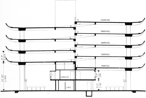
The starting point for Ingham and Wilson's design was the curved concrete edges that frame the four and five levels of car parking positioned above the two sides of the station concourse.
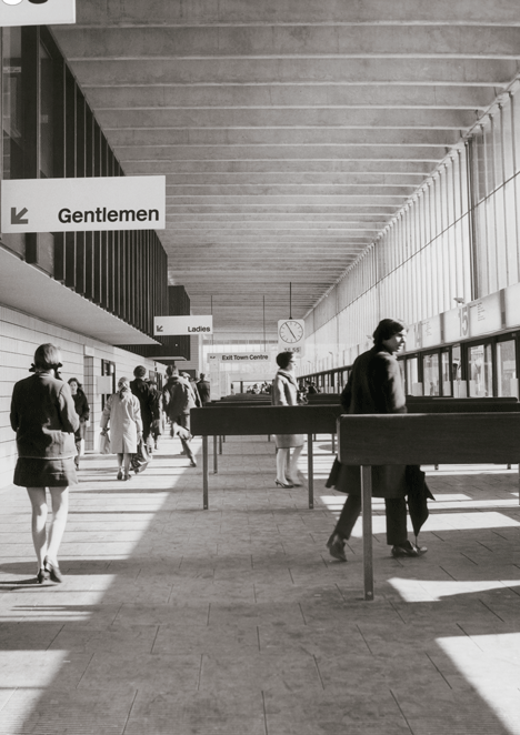
At the time, Ingham said his aim was to give ordinary people something of the luxury of air travel, which few people of that era could afford.
A factory was established on site to cast the concrete elements needed to give the building its unique profile. Using glass-reinforced polyester moulds, all 2,800 parts were produced in just under a year.
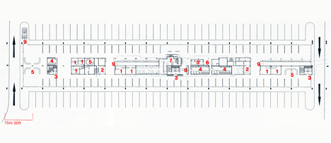
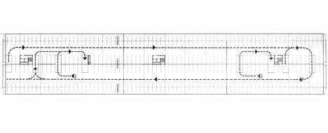
A double-height ground floor accommodates the height of a standard double-decker bus. Curving concrete ramps at the north and south ends of the building allow access to the car parking levels, while three subways and an elevated walkway allow pedestrian access.
Customer facilities, including cafes, kiosks, and information and booking offices, form a central spine that spans the ground floor space. Staff offices and toilets sit directly above.
The architects also designed custom fittings. These encompass oiled iroko wood seats, doors and barrier rails, oiled timber handrails, and unique signage and clocks.
When it was built, the station replaced four smaller bus interchanges, as part of a vision to transform Preston into a "Super City" that could accommodate a rapidly expanding population. This of course never happened, leaving a bus station far larger than was required.
Years of decline, thought by some to be deliberate neglect, followed. In 2012, the council voted to demolish the building, stating that it would be cheaper to start again than to carry out the necessary repairs to the existing building.
An outcry from the local community – many of whom named the bus station as their favourite local building – and a campaign that caught the attention of architects including Richard Rogers and OMA eventually led to a Grade II listing from English Heritage.
"There is a changing attitude towards 1960s 'brutalist' buildings, which to many represent a serious section in the historic development of architectural history in the UK," said Angela Brady, a former president of the Royal Institute of British Architects who backed the campaign.
"To rip out some of those pages of history would be to ignore and erase an important chapter which I believe no one has a right to do. It is part of our built culture, and not a fashion statement."
