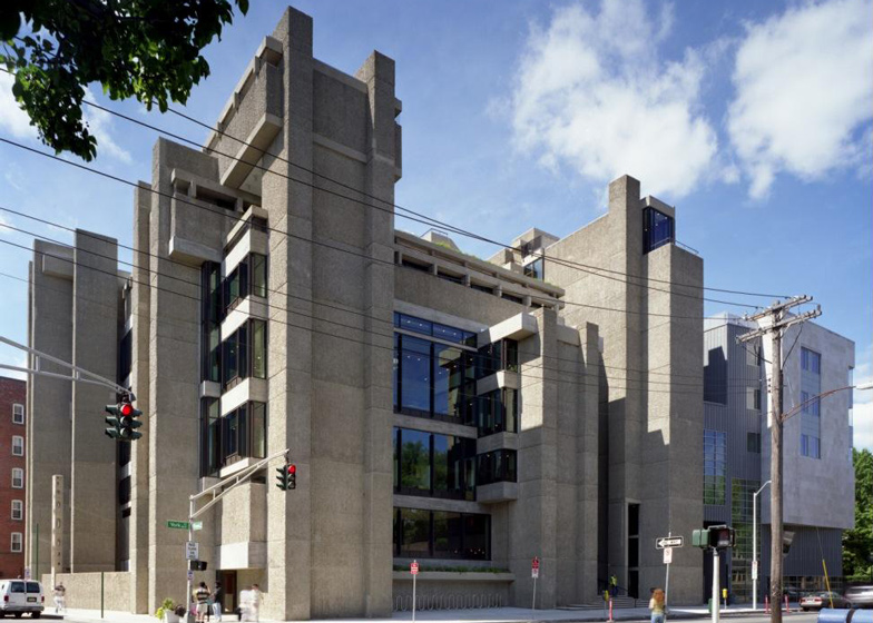
Brutalism: one of the earliest known examples of Brutalist architecture in America is Paul Rudolph's Yale Art and Architecture Building in New Haven, Connecticut, an imposing, fortress-like building that juxtaposes masses of textured concrete with layers of steel-framed glazing.
Paul Rudolph was awarded the commission for the Yale Art and Architecture building during his six year stint as departmental chair, between 1958 and 1965. His unique position as both client and architect gave him the opportunity to explore a bold new direction for architecture that still divides opinion.
Completed in 1963, the building is formed of intersecting volumes of bush-hammered concrete. Smooth concrete and glass horizontal elements are supported by a sequence of towers that protrude above the roof in a series of turrets.
"Paul Rudolph's Yale Art and Architecture Building showed modern architecture how to find its ways out of the confusion and dead-ends of the late 1950s," said Timothy Rohan, associate professor at the University of Massachusetts, and author of The Architecture of Paul Rudolph.
"Its powerful forms, textured surfaces, complex spaces, sensitive urban presence, and many allusions to the past demonstrated how to recover the things that Rudolph said the debased functionalism of the 1950s and the International Style had 'brushed aside', namely monumentality, urbanism, symbolism, and decoration," Rohan told Dezeen.
The building, now known as Rudolph Hall, occupies a corner site bordered on its south side by road, and on the north by red brick buildings. Across the road is one of Louis Kahn's earliest buildings – the 1953 glass and steel Yale University Art Gallery.
While the building's street-facing windows frame views of its Modernist forerunner, Rudolph had made a controversial turn away from the functionalism that characterised Kahn's design.
Speaking at the building's inauguration, British architecture critic Sir Nikolaus Pevsner chastised Rudolph's neglect of the functional style. "It is all very exciting, a powerful stimulant for the students. May it not be too potent for them; too personal as an ambiance?"
"What do we see here? Massive piers of concrete rise. Projections are over-emphasised throughout. Heavy slabs are crossed by thin slabs. Spaces inside cross too and offer sequences of most dramatic effects by unexpected vistas inside the building and even out of it," he said.
Slabs of ribbed concrete run in vertical sections on the interior and exterior of the 11,000-square-metre building. The concrete was cast in place using corrugated wooden moulds and bush-hammered to expose the aggregate.
Inside, the complex floor plan is made up of 37 terraced levels spaced across seven main storeys and two basement floors. Each level overlooks a central atrium that features a sunken pit and is topped by a series of skylights, while narrow concrete walkways connect the spaces on either side of the well.
The main entrance is set back from the street, accessed through a chute and stairwell between two concrete columns.
Architecture critic and Dezeen columnist Alexandra Lange studied at Yale. "It was the first time I spent a lot of time in a building that was strange and quirky and difficult," she said.
"I came to know its charms – the secret door at the bottom of the front stairway, that saved you a trip up the slow staircase; the architectural treasures embedded in the walls of the stair hall; the turrets at the top; the courtyard view from the long study tables in the library."
With a career spanning from the 1940s to the 1990s, Rudolph's oeuvre has been attributed to several architectural movements including the Sarasota School and late Modernism, as well as Brutalism.
The Yale Art and Architecture building features elements typical of the Sarasota School – terraced levels, an open plan core and plays on light and shadow – although externally it features the raw concrete of Brutalist architecture.
In 1969, the building was the target of a suspected arson attack that caused extensive fire damage to the upper floors, and water damage, as a consequence of fighting the fire, to the floors below. Refurbishment saw much of Rudolph's original layout altered by the insertion of mezzanine levels, sectioning of the space, and double-glazing.
By the 2000s the building had undergone several further renovations that compromised Rudolph's original design. A survey showed the building was no longer fit for purpose and didn't comply with contemporary fire regulations and accessibility requirements.
The university then commissioned Gwathmey Siegel & Associates Architects (GSAA), a firm led by a former student of Rudolph, to lead a $126 million renovation and extension project.
GSAA set about restoring Rudolph's original plan, removing the levels added in its post-fire reconstruction, inserting historically accurate glazing and restoring the concrete work. Rudolph’s orange and grey colour scheme was honoured with the refitting of a vibrant orange carpet that runs throughout, and new furnishings.
The addition of the Jeffrey H. Loria Centre and the Robert B. Haas Family Arts Library provides additional classroom and office space, two lecture theatres, a cafe and a ground floor library for the department. The 87, 000-square-foot building, clad in limestone and zinc panels, clings to the north-eastern facade of Rudolph's building, encapsulating one of the concrete facades.
The Yale Art and Architecture Building was rededicated Rudolph Hall at an inauguration ceremony for the renovation in November 2008 – 45 years to the day after the opening of Rudolph's original building.
"Now that it has been beautifully restored I think his intentions for education are much clearer," said Lange. "It can be another good example of how sympathetic renovation can reveal an architect's original intentions."
"It made Rudolph's career, and it will always be, for good and bad, the building with which he was most identified," she added.
Photography is by Richard Barnes.

