Frei + Saarinen adds a zigzagging roof to a community centre extension in Switzerland
A zigzagging roof extends across this extension added to the original gable end of a community centre in the Swiss municipality of Oberglatt by Zurich studio Frei + Saarinen (+ slideshow).
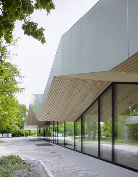
The roof covers an extension designed by Frei + Saarinen to replace a fire-damaged entrance wing to a large gymnasium from the 1970s that has been converted into a multi-purpose events space for the inhabitants of Oberglatt.
The extension provides a new main entrance and community facilities at the front of the existing building, which is now called the Chliriethalle and is used for sporting events, concerts, exhibitions and celebrations.
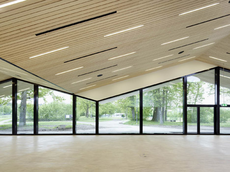
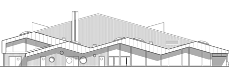
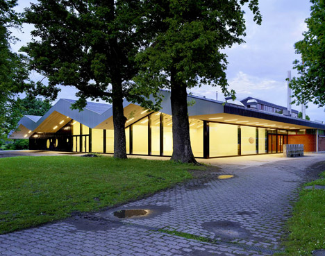
Frei + Saarinen won a competition to oversee the upgrade to the facility with its proposal for a predominantly glass-fronted space sheltered beneath a roof that projects from the edges of the existing roof's pitched section.
"The concept of the winning proposal suggested stretching the roof surface of the gymnasium over the new building," said a statement from the architects. "By doing so, old and new are unified by a roof that works like a brace."
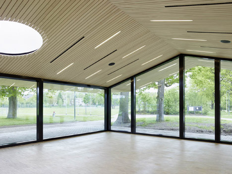
"Old and new should not appear as separate buildings, but as one big freestanding barn-like structure," the architects added, "so as to avoid having the addition look like a ridiculous annex."
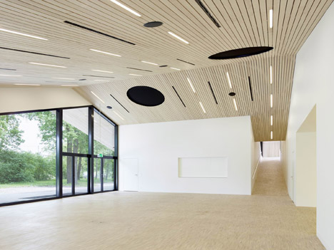
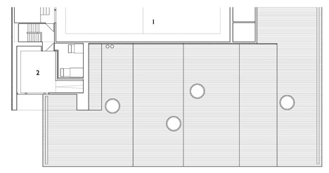
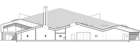
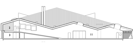
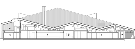
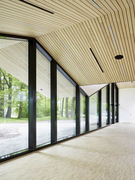
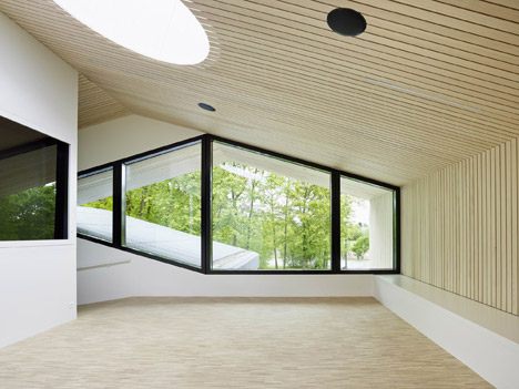
The new roofline reaches multiple peaks, creating differing ceiling heights appropriate for the activities that take place within the various spaces.
This ridged ceiling helps to create visual diversity along the length of the extension as it passes from the lobby area at one end to a ramp connecting to the upper level at the other.
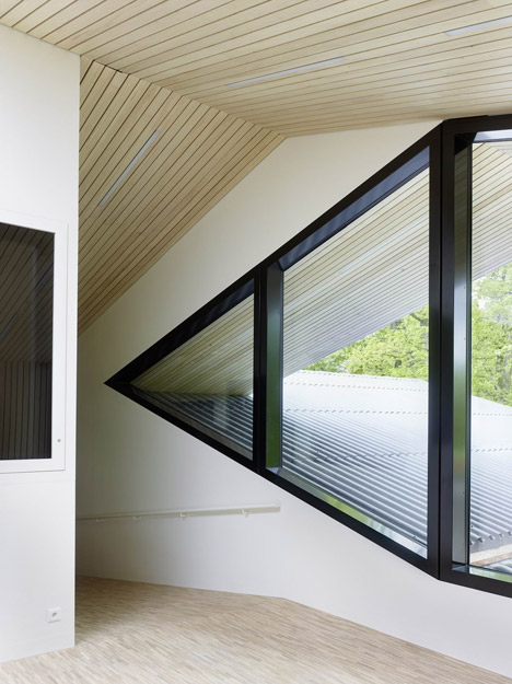
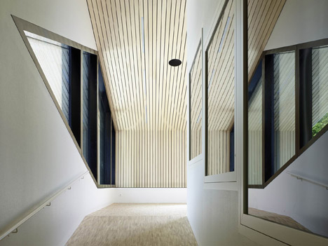
At the top of the ramp is a landing that looks out through an angular window towards the surrounding trees, connecting to a meeting room and vestibule overlooking the main hall.
Glazed trophy and display cabinets are built into a wall on one side of the ramp and continue around the corner onto the landing.
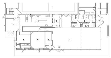
The main lobby space fills roughly half of the ground floor, but can be separated into two rooms with individual pitched roofs using a moveable wall.
The rest of the ground floor space is dedicated to services including a delivery space, a workshop, clubhouse, wardrobe, toilets, and an area for cooking and serving food.
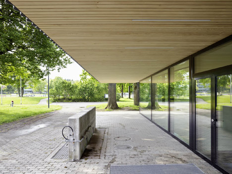
As the main public-facing part of the building, the extension is intended as a marker for the community and its zig-zagging section is therefore picked out in shiny silver panels.
The end profile of the roofline varies in thickness, designed to be reminiscent of the "beauty and tension" of calligraphy.
"It might seem like a strange comparison, but the front of the roof is designed to work as a sign for the whole building," said the architects. "Thus, its light silver colour, which contrasts to the black or glazed facade underneath and makes it visible from a great distance."
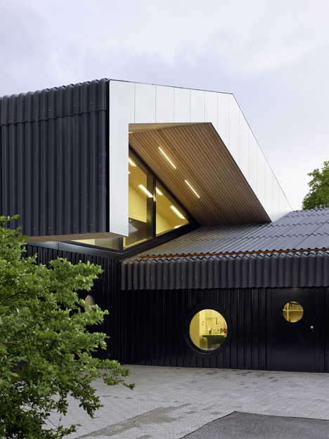
Glazing wraps around the public areas of the extension, while the more private spaces at the opposite end including the clubhouse are clad with timber.
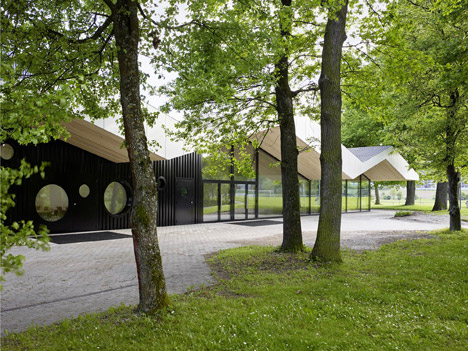
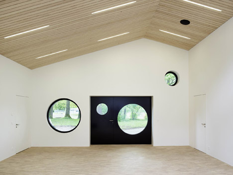
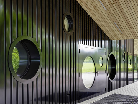
Round windows punctuating these surfaces are influenced by goalposts to reflect the building's main use as a gymnasium. The windows create a contrast with the glazing and its vertical framing, enhancing the differentiation between the two areas.
Photography is by Hannes Henz.
