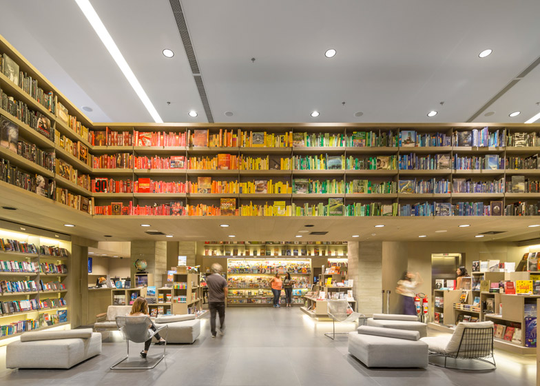
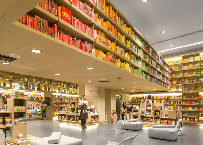
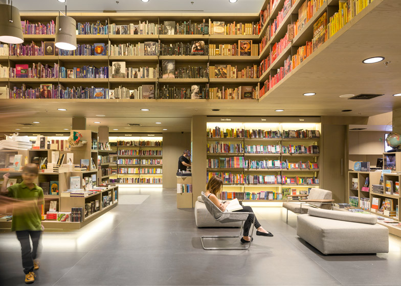
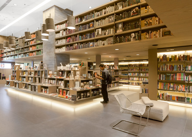
Books are arranged by colour rather than by title on the upper shelves of this bookshop in Rio de Janeiro designed by São Paulo firm Studio Arthur Casas (+ slideshow).
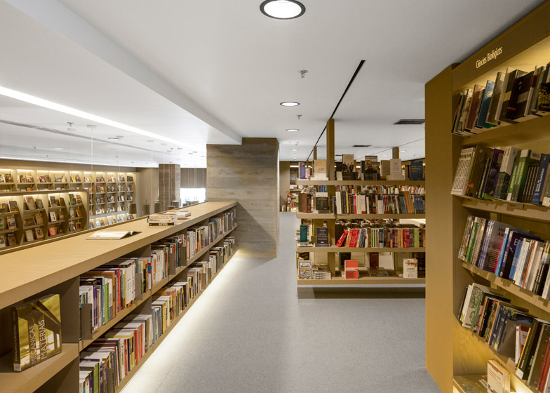
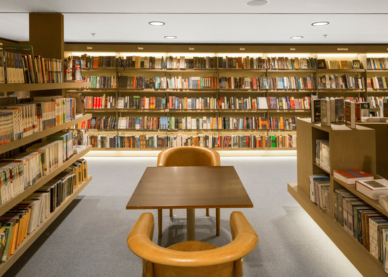
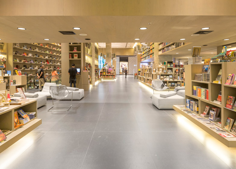
Studio Arthur Casas designed the flagship store for Brazilian retailer Saraiva as a large double-height space, flanked by a mezzanine of bookshelves. The client chose to fill these shelves with books arranged as a rainbow of colour.
"People have been asking us about the colour coding, but it was actually the bookstore that chose to do it," architect Raphael França told Dezeen. "It's funny to look at, but it wasn't really our purpose."
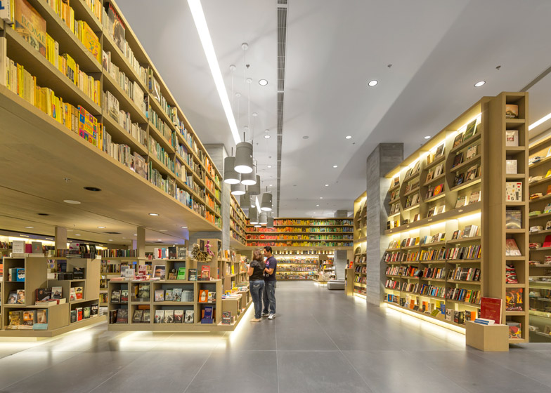
The architects wanted the space to combine the feeling of a public square and a library, encouraging visitors to relax.
As well as the main book shop on the ground floor, the shop accommodates an electronics retail space, an auditorium, a cafe and a children's area across two underground levels.
One of the key challenges for the architects was to provide a neutral backdrop for the products while creating a welcoming feeling, particularly in the subterranean spaces.
"It's a very large store but we also wanted it to feel cosy," said França. "We used warm lighting and textures so people feel comfortable and are attracted to explore the whole store."
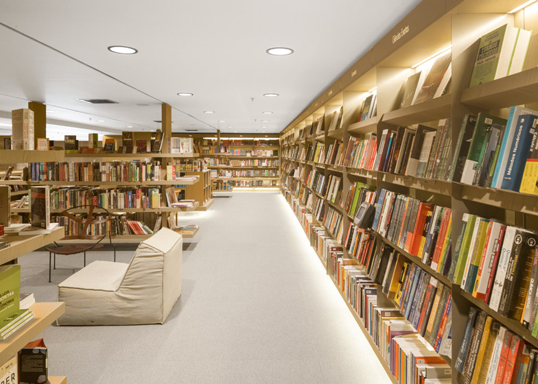
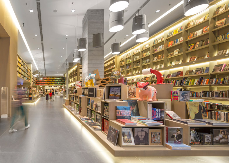
On the ground floor where customers enter, freestanding display units and shelves covering the walls of the double-height space feature concealed lighting underneath that gives the impression the products are floating.
Sofas, armchairs and ottomans by renowned Brazilian designers including Paulo Mendes da Rocha and Sérigio Rodrigues are positioned throughout the interior to create spaces where customers can relax as if in their own home.
A wall displaying more books lines the escalators that lead down to the basement, creating a visual connection between the different levels and inviting customers to circulate through the spaces.
The first basement level contains an electronics retail area that is differentiated from the book shop by the use of a cooler palette.
"The idea was to focus attention on the changing screens of the devices," explained França. "We applied the same idea of putting lighting under the furniture to give it the effect of lifting from the floor and used organic shapes that people can easily stroll around to interact with the products."
The final floor accommodates an auditorium alongside a children's space where the architects introduced more colour to create a playful feel.
A multicoloured stripy ramp lines the walls, providing access to the books and offering spaces for seating that are supplemented by poufs spread casually across the floor.
"We wanted to use the same aesthetic vocabulary in the children's space but render it in such a way that children could see it's for them," said França. "The use of colour helps it stand out from the rest of the store which is very minimal."
Above the bookshelves, illuminated trapezoidal niches containing books provide a quirky take on the displays found throughout the rest of the shop.
Photography is by Fernando Guerra.
Project credits:
Architects: Studio Arthur Casas
Author: Arthur Casas
Co-authors: Christiane Trolesi, Mônica Nickel, Marcela Muniz, Renata Adoni
Collaborators: André Chung, Christiana Matos.
Contractor: LAR Construtora
Lighting: Studio Serradura
Acoustics: Akkerman
Engineering: Grau Engenharia
Metal structure: Stec
Legal consultancy: Badiá

