AIM Architecture designs "back to the future" interiors for Shanghai shopping centre
AIM Architecture has designed a lobby featuring a light tunnel and a white "gallery-style" shopping centre for a retail and office complex in Shanghai (+ slideshow).
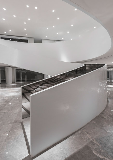
AIM Architecture was asked to design the two spaces for Fuxing Plaza by the site developer, the commercial real estate company Soho China Limited. The company have collaborated with architect Zaha Hadid on a number of previous projects including the recently completed Sky Soho, a retail and office complex near Shanghai's city airport.
"Designing a shopping mall is a strange thing; it is considered a commercial only affair," said AIM Architects. "It implies: not culturally relevant. That is odd, shopping malls seem to be among the highlights of our culture, like it or not."
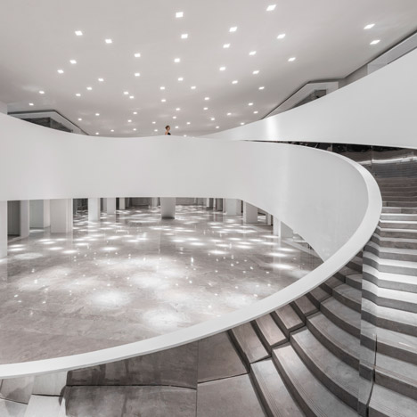
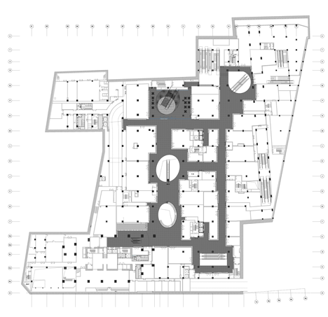
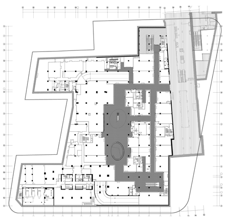
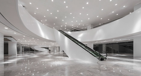
In response, the architects designed S-Mall, a "neutral and gallery style" shopping centre that houses 80 retail units for mostly independent stores, restaurants and bars.
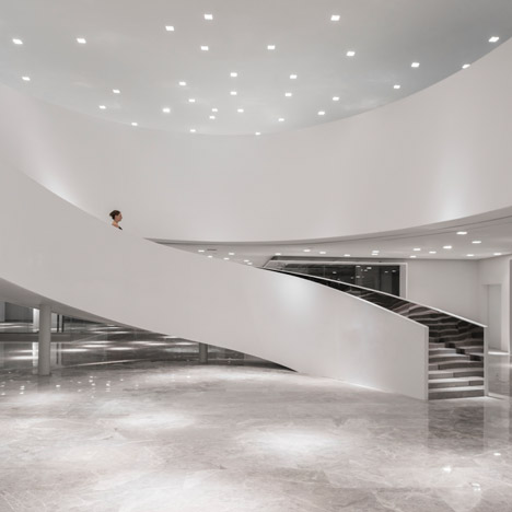
"Our aim is: 'Shopping S-Mall' instead of 'Shopping Mall'," said AIM Architects.
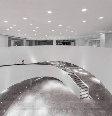
The shop fronts are presented at varying levels, in contrast to the continuous frontages typically used in shopping centre design. Individual retailers will be encouraged to customise their window areas.
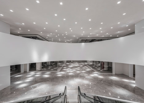
"We embraced Soho's admirable belief in the future, to present the project as a seductive bright white environment that encourages creativity and optimism and give all the protagonism to the units, [the] same as in an art gallery where art hanging on the walls or standing on podium are the ones that organise and fill the pure and neutral white space," said the architects.
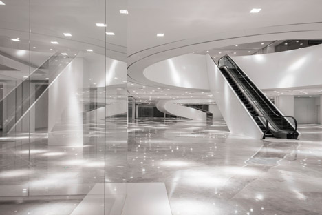
Square down-lights reflect off the highly polished marble flooring to produce a dappled effect. The walls are clad in contrasting white matt painted plasterboard.

"The spot lighting is chosen to create a spontaneous and lightly mystifying environment where things can be personal or individual, rather than collective and controlled," said the architects.
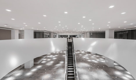
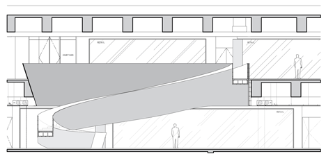
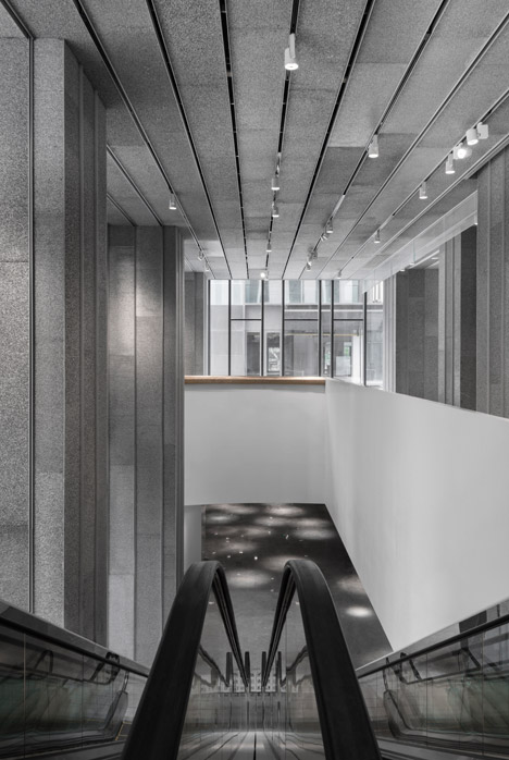
Escalators and staircases that connect the two levels rise through a series of ellipses in the ceiling of the lower floor.
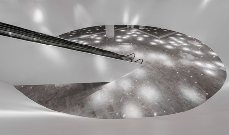
"We dramatised the escalators by cladding them in white and chrome, white for the exteriors presenting them as odd scaled sculptures of movement, while we clad the interiors in chrome to reflect the multifold of people using them," said the architects.
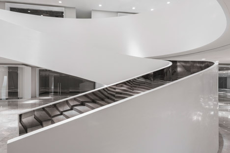
White pillars support a curved staircase also lined with mirrored panels. According to the architects the spiral steps acts "almost as a slide, to celebrate your movement in space."
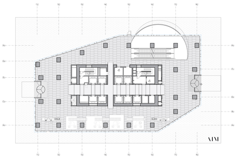
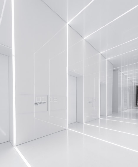
In the lobby, a brightly lit corridor runs through the centre of the 1,200-square-metre space. The corridor provides access to the lifts for the building, and connects two entrance points at either end of the lobby concourse.
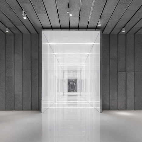
The corridor walls are lined with white back-printed glass and inset with a grid network of LED lighting. The linear lights reflect off the highly polished glass surface to give an illusion of an infinite network – a feature shared with the Glass Office AIM Architects designed for the complex last year.
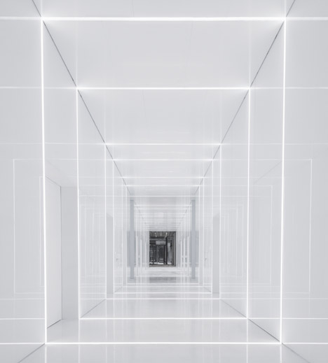
"The bright white 'back to the future' space is the lift lobby," AIM Architecture co-founder Vincent De Graaf told Dezeen. "Its stark contrast to the darkish grey of the rest of the lobby directs the people to the lifts. So we inverted the natural condition of light near the facade dark in the core to organise the space."
The main body of the lobby is clad in sections of mottled grey aluminium foam board. Clusters of white metal spot-lights sit in the groves of the panelling.
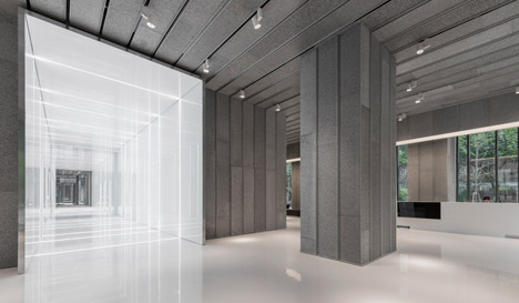
"Its aesthetic beautifully balances the smooth bright white in the lift lobby. The striking contrast with the bright white and the lively dark grey tints result in a stunning contemporary aesthetic," said the architects in a statement.
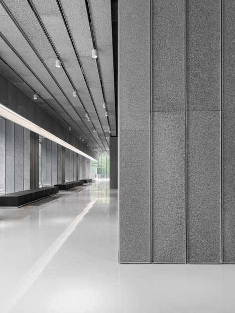
On either side of the white reception desk, columns lined with sections of aluminium foam board create pockets of seating along the glass façade of the building.
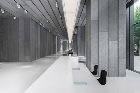
"The aluminium boards absorb sound very well, as a result of the open pore characteristics of the material," said De Graaf.
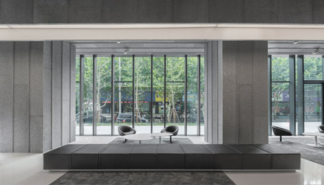
"It creates an acoustic atmosphere that is intimate, softened. Making this a pleasant space for a talk or a coffee, rather than a noisy distracting place."
Photography is by Dirk Weiblen.
Project credits:
Architect: AIM Architecture
Design Team: Vincent de Graaf, Wendy Saunders, German Roig, Zhuoran Chen, Jiao Yan
Consultants/engineers: ECADI as MEP consultant and HAIZHI as LDI
