FREAKS freearchitects redesigns Parisian tattoo parlour to avoid "cheesy" aesthetic
Architecture office FREAKS freearchitects has revamped the Paris tattoo and piercing parlour TribalAct to include a system of curtain tracks printed with Hieronymus Bosch paintings (+ slideshow).
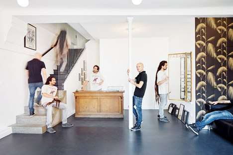
Parisian trio FREAKS freearchitects has overhauled the busy parlour's two floors to rearrange a jewellery shop and studios for tattoo and piercing artists.
The TribalAct parlour has been reordered to accommodate a busy roster of visiting international tattoo artists and to make the space more efficient, with a reception on the ground floor and dedicated space for the tattooists to work on the first floor.
"If you go through the internet looking for tattoo parlour design, you will basically find nothing designed by architects or interior architects," Guillaume Aubry, partner at FREAKS Freearchitects, told Dezeen.
"The culture of tattoo and piercing, a mix of street style, underground sub-cultures, and high trend influences, most of the time end up with a busy, messy, cheesy aesthetic where skulls, mermaids, dolphins and I-love-mum-roses share the room equivalently."
FREAKS, who previously renovated the one-time address of Napoleon I and stuck dimension arrows across the facade of Oscar Niemeyer's French Communist Party Headquarters, wanted to present the parlour as a sparse, clean space.
"It all started when I personally was at the parlour to get tattooed myself," explained Aubry. "Just like when you sit at your hairdresser's, you get to talk about this and that. Their concern was about renewing the parlour but along our talk it came quickly obvious that they also were in need of a stronger reconfiguration of the whole space."
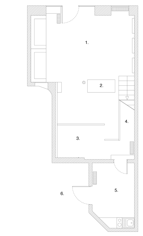
The architects have turned the ground floor into an airy open-plan reception where visitors can browse artist portfolios or wait for appointments with segregated public and private sections.
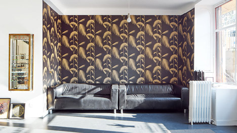
One wall is covered with a foliage pattern wallpaper, while the rest have been white washed. Furniture and cabinets were sourced for the space from French flea markets.
"Our ambition was just to be able to provide the most neutral but yet efficient context to allow all styles to re-invest the space. Walls are not white but blank, meaning that they might get slowly covered with drawings, pictures, posters along the upcoming years," said Aubrey.
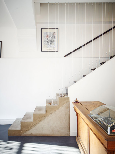
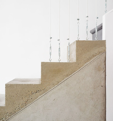
A concrete-clad staircase now leads directly to the first floor studios, with steel hook-anchored cords sectioning the stairway off.
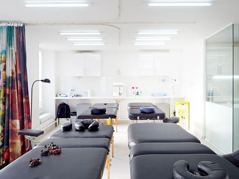
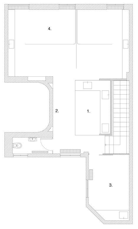
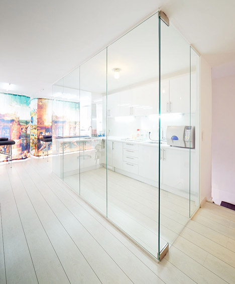
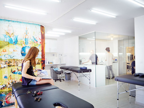
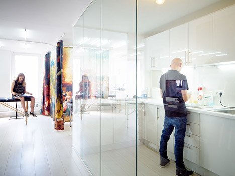
On the first floor, the parlour has been merged into one open-plan studio wrapped around a glass sterilisation room.
A private piercing room has been relocated to the rear of the building, as Aubry explains "intimacy is highly required because people are not only getting their noses and ears pierced."
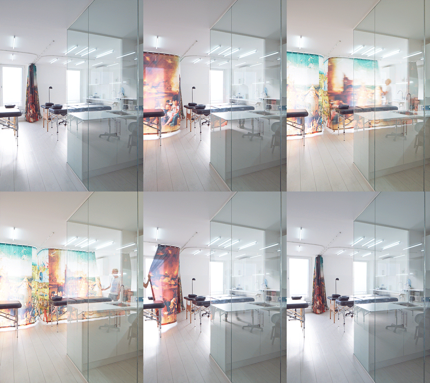
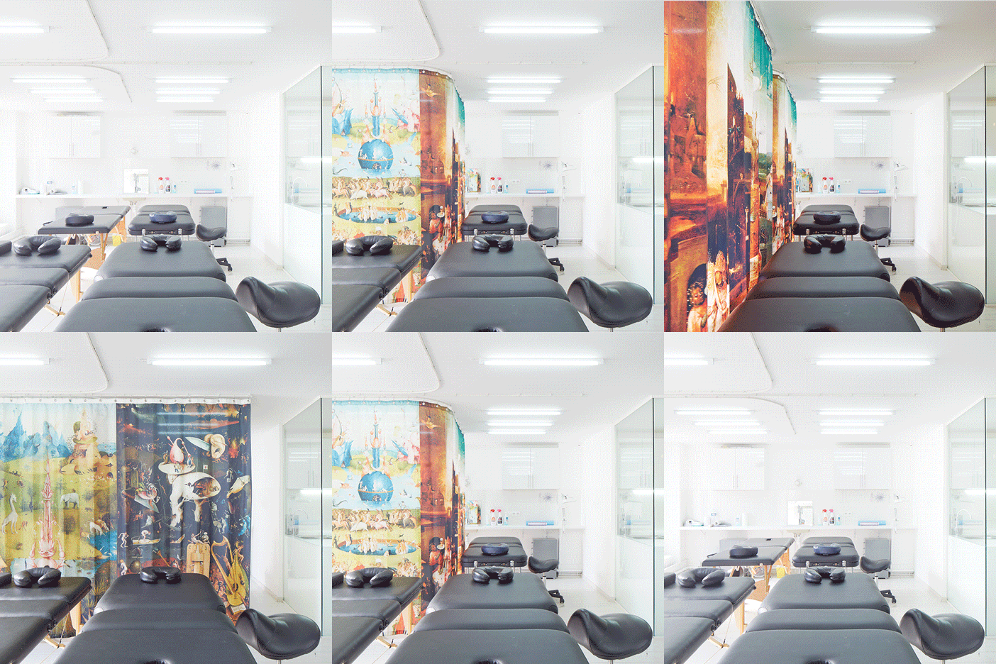
Curtains suspended on track rails are able to dissect the studio into two, three, or four cubicles to provide privacy for clients. The fabric for these is printed with scenes from Hieronymus Bosch paintings.
"It's a mix of excitation, fear, pain," Aubrey told Dezeen. "Having something to look at helps a lot to forget our tortured body. Think of how great it would be to have a picture to look at on the ceiling when sitting at the dentist's!"
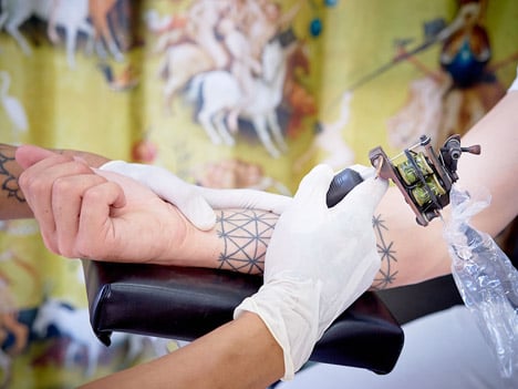
"And talking about torture we found Hieronymus Bosch paintings were so contemporarily up-to-date in a way, and so amazingly busy that you would always discover new details here and there. It's also in a way the only place where we really proposed something visually engaging."
Photography is by David Foessel.
