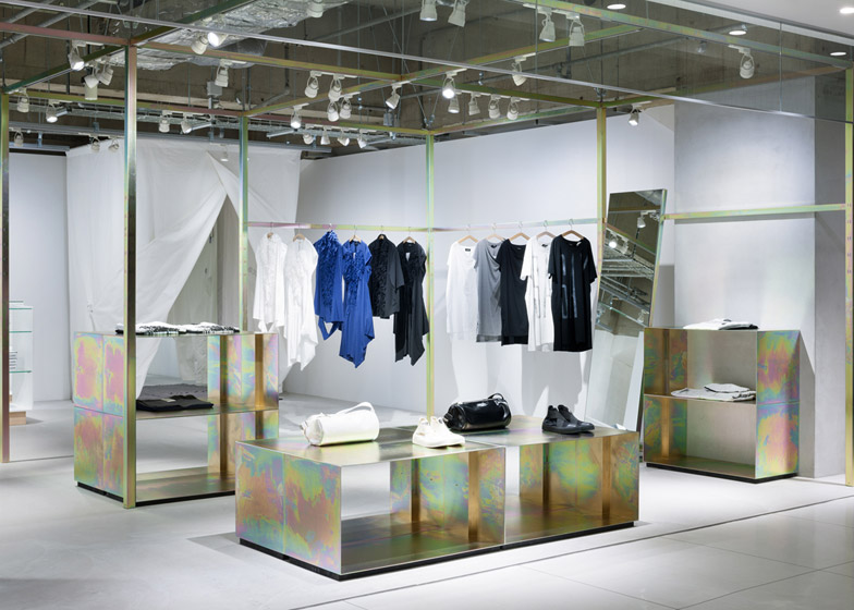
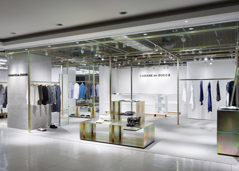
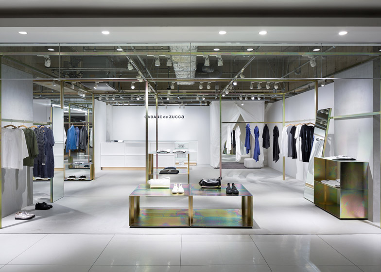
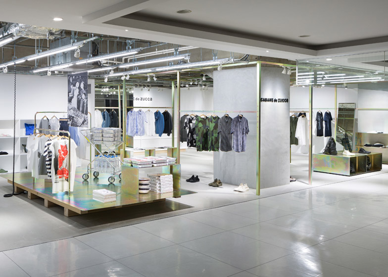
This Tokyo shop by Schemata Architects features exposed industrial fittings and galvanised metal display rails that have been treated to produce a petrol-toned surface (+ slideshow).
Japanese clothing brand Cabane de Zucca commissioned Jo Nagasaka of Schemata Architects to redesign their retail space within luxury Tokyo department store Shibura Parco, to accommodate the addition of a new range.
Zucca Dayz is a new offshoot of Cabane de Zucca designed by Rikaki Nagashima, which aims to target a younger market and the brand's next generation of clientele.
"When commissioned for the project, my initial thought was 'Unbelievable. Can't be true!' because Cabane de Zucca Flagship in Omotesando was the shop I admired most when I was a boy fresh out of high school, although I was not a fashion-conscious type," said architect Jo Nagasaka.
Nagasaka says he was influenced by the original decor of the shop that featured galvanised steel frames – an unusual choice of material for a shop interior at the time.
"The impression of the shop space still remains vivid in my memory," said the architect.
"When I went to check the pre-renovated state of the existing shop at Shibuya Parco, the atmosphere of the shop had changed and it somewhat dimmed my memory. In order to regain the brilliant image, we resolved to design a space that is simple and sophisticated – and also stimulating our senses in a new way," he said.
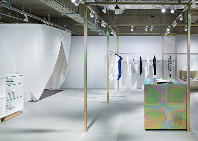
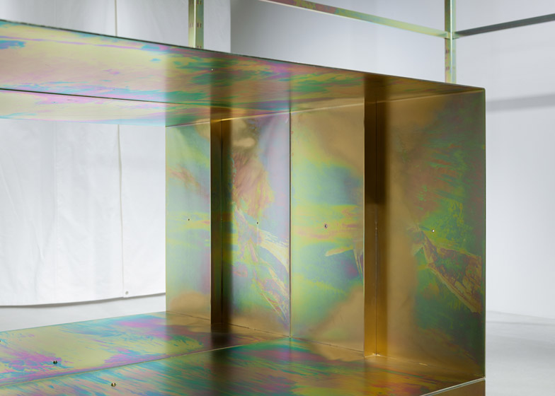
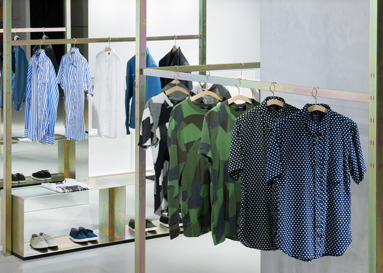
Nagasaka designed a new steel framework for the shop, differentiated from its predecessor by its chromate-treated finish. The treatment leaves a wash of petrol-toned colours on the surface of the metal.
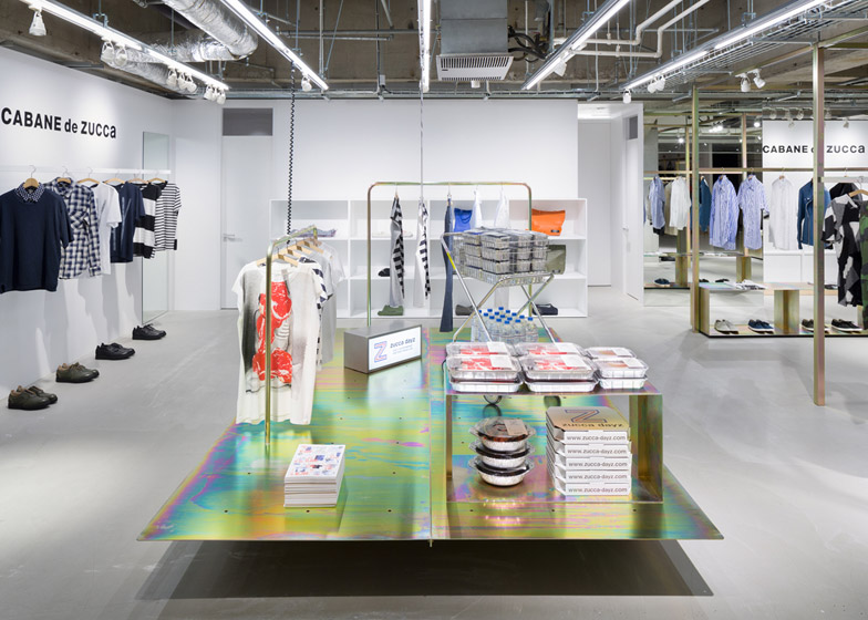
Open-ended boxes and a raised platform used to display the products are constructed from the same material.
Clothing, spotlights and a set of curtains are hung from the structure; the latter encloses one of three fitting rooms located towards the back of the shop.
Two further fitting rooms and a stock room are located in a space boxed off by a white wall.
A "bulky" column in the centre of the space had previously been used to divide the brand's womenswear and menswear collections. With the addition of the Zucca Dayz line the architect used the framework to reunify the space.
"Wrapped in the chromate treated steel frame, the central column is integrated as one of the spatial elements, creating continuity in the open shop space," said the architect.
The architect has foregone a suspended ceiling to leave the ventilation pipes and workings of the building exposed.
Japanese designer Rikaki Nagashima, who is responsible for developing the Zucca Dayz brand, designed the products, packaging, graphics and display for the range.
"The proposed brand concept is 'supermarket', suggesting the products' affordable price range, adaptability to daily-use, and familiarity," said Nagashima.
Nagashima has incorporated supermarket motifs into the range, including a collection of printed T-shirts that feature women with slabs of red meat, fried eggs and slices of tomato omitting their faces.
The items are packaged in aluminium foil trays typically used for supermarket produce. These containers are sealed with barcoded stickers imitating supermarket price tags.
"These packages are simply stacked on top of each other, instantly provoking the semiotic image of a 'supermarket'," said the designer.
Photography is by Takumi Ota.

