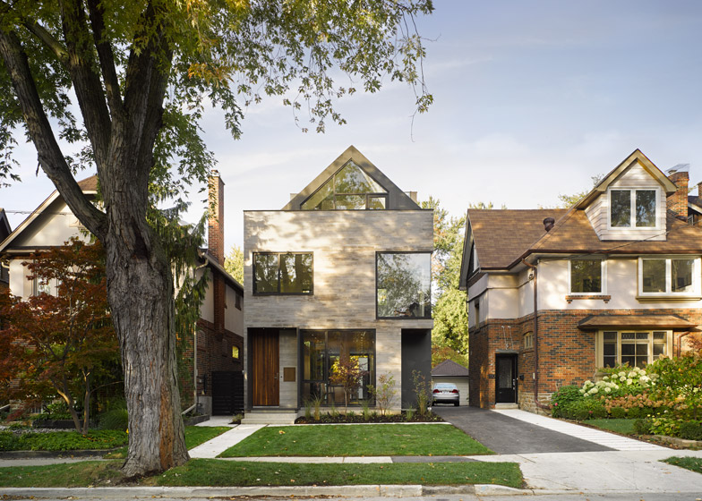
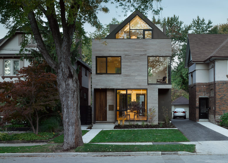
Canadian studio Drew Mandel Architects designed this new Toronto house to sit sensitively among its 1920s neighbours, mimicking their shape, size and two-toned facades (+ slideshow).
Moore Park Residence was designed by Drew Mandel Architects for a couple with a young child, and replaces an ailing 1920s house on the site – the first such tear-down on the street.
"The scope of the client's desire to re-invent the existing building and the commitment to build a life-long home tipped us to rebuild rather than renovate and expand," Drew Mandel told Dezeen.
"Their big dream was a fairly abstract notion of living in a modern, light-filled, open-plan house, close to public transport," added Mandel, whose other projects include a Toronto house with a cantilevered bedroom.
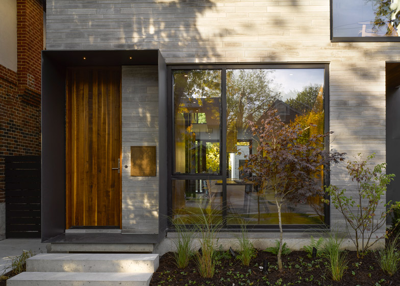
The house embraces the style of neighbouring homes with a pitched roof and similar set-backs, but uses modern materials and pared-back details. These include large minimally framed windows and local limestone cladding, which has been cut and laid to mirror the look of traditional bricks.
"The neighbours expressed a strong preference to see a familiar form on this site during consultation, so we embraced this, but put forward a clear example of a contemporary single-family residence," explained Mandel. "We did not want this to be a missed opportunity to explore the re-invention, re-interpretation and the renewal of the house typology with a more integrated approach for contemporary living."
The four-storey house is 16.7 metres long and 7.1 metres wide, so a basement has been added to house extra rooms, including an office, gym and media room.
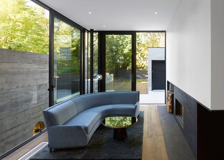
"The client was not interested in basement space, but we realised we needed more than three floors," said Mandel. "We solved this by adding a light-filled lower level, with a 2.83-metre-high ceiling and a 3.8-metre-wide sliding door that allows fresh air in and creates a visual and direct connection with the exterior."
The light well is bordered by a concrete wall with timber formwork, which echoes the texture of the home's limestone cladding. It allowed the architects to get around fire regulations that restrict the number of windows allowed at the side of a house.
On the ground floor, a steel portal has been placed outside the front door to provide a covered entrance.
"We felt a strong, simple geometric form should define the entry and complement the play of geometry throughout the building," said Mandel. "It's also nice to be sheltered from the elements when you're fishing for your keys."
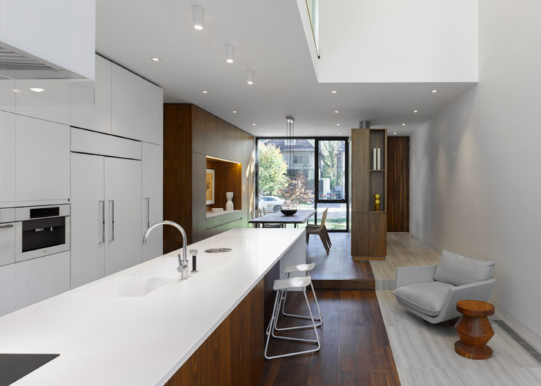
Inside, the ground floor has been designed as a flexible open-plan space, with a dining room at the front, kitchen and informal lounge area in the middle, and a more enclosed living room at the back.
"The ground floor is intended to allow one room's use to bleed into an adjacent space," said Mandel. "The floor level between the kitchen and the dining room, for example, has a six-inch difference, so the kitchen island could accommodate an area for sit-down dining at the end."
The first floor has two bedrooms, a bathroom and a family room, which is conceived as a flexible space that can be used as a yoga studio, a TV room or a guest room.
"The bedrooms are modest in size and the hope is that a child may hang out and do homework in this area rather than disappear into their room," said Mandel. "The house is designed to accommodate flexible daily uses, but also changes in use over a generation."
The top floor is designed as a more secluded space for the parents, with a master bedroom, bathroom and dressing area, and terraces at the front and back. The ceiling follows the pitch of the roof and is unbroken from one end to the other, in order to maintain views and light through the space.
The staircase connecting all levels has been designed as an enclosed space, in contrast to the open-plan areas on each floor, and features a recessed handrail.
"Handrails can be finicky and difficult, particularly at stair winders. In this instance, we wanted it to recede visually," said Mandel.
American black walnut has been used for all timber surfaces inside, chosen for its colour and grain, and to add warmth to the minimal interior, and honed Loire limestone has been used on the floor and walls of the bathroom to echo the exterior limestone cladding.
Photography is by Ben Rahn, A-Frame.
Project credits
Project team: Drew Mandel, Jowenne Poon, Rachel Tameirao, Jasmine Maggs
Structural engineering: Blackwell Engineering
Millwork: O'Sullivan Millwork Ltd

