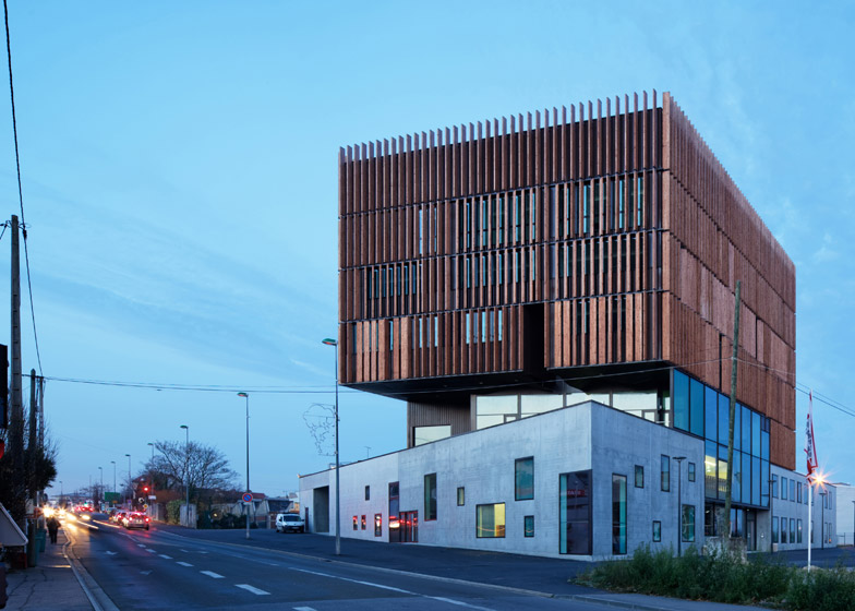
Moveable timber fins cover the top five storeys of this university technology centre by French architects Badia Berger to modulate light and shade inside.
Mantois Technology Centre is a new learning and research centre for the science and technology departments at the Université Versailles de St Quentin en Yvelines, near Paris. It was designed by Badia Berger Architectes for students and academics working in fields such as car design, home automation and mobility technology.
The jutting upper section is designed to announce the building as a new landmark on the campus, which is undergoing a wider regeneration, and also provides partial cover for a terrace on the first floor.
"The building constitutes the first phase of the redevelopment precinct – as such it was important for it to maintain a level of visibility," the architects told Dezeen.
"It forms an angle which serves as a focal point, and the facade contributes to creating a vibrant public space, with its high-level visibility and the balcony open to the valley below, creating a belvedere," they added.
The timber fins that cover the exterior can rotate to alter shade and light inside, and are made from heat-treated pine.
"The thermo-treatment improves the timber's durability and the process requires no chemicals – only heat, steam and oil," said the architects.
By contrast, the lower section of the building is designed as a more closed volume, made from self-levelling concrete that was poured on-site to offer a smooth and homogenous texture.
"The mineral-like quality and irregular apertures of the horizontal volume contrasts with the vertical volume suspended above," said the architects.
The bottom three levels of the seven-storey building are devoted to group activities, with an industrial workshop for creating robotic machinery on the ground floor, a cafeteria and outdoor terrace on the first floor, and a library and auditorium on the second floor.
A triple-height foyer sits between these three floors, providing visual connections between the different levels.
"The building is designed around a sectional drawing that links its different levels and users, rather than offering functions and levels that are simply layered and compartmentalised," said the architects. "It creates varied viewpoints, allowing the building to be read and understood."
Large 60-centimetre-square clay tiles have been chosen for the flooring throughout to provide a hardy, dirt-resistant surface.
Reflective curved panels have been added to the cafeteria ceiling, made from a stretched textile on a metal frame. "The cafeteria faces the city and the ceiling reflects this view, linking the exterior to the interior," said the architects.
In the auditorium, the ceiling has been covered in particle board and coated with a white laminate, which helps to reverberate sound and light throughout the room.
Photography is by Takuji Shimmura.
Project credits
Project lead: Stephane Nikolas
Economist: Gautreau Associés
Structural engineering: Batiserf Ingenierie
HVAC engineering: Sogeti
Acoustics: A. Taravella

