World Architecture Festival 2014: Singapore's creative industries are moving out of the central business district to more affordable light-industrial areas, says architect Colin Seah, who has recently completed a layered workplace building in the Pasir Panjang neighbourhood (+ slideshow).
Speaking to Dezeen at the World Architecture Festival in Singapore last week, the Ministry of Design founder explained how the city's emerging design studios have created new creative epicentres within the city fringe, where rents are lower and spaces are often more generous.
"The government wants to promote these industries and they have allowed them to use these light industrial spaces as offices because the rents are a little better," said Seah, whose own office occupies six converted shophouses in Singapore's Chinatown area.
"There isn't any light industrial land in the city, but there is in the city fringe," he explained.
"So there has been this recent phenomenon where creative industries have moved into these sort of light-industrial buildings, and because of that the developers have responded. So buildings that once used to look very warehouse-ish have now begun to look a lot more edgy and more interesting."
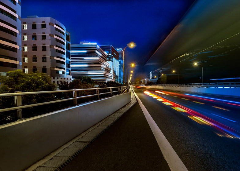
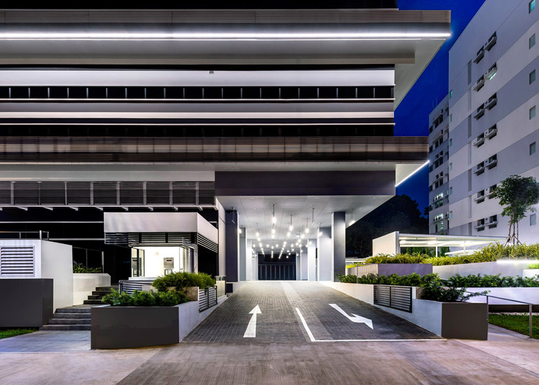
In light of this, Seah's firm was commissioned to design 100PP – a new eight-storey office block with an intricate facade created by striated layers and shifted floorplates.
"When we first started, because of cost, it was just a box," Seah told Dezeen.
"But then we tried to convince the client to let us build more value into the design, for instance we stepped these balconies back from the front. That's all gross floor area that the client didn't have to pay extra for, but we've increased the value by up to ten per cent."
100PP offers a selection of six-metre-high offices, which have been marketed at graphic designers, textile designers and animation studios. All of the units are for sale rather than rent, so will be unlikely to attract startups, but Seah hopes it will form the beginnings of a wider creative quarter.
"Hopefully it will attract more businesses of the same nature," he said. "In the end it's a little bit of a mixed bag but already the building suggests an attitude so we hope tenants will go with that flow."
The building faces the sea on one side and a highway on the other. Responding to this, the staggered layers are shifted back towards the view, which naturally created a series of balconies.
Strips of lighting help to emphasise this layering, while windows and air-conditioning ledges extend all the way around the perimeter.
"There are two ribbon windows for each floor and in-between them are striations, so that from a distance it's hard to tell what is what. It sort of confuses the scale, which we thought was interesting," said the architect.
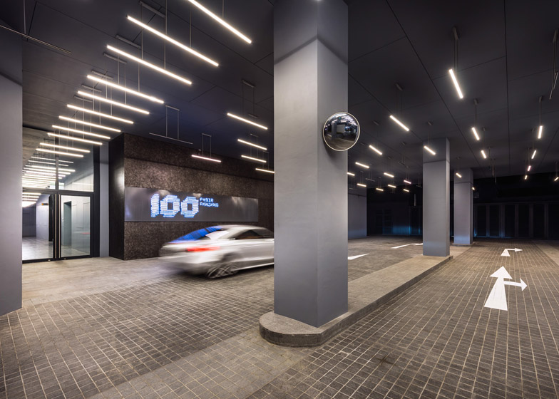
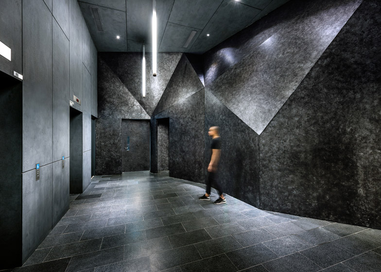
Internally, an industrial aesthetic is created using exposed raw materials. A drive-through area at the base of the building offers a drop-off point, leading into a lift lobby with faceted walls, while the building's roof is a garden overlooking the sea.
"We wanted to imagine two processes," added Seah. "One is the skin – you enter the bowels of the building and it sort of transforms a little bit. But the second is when you emerge back out and walk round the balcony, and you then re-contextualise what you saw from the outside. We wanted the internal journey to feel like a transformation."
Ministry of Design also developed the branding for the building. The name 100PP relates to both the address, 100 Pasir Panjang, and the symbolic meaning of the number 100, which alludes to perfection and completeness.
Project credits:
Architectural and Interior Design: Ministry of Design: Colin Seah, David Tan, Jeremiah Abueva, Zsombor Baktay, Don Castaneda, Charissa Ho, Norberto Olegario, Ruth Chong, Arnel Anoneuvo
Submissions Architect: AC Consortium Pte Ltd
Contractor: CES Building and Construction Pte Ltd
C&S: Engineers Partnership LLP
M&E: HPX Consulting Engineers
Quantity Surveyor: Davis Langdon & Seah


