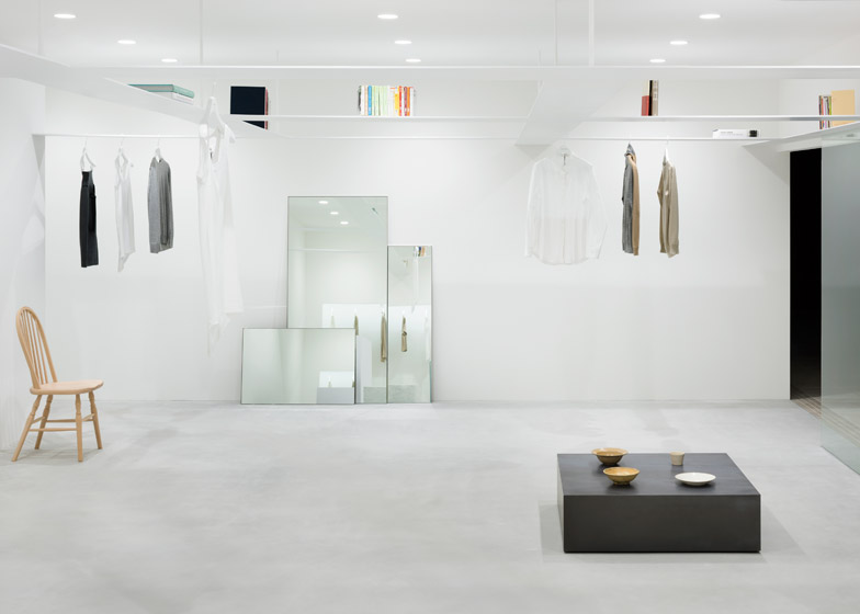
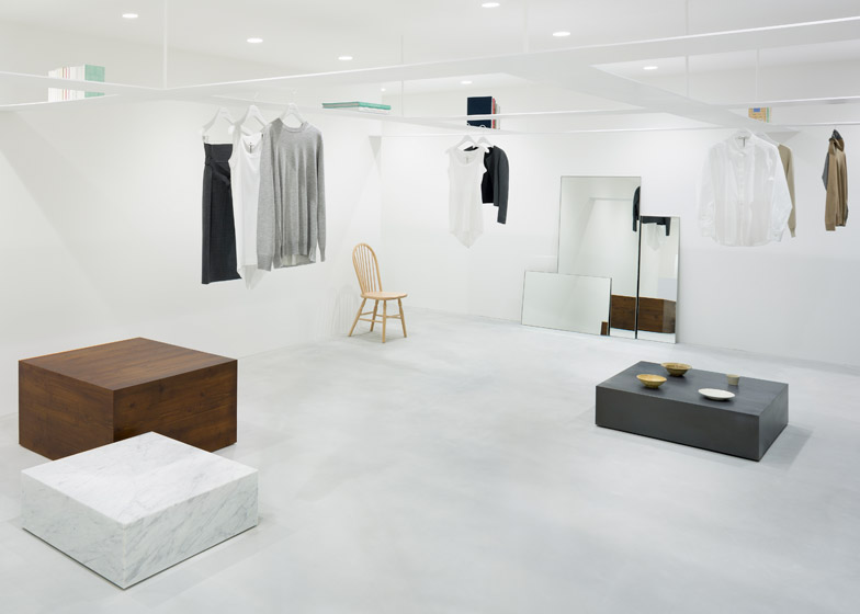
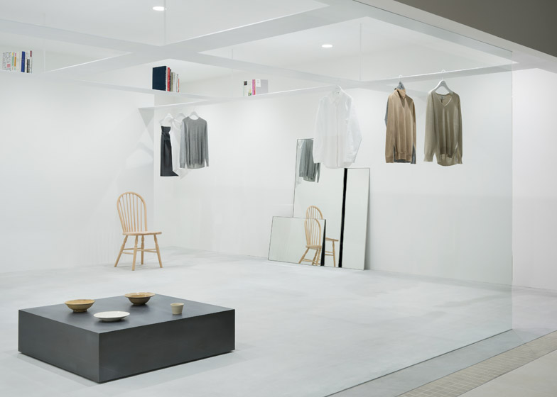
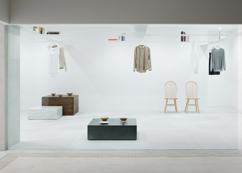
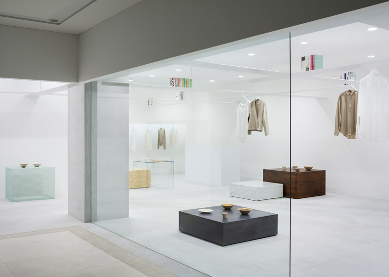
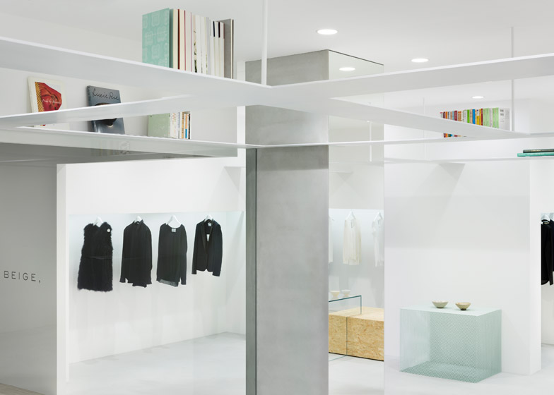
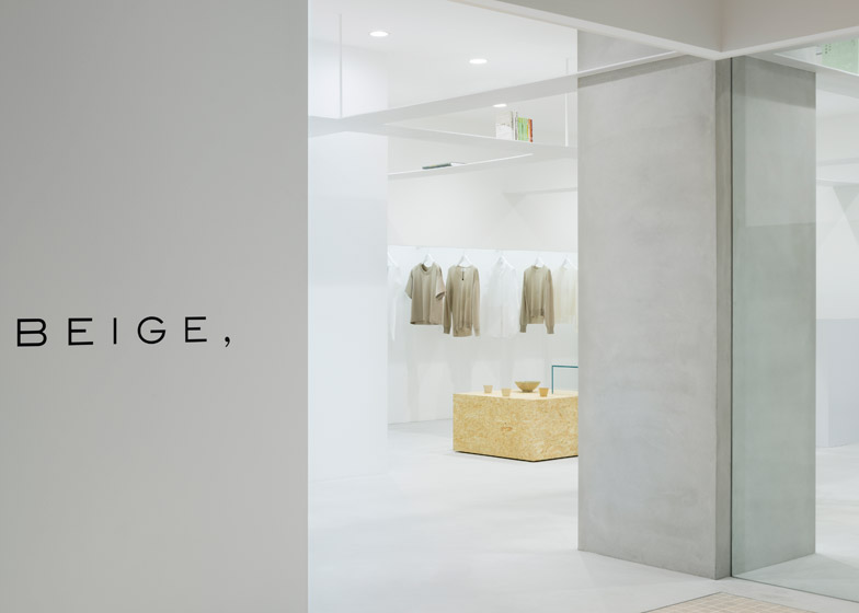
Books are displayed on thin suspended beams that double as garment rails at this minimal Tokyo concept store by Japanese studio Nendo (+ slideshow).
Nendo's store interior for Japanese fashion brand Beige had to incorporate areas for a library and a gallery, as well as the clothing display.
"We considered a zoning approach with specific areas for the shop's different elements, then decided that subdividing the already small space any further would simply clutter it," said the studio.
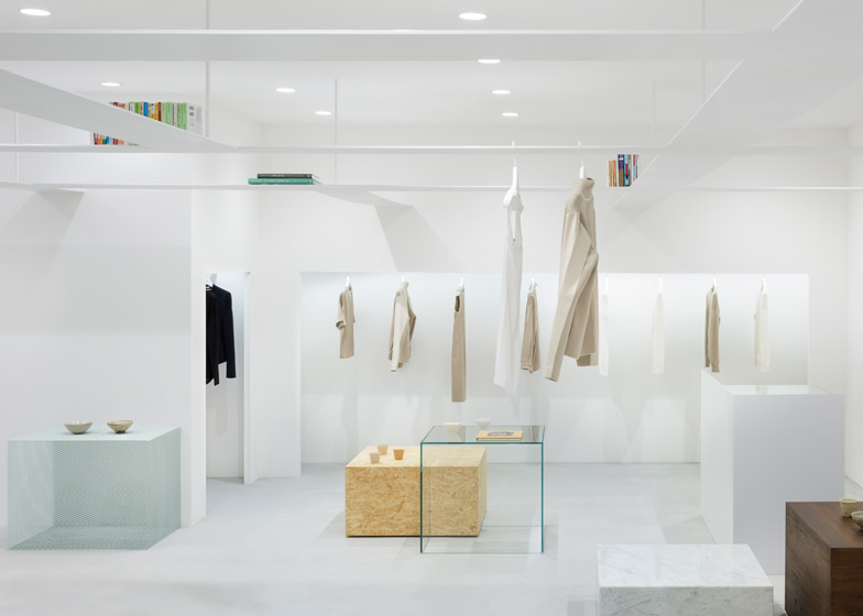
To save space, the designers added 7.5-millimetre-thick interconnected shelves that form a grid 2.05 metres above the stop floor, creating a separate "attic-like" area to position the literature.
Magnetic bookends hold the books in place, preventing them from falling onto shoppers below.
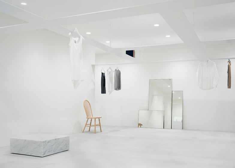
The shelves double as rails for the brand's clothing designs, which hook over the edges on hangers and can be positioned anywhere around the grid.
"The use of vertical layers allowed us to create a highly flexile, visually neat space," said Nendo.
Dezeen Book of Interviews: Nendo founder Oki Sato features in our new book, which is on sale now
More garments are displayed in a niche beside the fitting room, while a group of freestanding mirrors are leant against another wall.
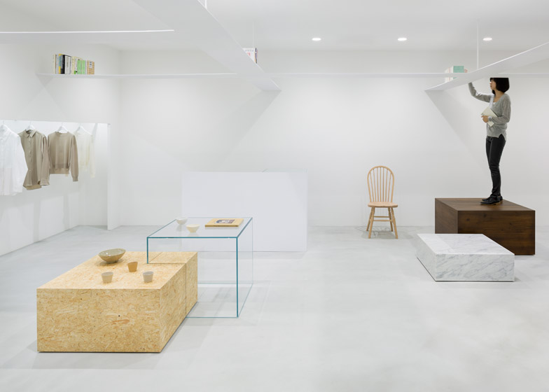
Box-shaped plinths dotted around the floor are made in a range of materials, including oriented strand board (OSB), glass, wood and marble.
These different-sized boxes are used to showcase accessories and artworks, or as steps for clambering up to reach the books above.
They can be moved around the floor to create different layouts, while a taller fixed white structure acts as the counter.
Located in the Tamagawa Takashimaya shopping centre in suburban Tokyo, the L-shaped store features white walls, floors and ceilings.
A large pane of glass provides floor-to-ceiling frontage onto the shopping centre concourse. An opening on one side of the window and another in the perpendicular wall provide access into the boutique.
Photography is by Takumi Ota.

