Genesin Studio renovates Victorian shop in Adelaide for Aesop
Genesin Studio has designed a pale wood and antique marble interior behind a dusky-green Victorian shopfront for skincare brand Aesop's new Adelaide store (+ slideshow).
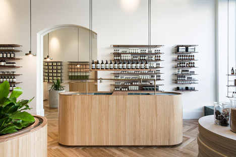
Genesin Studio created the interior for Aesop on Rundle Street – a popular shopping area within the studio's hometown of Adelaide, South Australia.
The studio maintained the original moulding and wood paneling of the historic shopfront, while introducing contemporary fittings to the interior, including three light oak display islands.
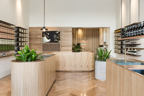
"Materials were reinvented into the space to encourage nostalgia of the site's heritage, but also to create interesting design components to platform the Aesop shopping experience," said studio founder Ryan Genesin.
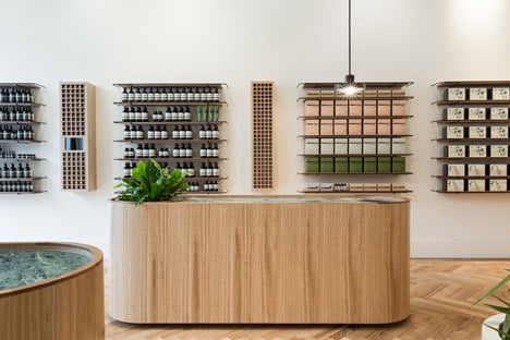
The studio used Tasmanian oak as the predominant material for the interior, cladding floors, sections of wall and three display islands in the wood. Sections of the timber are arranged with the grain running in opposing directions to differentiate various components.

Three oblong islands with rounded ends are clad in vertical strips of oak, sat on parquet flooring made from the same species. Ten oil burners concealed beneath grates in the floor pump fragrance around the interior to "aromatically brand the store."
"The hard-wearing Tasmanian oak was used to display Australian timbers to international shoppers and to give longevity to the design of space with its honey tones; these tones also give the Aesop brown bottles an honest, earthy contrast," said the architect.
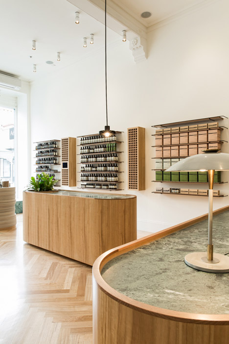
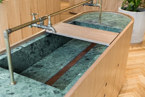
The three islands have green antique-marble countertops with recesses shaped for their specific uses. The first – a cash desk positioned at the rear of the shop – has a rectangular section of marble removed from its surface to hold a laptop.
A second flat counter top for displaying products in the centre of the store has integrated planting, while a third forms a marble wash basin – with a strip of metal mesh inserted into the base to allow water to drain away and a wooden display slat across its middle.
"Antique green marble was used to modestly celebrate the Victorian period of the building and to give foundation to the interiors, but detailed and applied in a contemporary way," the architect said.
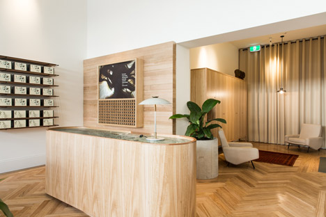
The brand's products are displayed around the walls on rows of wooden shelves with curved metal surrounds, and on suspended shelves over the wash basin and in the shop window.
"Blackened steel rod shelving was used for its simplicity and rawness that also pays homage to the old building," said Genesin.
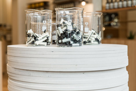
Smaller items are presented in large glass beakers on a podium made of stacked circular disks. Pendant lights hung on steel rods are positioned over the counter tops and moulded concrete plant pots.
Behind the cash desk, a section of wall is clad in chunky planks of oak. To the right, a lounge area with armchairs and beige linen curtains creates a space where customers can enjoy a coffee and browse the store's library.
The woodwork is offset by the white on the walls and ceiling, which is dotted with spotlights.
"The white space also gives emphasis to the merchandise and helps to exhibit and display without distraction, like a gallery," said the architect.
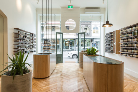
The moulded and panelled shop front has been painted a dusky-green to contrast with the light interior space. A three-tiered shelf is suspended on metal framework in one window, above marble-lined sills.
"The signature Aesop dusty green painted facade sits perfectly with the old building facade and understatedly gives Aesop street presence," said the architect.
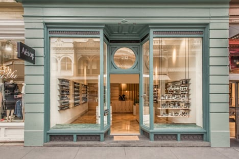
A monochrome Aesop sign is hung perpendicular to the green shop front.
Photography by Jonathan VDK.