"Why don't they give up building this thing?"
Comments update: after a short animation simulating the completion of Antoni Gaudí's Sagrada Família basilica went viral on social media, readers revisited the story to question the logic of such a long-term project.
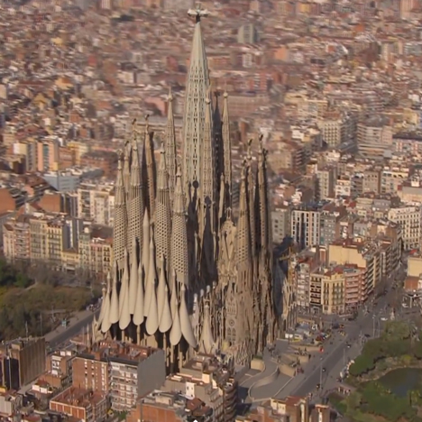
Out with the new: work began on Sagrada Familia in 1882 and Catalan architect Antoni Gaudi took over the project in 1914. A one-minute video showing how the basilica will look when it is eventually finished resurfaced on social media this week, prompting renewed questions from Dezeen readers.
"Why don't they give up building this thing?" asked Augusto Quepe. "It's already beautiful unfinished." Quepe went one step further by asking whether the structure's old foundations could even cope with the strain of additional weight. "The foundation is so old that the building could crash before it's finished."
But Sam suggested that the longevity of the project is a testament to architectural planning and foresight. "There are few projects in the world that retains this level of integrity over such a long period of time," he wrote. "And to those who think the structure might not be able to cope when completed, I'd suggest that every element of the build was considered before the first worker arrived on site, and remains relevant to its plan despite the onset of modern techniques." Read the comments on this story »

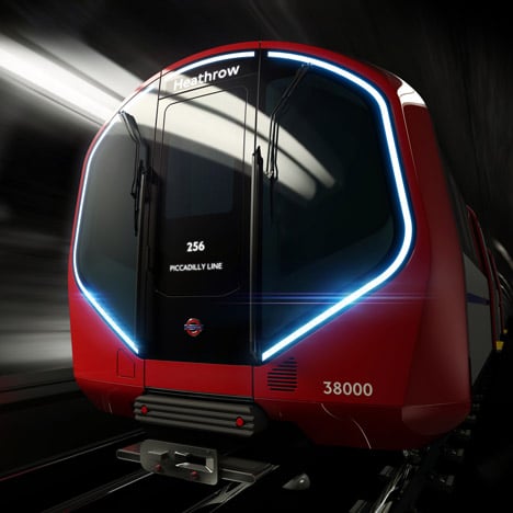
Driverless technologies: a number of driverless vehicles have been unveiled over the past week, including air conditioned, wi-fi enabled tube trains for the London Underground by product design studio Priestmangoode.
But not everyone was thrilled at the prospect of being driven by a computer. "Why do we incessantly develop ourselves out of jobs?" asked Tom_Tom94. "Our resolute obsession with automatons will be our ruin."
"Modern technology is determined to marginalise the need for people," added Lowri, who predicted "a future controlled by robots."
Others were more enthused about the idea of driverless trains. "The idea that we should keep spending money on antiquated jobs is beyond me," wrote Londoner. "If efficiencies can be made and automated services rolled out, the money you save can be directed to other public services." Read the comments on this story »

Hadid's latest: nothing provokes stronger opinions on Dezeen's comment boards than Zaha Hadid's architecture, and her latest project – a wooden structure comprised of five towers designed for Cambodian genocide researchers – was no exception.
Jonathan Tuffin was among the readers who liked the design, writing "I don't usually like Zaha Hadid's work, but I think this looks in keeping, and it will provide a great monument and place to remember in Phnom Penh."
Remod also joined the voices of approval, adding "Good, refreshing move for Zaha." "Finally, a building that doesn't look like a spaceship," added oyster.
But some were less convinced: "I think [...] it looks rather totalitarian, dystopian and scary," wrote one commenter, while Jimbo felt it looked familiar. "Wait... isn't this Heatherwick's distillery turned belly-up?" he wrote. Read the comments on this story »

Death-ray architecture? French architect Jean Nouvel's plant-covered tower scheme in Sydney attracted criticism from readers for its huge cantilevered panel of mirrors, designed to reflect light down into the lower levels.
"What happens when the building becomes neglected and that giant reflector breaks and starts frying local residents?" asked generalpopulation.
David also poked fun at the mirrors, writing "better hope they got their sun studies spot on, or else I feel another Walkie Talkie incident coming along."
"Even better... if someone hacks the computer controlling the mirrors, they've got themselves an urban death ray," added Paul123.
Not everything about the building received an entirely negative response. "It is great to see the innovative incorporation of biophilic design strategies like green spaces and daylighting in residential towers," wrote David A. Navarrete. Read the comments on this story »

Misty waters: a small portable humidifier was probably the unlikeliest product to provoke controversy, but managed to cause a spat between readers nevertheless.
"It's a humidifier, with some nice packaging that will be thrown away with scant regard. Not interesting in the slightest," complained Chris MacDonald. "You lot are all acting like criticism is somehow worth less than praise," he added.
"Compare that to other products on the market and you'll realise how elegant and smart this product is," countered Michelle. "If you or a child has trouble breathing, you might find that you do care a bit." Read the comments on this story »