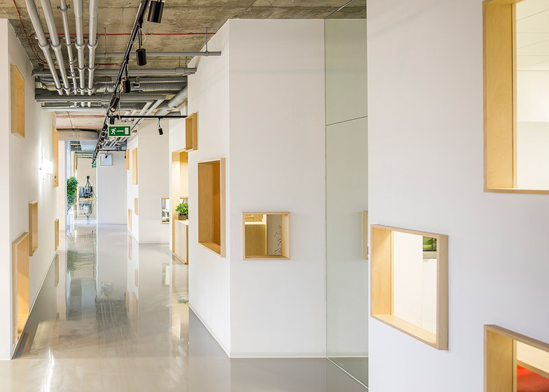
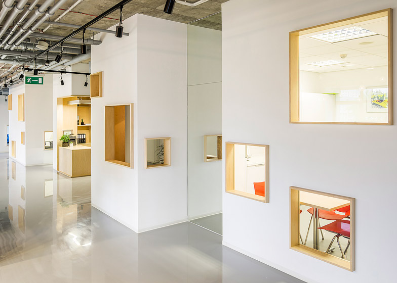
Warsaw studio MFRMGR has subdivided this office space in Poland to create individual workspaces for employees within wooden cabins designed to look like a "mini-town" (+ slideshow).
MFRMGR Frejda & Gratkowski Architekci collaborated with Pamela Krzyszczak on the project for the Warsaw-based IT company Decerto.
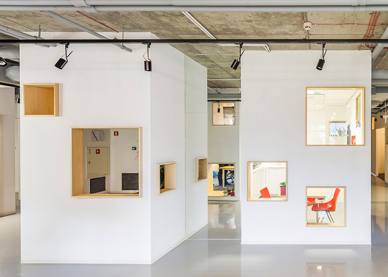
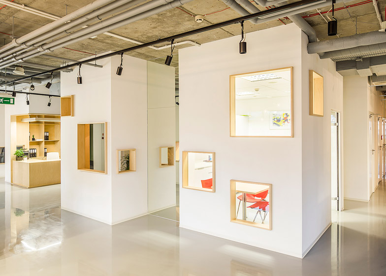
The studio filled the 400-square-metre commercial office with individual wood-lined booths that look like miniature flat-roofed houses.
The small-scale offices are designed to give a more homely atmosphere for the company's staff, which they believe will be more conducive to productivity.
"From the very beginning we intended to create an original, non-cliché space," the architects told Dezeen.
"In the building, all the offices looked the same, with their boring expression and sad, dark, low rooms. All designed in the same manner, using the same materials – repetitive solutions that did not take users into consideration, rendering them bored and uncreative," they added.
The exteriors of the cubicles are plastered and painted to look like the rendered walls of a house.
Plywood-framed windows cut through the walls are designed to create less claustrophobic working conditions for the inhabitants, but also to allow communication with passers-by.
Staff have begun to store personal belongings, books and flowers on the windowsills, an unintended but welcome use of the space according to the architects.
"By putting their belongings in these places, the users of particular spaces provide a specific character to each of the rooms, just as residents adjust the appearance of windows in their homes by hanging curtains and placing plants and flowers on the windowsill or hanging laundry to dry," said MFRMGR, who also designed a wooden canopy for a Thai noodle-bar in Warsaw.
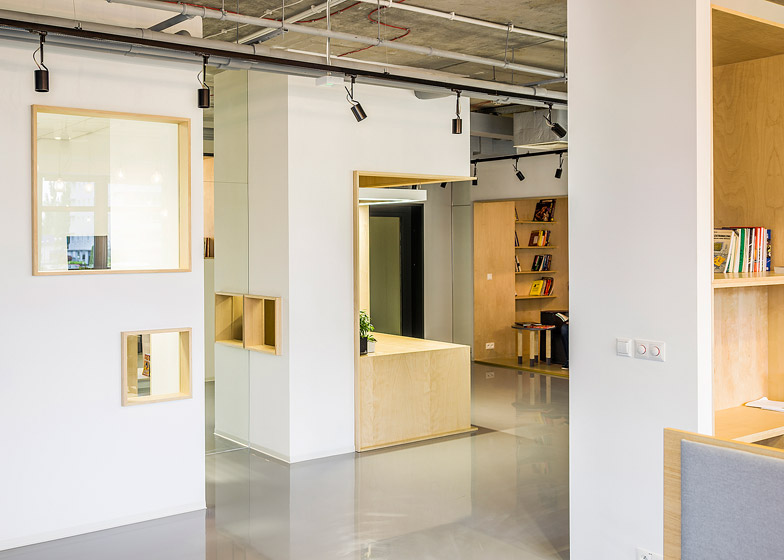
Sections of mirror-wall inserted between offices give the illusion of a larger space. "They [the mirrors] were distributed in a way which creates an illusion of streets meandering between the houses, thus creating a 'mini-town'," said the team.
On the interior, the workspaces are lined with grey carpeting and warm-toned plywood walls to create "a friendly, welcoming space." Closets and shelves are built into the walls to give employees storage space.
The booths are lit by simple pendant lights hung from black electrical cabling.
The hallways and conference rooms contrast the homely interiors of the cubicles with glossy grey resin floors and concrete ceilings.
MFRMGR removed the suspended ceiling tiles to expose the concrete ceiling, cabling and pipes, reinforcing the contrast between the light, warm interior spaces and the industrial-looking structure. A black lighting rig on the ceiling directs spotlights onto the corridor areas below.
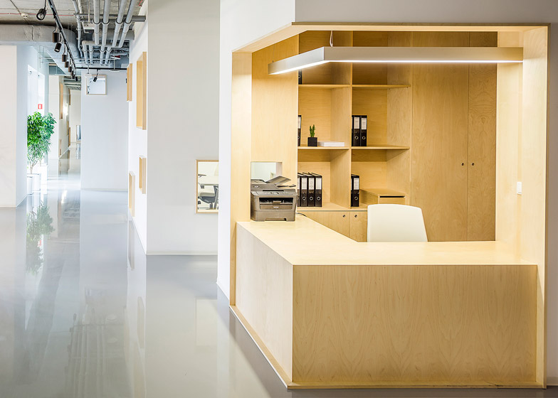
Off the hallway, a wood-lined alcove with a sofa creates a waiting area for clients opposite an open-fronted reception cubicle.
"We wanted to fill the office with positive features relating to the archetype of home space," said the architects.
The Polish studio also renovated a sandwich shop in Warsaw this year, based on the brightly-coloured framework of market stalls.
Photography is by Jakub Ceryowicz.

