Italian studio Massimo Galeotti Architetto has filled in the empty corner of a house in Treviso with a timber-clad extension to provide space for a new music room (+ slideshow).
Located in in Treviso's historic Fiera neighbourhood, Casa Fiera was renovated by Massimo Galeotti Architetto for a man and his family who has previously lived next door.
"The owner has a passion for music, and wanted to live in a place full of history, close to where he was born and grew up," Galeotti told Dezeen.
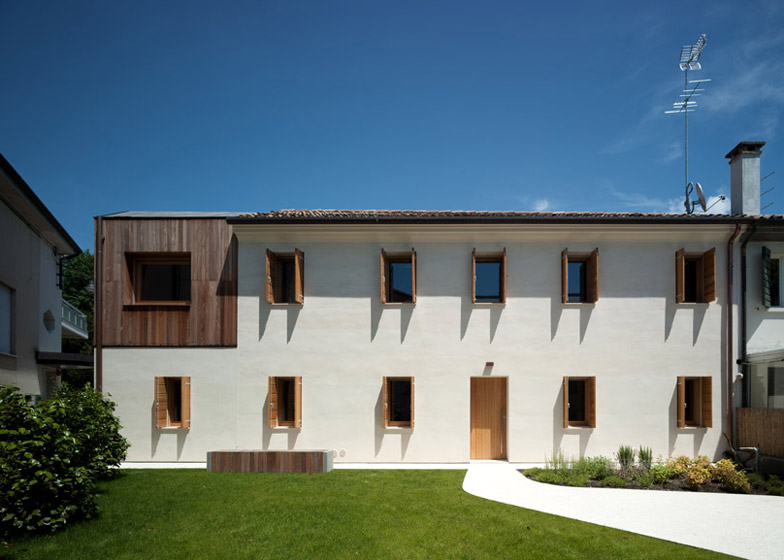
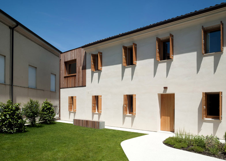
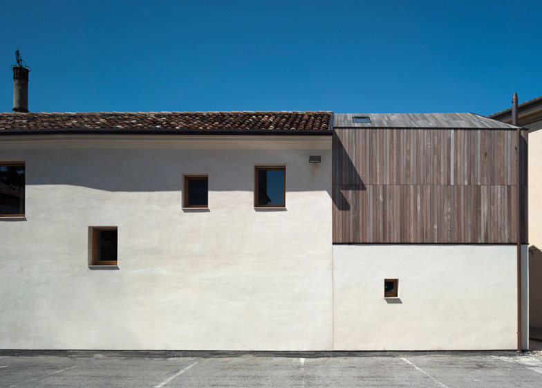
The original house is approximately 100 years old, but had been abandoned for decades before work commenced. The extension replaces a vacant corner that was previously used as a terrace, and is clad entirely in ipe, a durable South American hardwood.
"This additional volume made of wooden slats for the walls and sloping roof not only enhanced the artistic quality of the original home, but also completed the entire volume and underlined the differences between the old structure and the new one," said Galeotti.
The exterior of the original house was refreshed with new lime render, and windows with larch frames and shutters were added at the back to provide views of an adjacent 12-century church.
A new white gravel path cuts across the back garden to meet the home's main entrance and complements its white exterior.
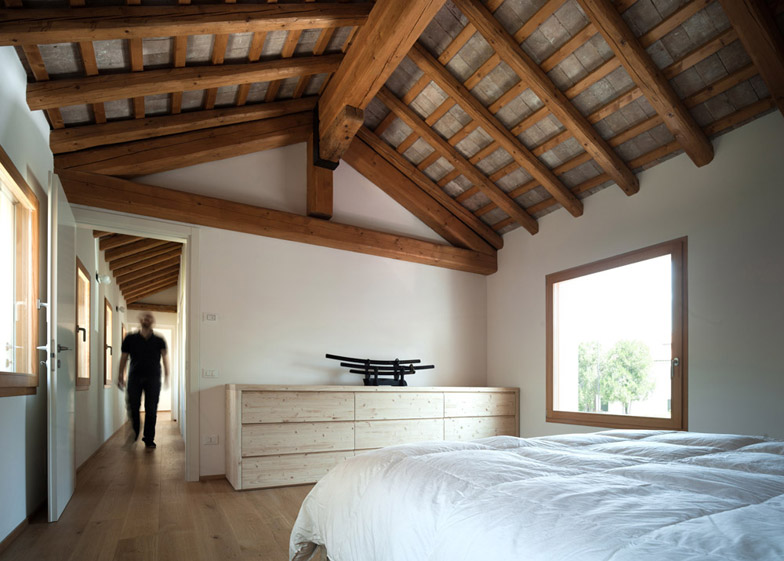
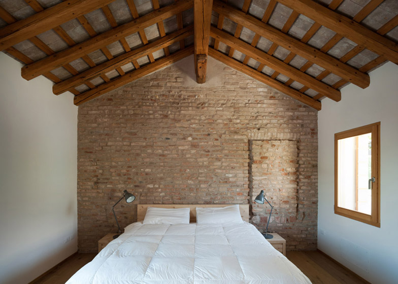
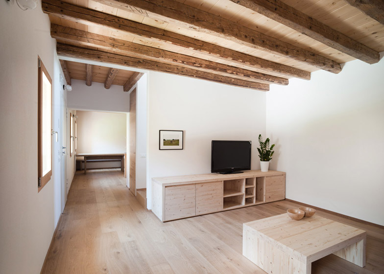
Inside, the original layout was kept intact, and ceilings were removed to expose the building's timber beams.
"The interior spaces and stairs have not been changed – there were no demolitions. Instead, the renovation focused on removing excess layers to show the beauty of the structure," said Galeotti.
Bricks were also exposed in some rooms, revealing an old walled door and window in the living room and bedroom.
"Removing the plaster, we found interesting elements from the past, but these openings remain closed because the house is joined to another," said Galeotti.
The two-storey house has communal spaces arranged on the ground floor, with a living room, kitchen and dining area, as well as a bathroom and laundry room.
A glass sliding door was added to separate the kitchen from the living room. "We wanted to find a way to limit smells travelling from the kitchen to the living room, but chose glass to maintain the perception of space," said Galeotti.
White walls and oak flooring with visible knots were used throughout the house to complement the natural materials of the exposed structure.
In the bathroom, a calmer palette of matte grey ceramic tiles was used, and the bath surround was extended to the walls on either side to provide space for seating and toiletries.
"The main bathroom is a special place because you can have a shower and observe the garden at the same time," said Galeotti.
The top floor has the master bedroom, guest bedroom, smaller bathroom, and the new music room, which was designed as a flexible space and has a rooflight to bring in additional light.
"This new room can be used as a music studio, but it can also be a place just to relax or read," said Galeotti.
Photography is by Francesco Castagna.

