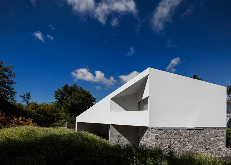
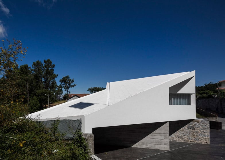
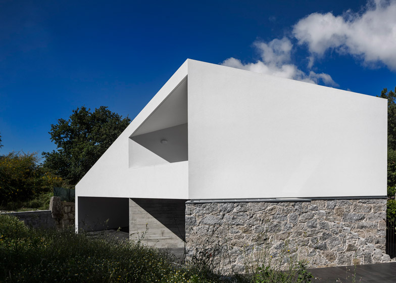
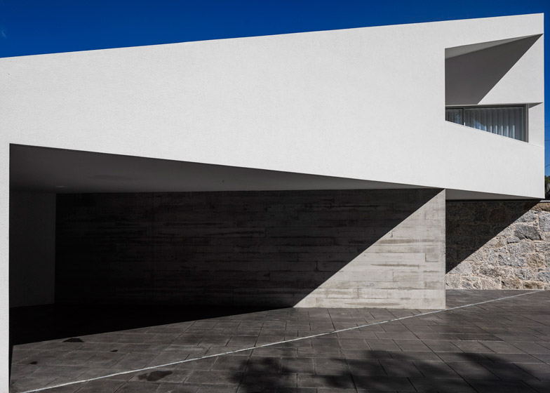
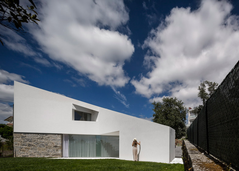
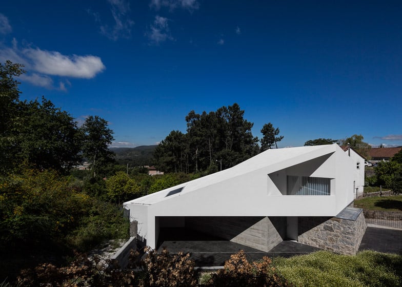
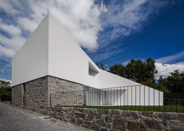
This Portuguese house has been completely transformed by architects Rui Vieira Oliveira and Vasco Manuel Fernandes, with a new structure that rests on top of the original home's granite walls (+ slideshow).
Taíde House involved the renovation and extension of a 74 year-old house in the northern Portuguese village of Taíde for a family with one young child – the father of whom had lived in the house his entire childhood.
Architects Rui Vieira Oliveira and Vasco Manuel Fernandes collaborated on the design, and Fernandes managed the construction, which has added 60 square metres of space to the house.
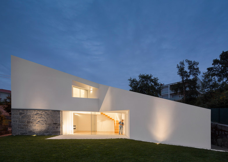
"It was essentially a building made of wood and over the years it had degraded, so we chose to demolish it, but the granite walls of the ground floor were well built, so we kept them to preserve the memory," Rui Vieira Oliveira told Dezeen.
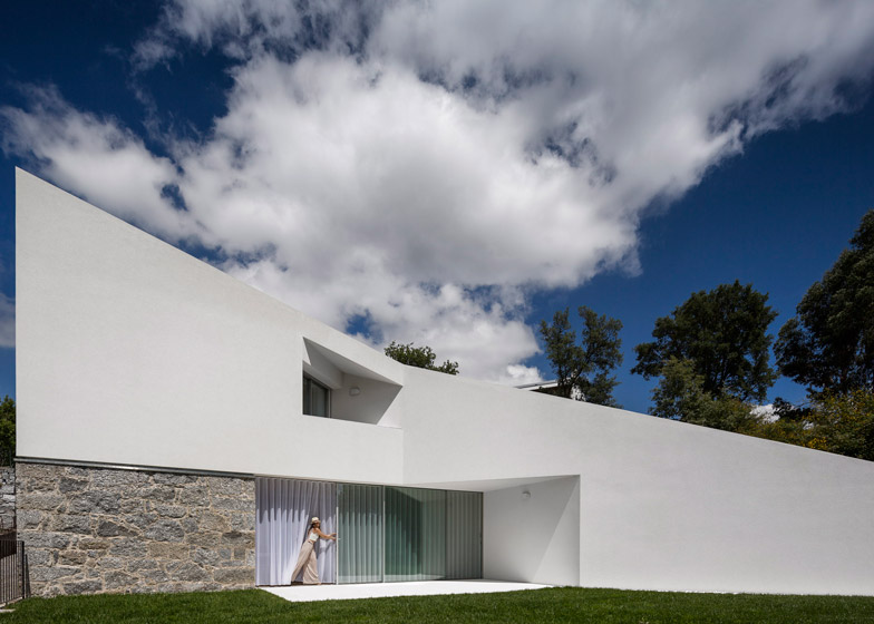
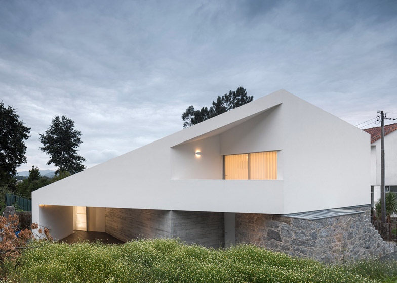
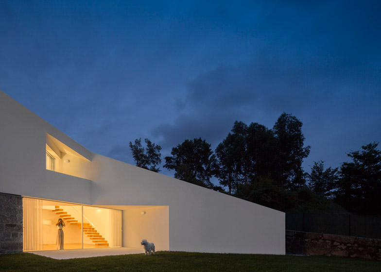
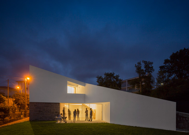
The new design retains the square footprint of the original granite structure and tops it with a roof extension that juts out at the side and engulfs part of the ground floor, providing extra space on both levels.
"In early sketches, the roof emerged, and assumed itself as the structuring element for the whole project," said Vieira Oliveira, who designed its angular shape to echo the pitched roofs of surrounding houses, so that it would relate to its surroundings "in a friendly way".
"The concept was not to disrupt the past completely. We felt that we could create something dynamic without hurting the surrounding environment," he said.
The long slope of the roof, which has voids cut into the front and back to provide sheltered balconies, was also designed to reduce the apparent scale of the new house, which is in a hilly location surrounded by other homes.
"The surroundings work as an amphitheatre, in which the gaze of the neighbours is very proximate. Streets are narrow, backyards are almost public and every word is listened to, so the scale and the design of the house was a concern," explained Vieira Oliveira.
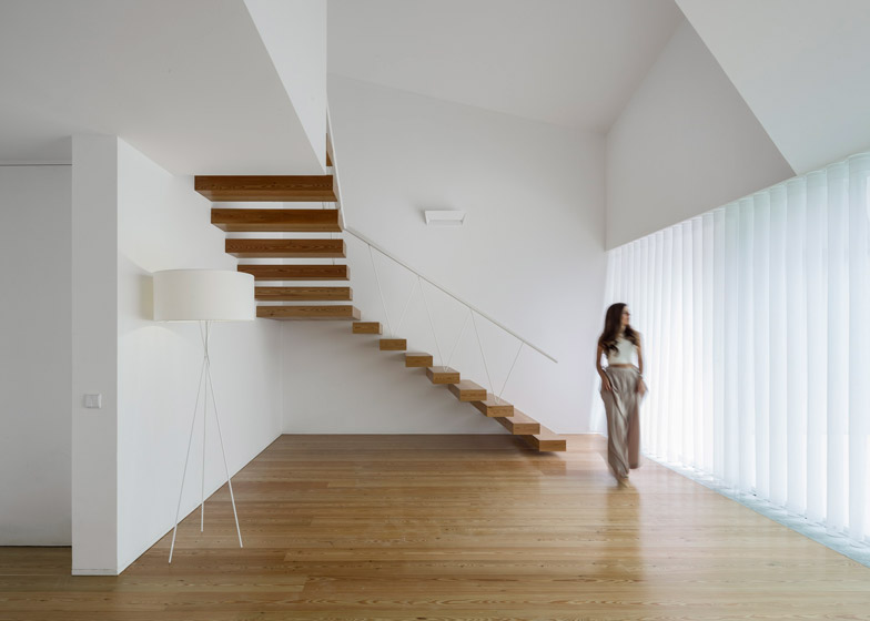
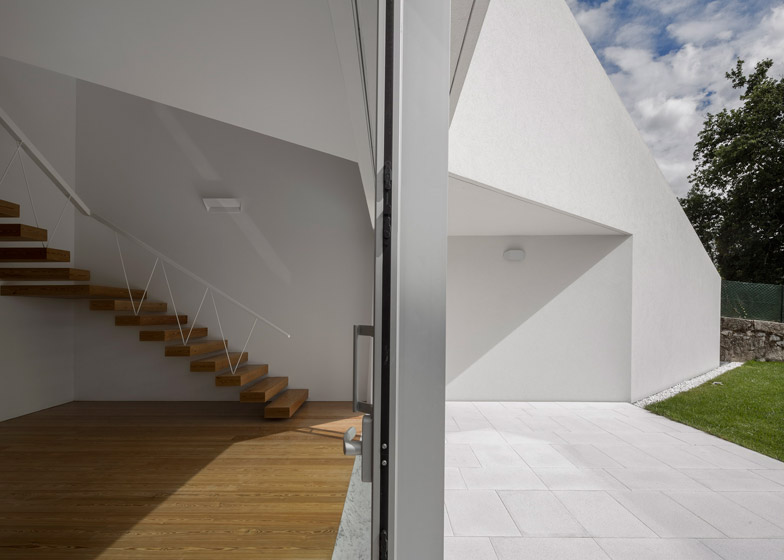
The entrance is tucked away at the back of the house, and leads to an open-plan living room and dining area, with a kitchen at the side that can be hidden behind sliding doors.
"Originally the client had showed the will to make something simple, something 'easy' to enjoy," said Vieira Oliveira. "The idea was a simple house in which one could, for example, conceal the kitchen, thus occupying a minimal amount of space."
The ground floor also has a study at the front, accessed by a corridor lined with floor-to-ceiling storage.
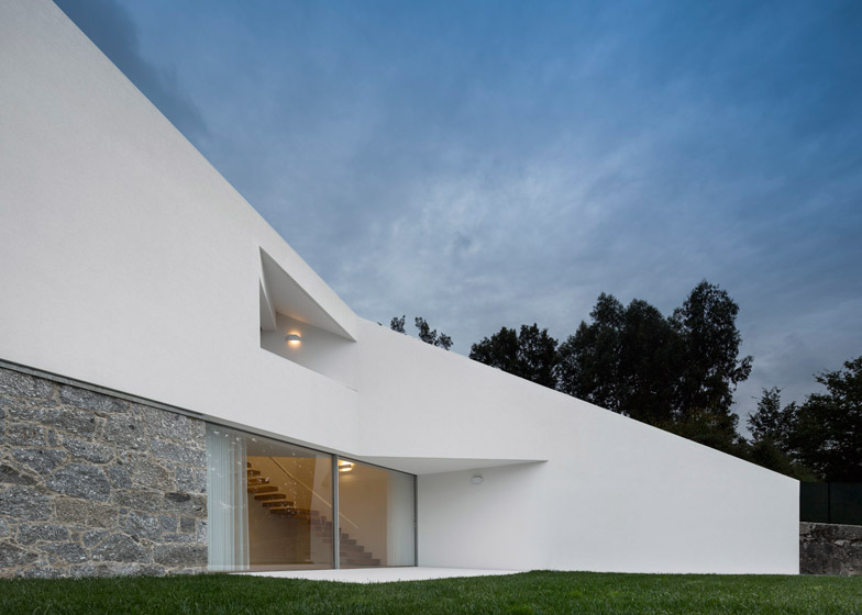
A 6.4-metre-wide glazed opening leads to a terrace, which is partially sheltered by the angle of the new extension, and features white paving slabs to unify it with the house.
A cantilevered open-tread staircase leads from the double-height living space to the first floor, which has two bedrooms, each with an en-suite bathroom.
Both bedrooms feature tall ceilings and integrated storage, and have their own balconies.
All bathrooms were finished with Carrara marble, and Nordic pine was used for the all the flooring, chosen for its colour and smell.
Lighting was carefully integrated into the design throughout the house, and thermal insulation was added to the exterior to improve the home's energy efficiency.
Since completion, the new house has been quietly accepted by people in the village, according to Vieira Oliveira.
"Every time I visit, the neighbors say good morning, so I deduce that they still like me," he said.
Photography is by Fernando Guerra.

