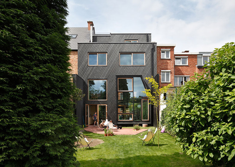
A mixture of simple windows and double-height glazing bring light and views into the back of this Belgian house, which NU Architectuuratelier has converted from flats into a family home (+ slideshow).
Kessel-Lo House in Leuven, Belgium, was designed by NU architectuuratelier for a family with two children who originally wanted to extend the former apartment building, but eventually settled on opening up the existing space.
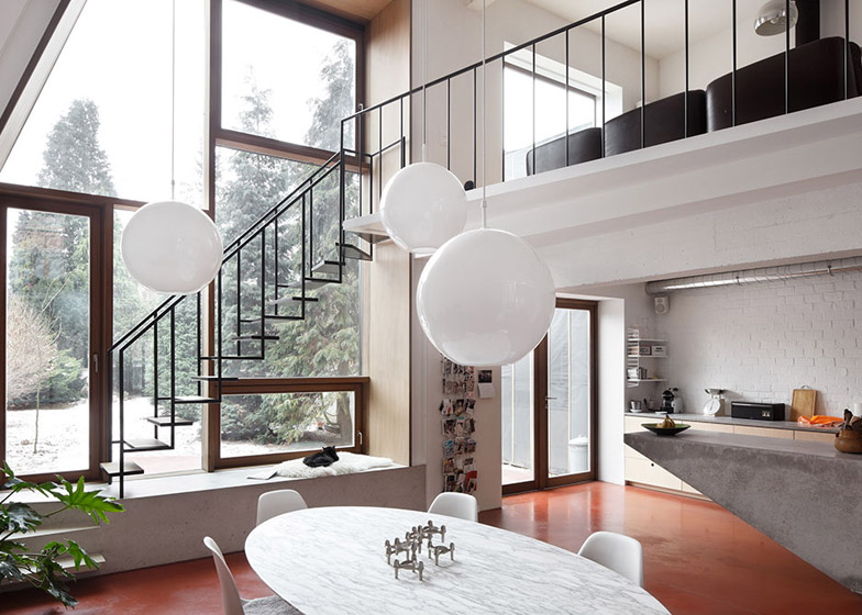
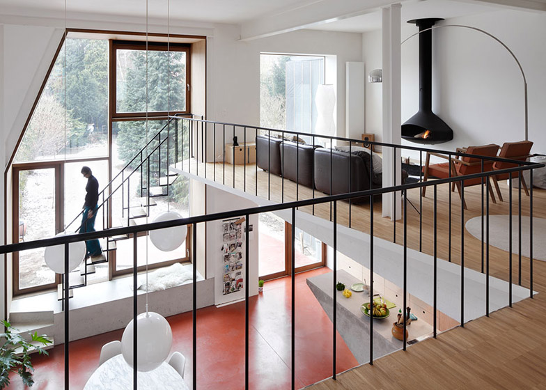
"We decided to work with the qualities of the building and found no need to extend it," said architect Armand Eeckels, who knocked an opening between the ground floor and first floor to create a double-height living space at the back.
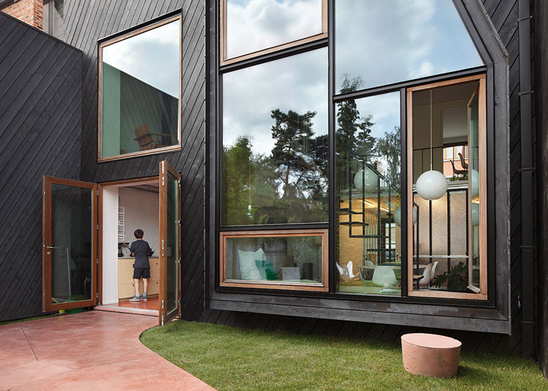
Floor-to-ceiling glazing was added to offer both levels of the living area a full view of mature trees in the garden, and smaller open-able windows were incorporated within this to provide ventilation.
Multiple exits on the ground floor give the house a more dynamic relationship with the garden.
Two glass doors in the kitchen provide the main access outside, and a single door at the bottom of the tall glazing offers a quicker route between the garden and the stairs from the first floor.
"The single door at the foot of the stairs plays an important role, because it creates a more direct connection between the living room on the first floor and the garden," Eeckels told Dezeen.
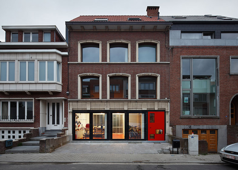
Diagonal strips of black-painted timber were added to enliven the exterior of the four-storey home.
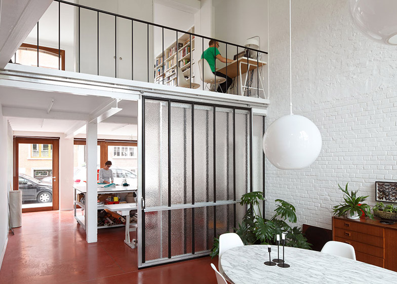
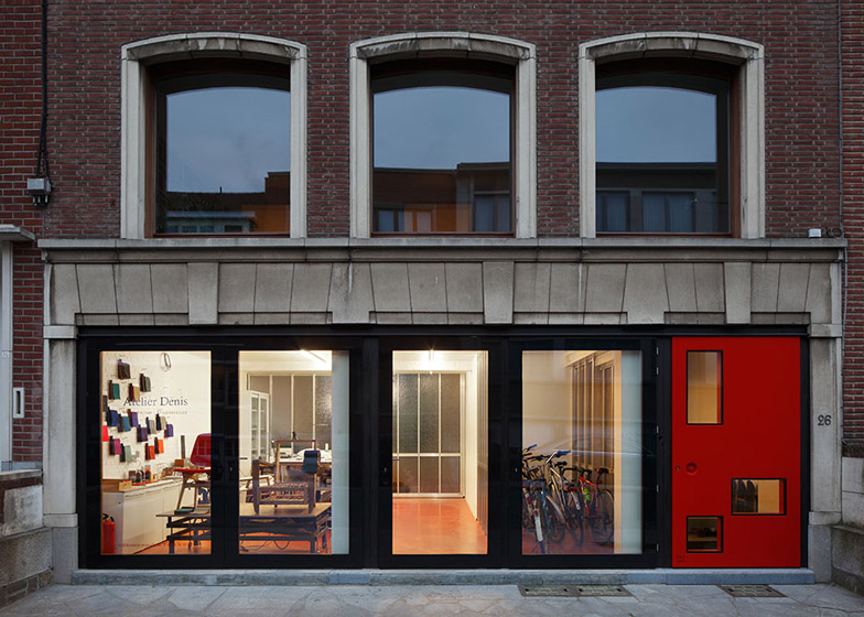
The front of the ground floor, which previously housed garages, was turned into a studio and display space for the owner's upholstery business, and is designed to act as a buffer between the house and the street.
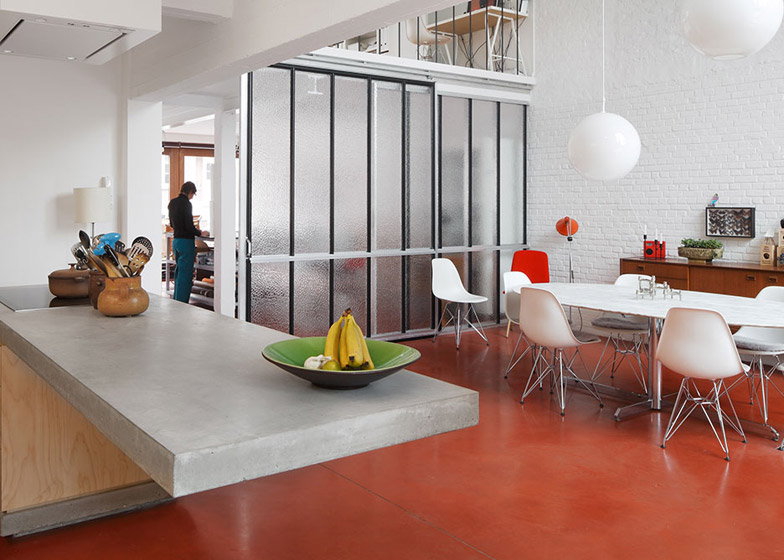
A frosted glass screen separates the studio from the double-height living area, which features concrete flooring with an earthy red pigment.
"It was a way to introduce colour to the interior, but not in a decorative way," said Eeckels, whose firm's past projects include a house with a latticed fibre-cement facade.
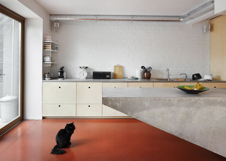
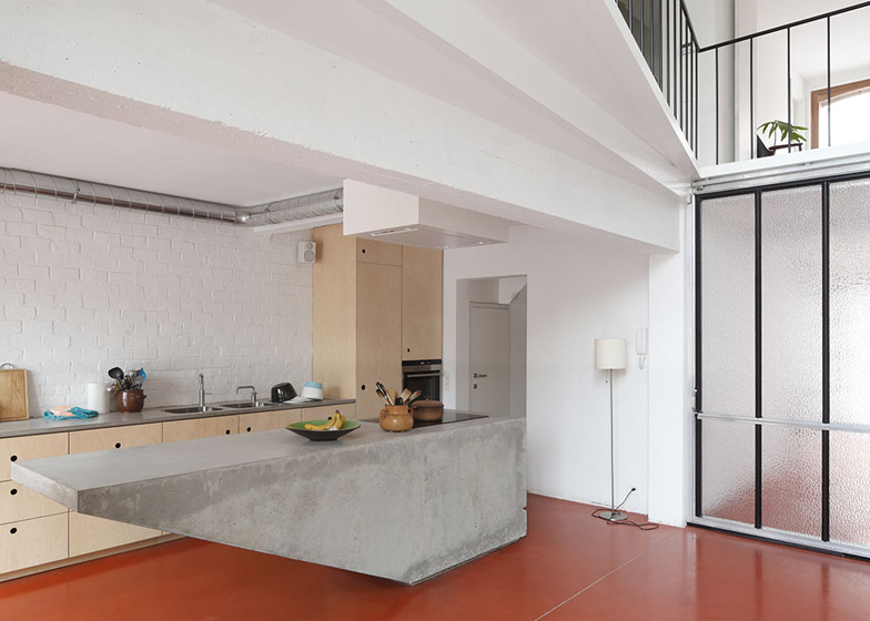
The kitchen on the ground floor features a tapered concrete island in the centre, which was poured on-site.
"We liked the idea of having this solid object defining the openness of the space," said Eeckels. "The tapered shape also gives it a certain lightness. It becomes less of an obstacle between kitchen and dining area."
The kitchen and dining space is overlooked by the first floor, which has an office and two living rooms – one facing the street, and the other facing the garden.
"One is designed as a quiet retreat, while the other is a place where the children can watch TV and play," explained Eeckels.
The second floor has two children's bedrooms, a guest bedroom and a bathroom, and the top floor has a master bedroom and bathroom, a dressing room and storage.
One of the baths extends to the wall to provide a seating ledge at one end with storage beneath.
"It's not that there was a huge lack of space in this bathroom – we just prefer doing only one gesture in a smaller room," said Eeckels.
Photography is by Stijn Bollaert.

