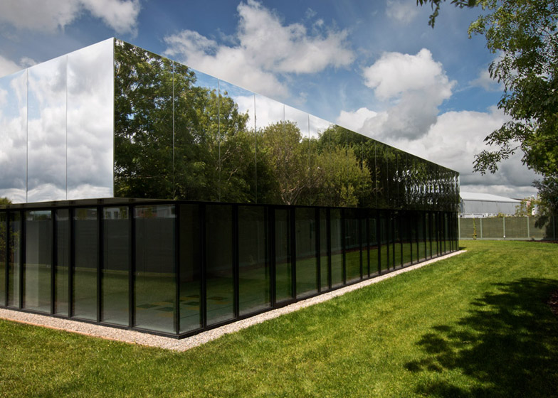
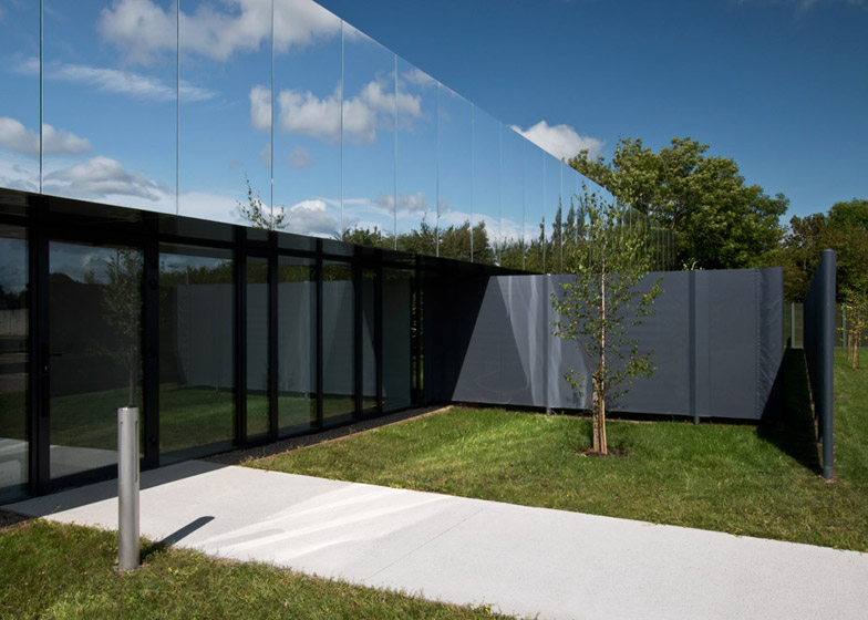
The mirrored roof of this children's care centre by SATA reflects the surrounding treetops and west Ireland skies (+ slideshow).
SATA designed the single-storey glass and aluminium structure to house services for the West Limerick Children's Centre, in county Limerick, Ireland.
The building by the Irish firm provides services for approximately 320 children and young adults under 18 years old with physical, intellectual or sensory impairments, and their families.
"We have focused on creating specific spatial experiences to be enjoyed all users at the centre regardless of disability, and on enhancing that experience through design features which would not trigger any distraction or discomfort for users – in particular users with autism spectrum disorders," SATA co-founder Mark Thompson told Dezeen.
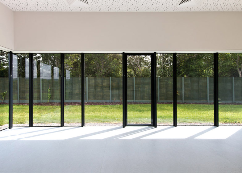
Black mullions that create a framework for the glass structure also disguise interior partitions between therapy rooms that run around the perimeter of the space.
"In some ways, we tried to express the ethos of the centre through the external expression of the building," said Thompson.
"The perimeter glazing at ground level, for instance, creates an open and equal relationship with the site, on all sides, just as the centre does with the surrounding area and community."
A polished aluminium parapet that tops the glass-clad structure reflects the sky and surrounding foliage, blending the structure into its landscaped setting.
At the opening ceremony for the centre, the client said the building's roof was a "cloaking device", that disguises the building in the right weather and light conditions.
On the interior, the therapy spaces are accessed from a white corridor that circulates around a central island. The island houses a staff room, toilets, storage and treatment rooms.
A long set of clerestory windows over the corridor provides a natural light source for the spaces in the centre of the building.
The architects were asked to use a neutral colour palette throughout the interior of the building, and to avoid using design features that might negatively impact on some of the children that use the centre.
"We were asked by the client to use a limited and unsaturated palette of colour and to avoid repetition of patterns in the design," said the architect.
The limited colour palette led the architects to focus on the use of light, informing the decision to give the building a glass facade and interior skylights.
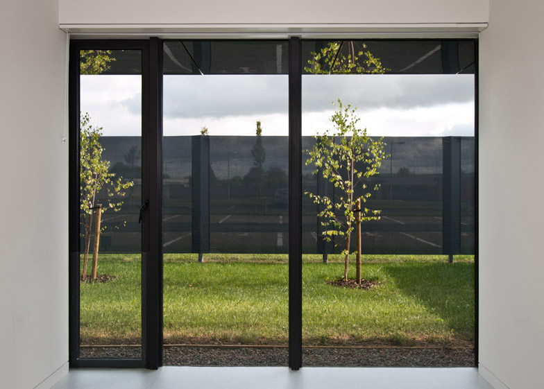
The "bright and spacious" rooms situated by the entrance of the building are shaded by a translucent grey rubber screen to give privacy for treatment rooms and a children's play area.
"We chose a composite rubber membrane for its specific transparency as it permits light and view from inside, whilst keeping activity sufficiently private within," explained Thompson.
Photography is by Kate Bowe O'Brien.


