Pentagram rebrands MIT Media Lab with grid-generated glyphs
Design agency Pentagram has used a simple grid of squares to create a new visual identity for the Massachusetts Institute of Technology (MIT)'s research centre (+ movie).
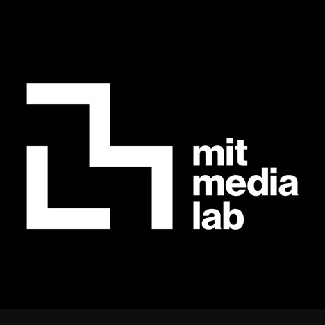
Pentagram designers Michael Bierut and Aron Fay based the branding on a logo created for MIT Media Lab's 25th anniversary in 2011 by designer Richard The, based on a seven-by-seven grid.
This was combined with a motif designed by the lab's co-founder Muriel Cooper for MIT Press in 1962 – a minimal configuration of seven vertical lines.
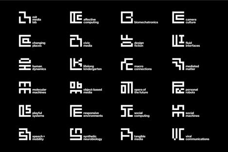
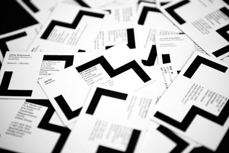
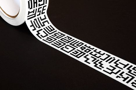
The Pentagram team used The's grid to generate a simple ML monogram for the main logo, then created similar designs for each of the 23 research groups that operate under the Media Lab's umbrella.
"The result is an interrelated system of glyphs that at once establishes a fixed identity for the Media Lab, but celebrates the diversity of activity that makes the Lab great," said Pentagram.
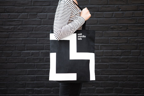
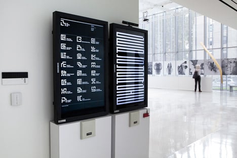
The underlying grid also led to the creation of a set of way-finding icons and a custom typeface, though Helvetica is used for the majority of text across the visual branding and other graphics.
"Helvetica, so central to MIT's communications when the Media Lab was new, has been reinstated to support the overall system," said Pentagram.
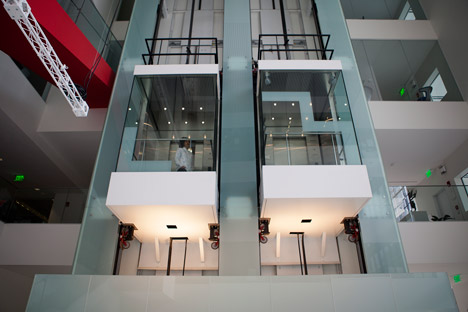
The icons are implemented on signage across the lab's building in Cambridge, Massachusetts, including on wall displays, lift shafts and information boards.
The brief to combine the two historic designs came from a group at the Media Lab, which included co-founder Nicholas Negroponte, Tangible Media group head and Lab associate director Hiroshi Ishii, Mediated Matter group head Neri Oxman and communications director Ellen Hoffman.
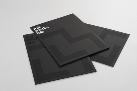
MIT Media Lab's website, stationery and accessories have all been updated with the monochrome graphics.
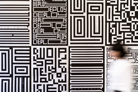
The new identity was unveiled at the Media Lab's 2014 Fall Members Meeting, for which Fay extended the visual language to create different graphic iterations of the word Deploy – the theme of the conference.
MIT Media Lab's first identity was developed by graphic designer Jacqui Casey and featured an adaptable motif of coloured bars, influenced by an installation that artist Kenneth Noland created for the centre's first home designed by architect I M Pei.