"Design and architecture has been a key influence" says COS managing director
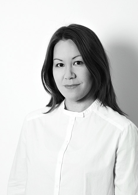
Interview: fashion brand COS is heavily influenced by architecture and design, says managing director Marie Honda, who tells Dezeen how the company built a global business with 104 stores in 25 countries without using conventional advertising or catwalk shows (+ slideshow).
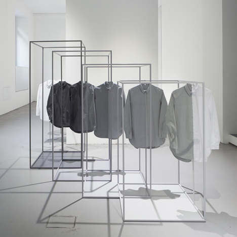
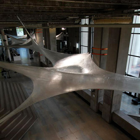
Instead, COS uses collaborations with designers including Nendo and Numen/For Use to target customers who work in the creative industries.
"You can see from our trend boards that our inspiration from the beginning has been very, very strong from the design world, architecture, graphics, etc," Honda told Dezeen. "It has been a key influence."
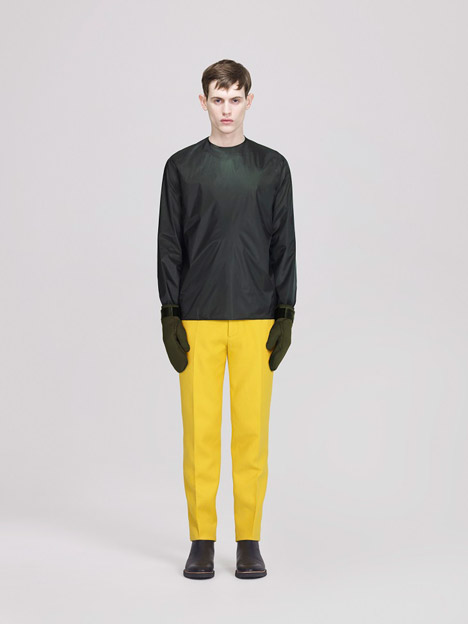
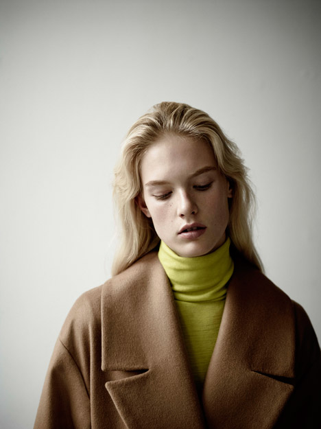
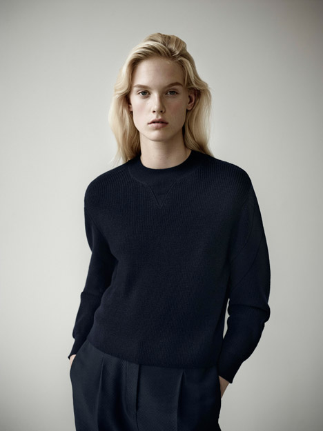
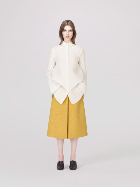
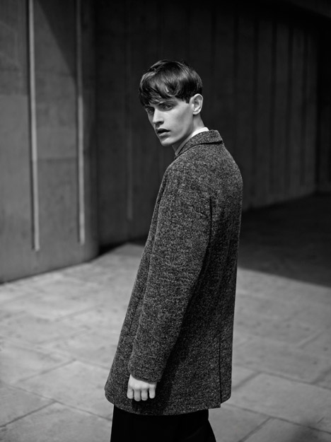
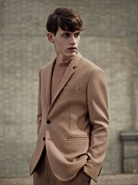
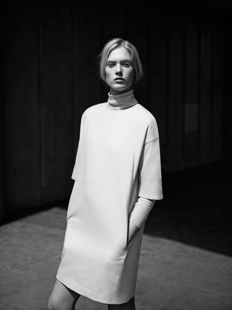
The brand's minimal garments, which Honda describes as "understated" and "timeless", defy seasonal trends and have became popular with architects and designers, who see COS as a more affordable alternative to luxury brand Prada.
COS, which stands for Collection of Style, launched in 2007 as part of Swedish retail giant H&M with the aim to provide "design quality for an affordable price" to shoppers looking for high-fashion garments for high-street prices.
"It felt like it was something missing in the market," said Honda, who began her role a year after COS launched and has since steered the brand's unique approach to fashion and retail.
The brand has used all aspects of design to build its reputation, following the principles of "timeless, modern, functional and tactile" for its garments, store interiors, graphics and packaging – all of which are currently designed in-house.
"These are the things that we really believe in throughout the brand, so not only with the collection but when we build the stores," said Honda, who added that the graphics and branding design also "goes hand in hand".
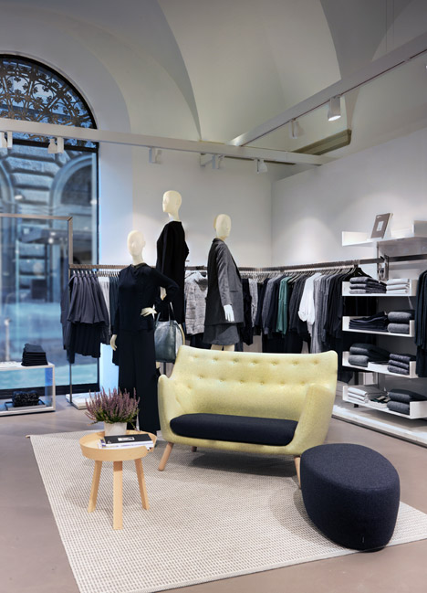
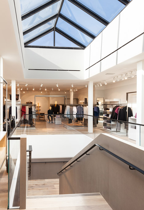
Honda was speaking to Dezeen at the brand's London headquarters, close to its Regent Street store – the first that COS opened and provided the model used for all of its retail interiors.
Metal rails divide the open spaces into the brand's four different collections – womenswear, menswear, children's clothing and accessories – while wood and concrete surfaces are used to "enhance the products".
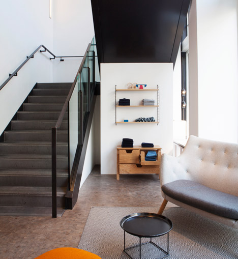
COS opened its 104th store in Los Angeles last week and plans to roll out new locations in Tokyo, New York, Melbourne and Seoul before the end of the year.
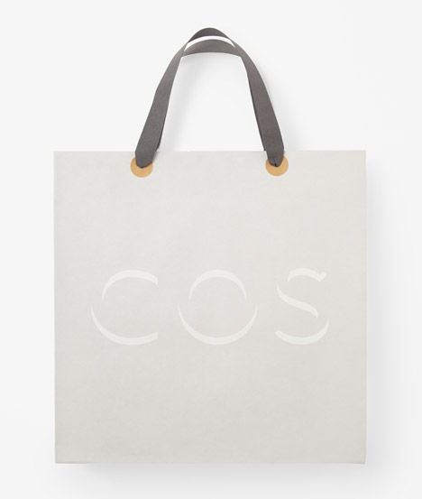
"Attention to detail is in everything throughout: what kind of buttons do we use, how do we cut the garments, but also within our packaging and our bags we have in the stores," she said. "How long should the handle be, what is the softness of the handle etc. It's key throughout all areas of the brand."
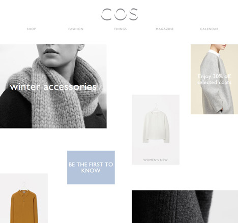
Rather than putting on fashion shows, COS shares its new collections directly with its audience via its website and a biannual printed publication that both feature pared-back designs.
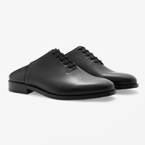
The brand does no advertising and instead sponsors events like the Serpentine Gallery Pavilion's Park Nights summer talks programme, for which it created a limited-edition Serpentine Shoe to coincide with the opening in June.
"We try instead to find other people who influence us to work together, for example when we work with Serpentine," said Honda. "There are other ways to reach out."
COS is also supporting an installation of translucent tape tunnels currently on show in a Paris art gallery, and collaborated with Japanese design studio Nendo to create an installation at Milan design week in April.
"One of Nendo's chairs with the clever part that has been created from one piece of wood features on our trend boards from time-to-time," said Honda.
Read an edited version of the transcript below:
Dan Howarth: Could you tell me a bit about the story behind COS and how it was set up?
Marie Honda: We've been based in London since the start, launched in 2007 with the business idea: high-fashion quality for an affordable price. We always said it was so fortunate that it was a group within the H&M group, which really felt strongly about this idea and developed this further. The response came to us quite quickly that it felt like it was something missing in the market, filling a gap in the market – something a little in between the high end and the high street. The response was really positive from the beginning, and that's kind of where we stayed in a way, in both worlds.
Dan Howarth: Have you been involved since the beginning?
Marie Honda: I started in 2008, so I joined a year after they opened the first stores. So still fairly young and not so many stores so it's been a fantastic journey throughout. As I said the response has been positive so far from the customer and we take that with us all the time to continue to develop the brand.
Dan Howarth: Where were the first stores opened?
Marie Honda: The first stores were here on Regent Street in March 2007 and it was quite a quick roll out, the first year. We rolled out stores here in London, also in Berlin and Copenhagen and so on, then there was a few stores here in the first years. Since then we have opened store 103 in Paris.
Dan Howarth: How do you translate the middle ground between high-end and the high street into the clothes?
Marie Honda: For our customer and our aesthetic, I think the key for us is timelessness, modernity, functionality and tactility. The timelessness is in the garments for everyone's essential wardrobes that don't have to be trend specific. Something that lasts a little bit longer in essential garments, such as the white shirt that we strongly believe in throughout all the concepts in our range, the trench coat or the fitted blazer, in menswear the perfect pair of chinos. It's not so much about trend and season, it's a bit season-less and lasts a little bit beyond.
It's important then to be modern still. We talk a lot about our customer being aware and really knowing what they're buying into. Modernity is important in that sense. How does the colour look this season? Is it a little bit of stretch that we're adding? How is the cut of the garment? Of course that sort of thing is always changing. But modernity can also be within the material, which is changing a lot right now overall. A lot of new materials are coming in, a lot of finishings. Or how you cut can be quite modern, maybe with a fastening etc. It's just always pushing ourselves and our production team to make sure we can make it new for the customer.
Tactility goes throughout, not only the collection but everything that surrounds us, also the stores and all areas of the brand. What is the finishing? What is the softness that it feels? If we work on the store designs it's equally important. What kind of materials do we choose for the cash desk, for example, because that's something that the customer touches and the fitting rooms etc. For all the materials around us, we always talk about the surface and how it feels.
The functionality is key for us as well. It's important if you have a new shape or cut in the garment that it is still functional and flattering when you wear it. People tend to say we are quite minimalistic but it's not always the case that we want to be. I think it's just the way we work with the garments. We don't add things if there's no reason for it, really. So then it becomes more minimalistic in that way.
Dan Howarth: There's a lot of emphasis on detail?
Marie Honda: Absolutely. Attention to detail is in everything throughout: what kind of buttons do we use, how do we cut the garments, but also within our packaging and our bags we have in the stores. How long should the handle be, what is the softness of the handle etc. It's key throughout all areas of the brand.
Dan Howarth: How would you describe the brand's overall aesthetic?
Marie Honda: From the beginning it's been a different aesthetic, more understated rather than showy. I think the key was for us is the design quality for an affordable price and just to find the perfect essentials for everyday wardrobes.
Dan Howarth: Your stores are all designed in-house. How would you describe their aesthetic?
Marie Honda: I think the original concept was created by William Russell. We have the four different concepts within our collection, the idea was to create rooms within rooms. That's why we have the metal rails and we don't have any fixed walls. We love the open space, but create the smaller rooms for each and every concept with the rail system to create rooms within the room. It's important to have the place as a blank canvas because we really want the product to speak for itself, that is the most important thing for us, but also by using some of the materials it can enhance the products in a way. By using the metal, concrete and warm woods in there we create a really nice atmosphere for our garments to hang within.
Our architects here do everything in terms of store planning. Each and every space in the store is unique so we sit down and look at every space together and say "OK, what can we use?" We love the light, we love to have all the open windows, we like to have a lot of old features that we always keep. We want to keep the original features as much as we can then try to find a way that we can create the space to work together with the original features. So we have some fantastic old features, for example in our Florence store, it's a very old building and we still have the wooden ceilings.
Dan Howarth: How important is graphics and brand presentation?
Marie Honda: It just goes hand in hand, I think. Again this goes back to the first words we talked about - timeless, modern, functional and tactile. These are the things that we really believe in throughout the brand, so not only with the collection but when we build the stores, timelessness in the material that lasts a little bit longer and wood that gets more beautiful when it gets more worn. When you come into communication, graphics and marketing, it's the same thing there again, we wanted it to be something that has the same aesthetic and feeling of timelessness and tactility, so I think it's just surrounding the whole brand. I think it's very important that the customer should appreciate it as much as we do, that they should really feel everything that is put into it is there for a reason.
Dan Howarth: Is your graphic design and branding all done in-house as well?
Marie Honda: Yeah, we're all sitting together, which is fortunate because we can work across all departments. We have heads of design for the collections, then we have a team for the art direction for all the graphics, and then of course we have the architects working for the stores. So we have teams, marketing, graphics, interiors, with architects, with design and buying, but the beauty is that we all work together.
Dan Howarth: Where do the COS fashion, interior and graphic designers get their inspiration?
Marie Honda: You can see from our trend boards that our inspiration from the beginning has been very, very strong from the design world, architecture, graphics, etc. It has been a key influence. The creatives here and heads of design always make their in-house directions and colour schemes, picking from everything that surrounds them that they are influenced by right now. That tends to be a lot from the art world, design, architecture and photography. At the moment there's a lot of lighting and sound installations going forward but it's just something that influenced them. They use that as a direction for the collection but also for the rest of the brand so for the visual team, marketing and online.
Dan Howarth: Do the disciplines you mentioned reflect the customer base that you have?
Marie Honda: The customer that we have met throughout the years in our stores and who contacts us online, we feel like this is someone who is very aware and has a big-city mindset. They don't have to live in a big city, but they have a big-city mindset so they're aware of and interested in everything that is happening around them, it doesn't have to be fashion, it can be design or culture, politics, everything really.
They're very aware of how they spend their money and what they buy into, so they really appreciate value for money in that sense. We are hugely influenced by that and also how we create the stores, it's a fantastic response if we also get those influences the same way back to us. It's a cycle I guess, we hope we can of course give back in a way.
Dan Howarth: Why does the company sponsor events like the Serpentine Gallery Pavilion talks?
Marie Honda: We have supported various big organisations before and collaborated with a few different galleries and artists. I think the Serpentine for us, here in London is such a fantastic charitable organisation that is open for everyone – art for all is their value, so we found a lot of common values with them, that they wanted to give back and share with everyone. When they have their talks, most of our team attend and are really influenced, so we felt that also this was a really nice collaboration to do. Sponsoring them to continue to do the Park Nights, as they did this summer, they were able to do more over a longer period of time. We're hugely inspired by what they do.
Dan Howarth: Has the collaboration resulted in any specific products in your range?
Marie Honda: Last year we did a couple of shirts that we already have in the collection but in a light blue colour that we also sell in their gallery shop and also in our store. This year we created an addition of lace-up shoe for men and women.
Dan Howarth: How did the collaboration with Nendo at this year's Salone del Mobile in Milan come about?
Marie Honda: Again through a very organic process in that way. One of Nendo's chairs with the clever part that has been created from one piece of wood features on the trend boards from Karin and Martin from time-to-time. So when we had the chance to meet with Oki Sato it just felt right for both of us. We had a talk and from there we took it on board and it was a process for both of us coming up with the idea, it came very natural for both of us and it came quite quick. I think sometimes those are the ones where it becomes the best because it just feels right from both, so we were really happy with the outcome of the shop where we sold his Nendo things and our garments together with the installation of the white shirts.
Dan Howarth: Does your team go to Milan every year?
Marie Honda: Yeah it has been really amazing for us to be able to sell our things there and to be able to decorate that store environment. But also it's such a nice environment to be in, to go and look at what everyone else is doing. So we've always been there to get the influences and be part of it. We really see our customers there.
Dan Howarth: Why do you not have biannual fashion shows like most other brands?
Marie Honda: It has always worked well for us in a way that we try to share as much as we can directly with the customer. Since the beginning we have had our magazine that we print twice a year. We have a lot of information shared on our website, obviously a lot of collection things. We can share the content we produce with everyone and that's how we share it.
Never say never, but also we don't advertise as a brand either, we're a non-advertising brand. We try instead to find other people who influence us to work together, for example when we work with Serpentine etc, so there are other ways to reach out.
Dan Howarth: How has being based in London been beneficial?
Marie Honda: It's a very international city and looking at the level of colleges and design colleges here in London it's fantastic the level that we can get on the design but also in all areas of the brand. So I think it's just that international client that you have in London.
Dan Howarth: Do you hire a lot of your staff from the London design schools?
Marie Honda: Yes, our head of design for womenswear, Karin Gustafsson, came from the Royal College of Art, and head of menswear Martin Andersson comes from Central Saint Martins, so we have quite a huge talent from the colleges here in London.
Dan Howarth: H&M is a Swedish company and you're Swedish too. Does COS have a strong Scandinavian influence?
Marie Honda: It's difficult to shy away from, we have a heritage in that sense from a brand that grew and was based out of Stockholm so it has an influence on us. I think it's amazing that we have that background but to be based where we are and to create something that feels quite new, we always hope we can develop it in our own way.
Dan Howarth: What direction is the brand moving in?
Marie Honda: It's been an amazing autumn for us already, we have a lot of new store openings. We're opening up in LA later on and also Tokyo, and a new store in New York and also Melbourne, and the last also in Seoul.