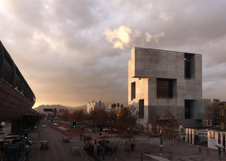
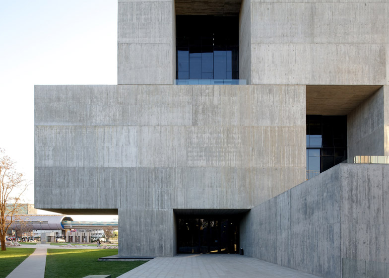
This concrete innovation centre at a Chilean university by Santiago studio Elemental has deep recessed windows designed to cool its network of communal interior spaces (+ slideshow).
Elemental designed the 8,176-square-metre Innovation Center UC – Anacleto Angelini on the campus of the Universidad Católica de Chile, in Santiago. The 14-storey building, which includes three floors underground, was created as a space where companies and businesses could converge with researchers.
The client requested a building with a "contemporary look" but the studio felt a "professional responsibility" to avoid the environmental and design pitfalls of the glass-fronted buildings typically associated with innovation in the Chilean capital.
"This building had to respond to the client's expectation of having an innovation centre with a 'contemporary look'," said studio director Alejandro Aravena, "but the uncritical search for the contemporary has populated Santiago with glass towers that due to the desert climatic local condition have serious greenhouse effect in the interiors."
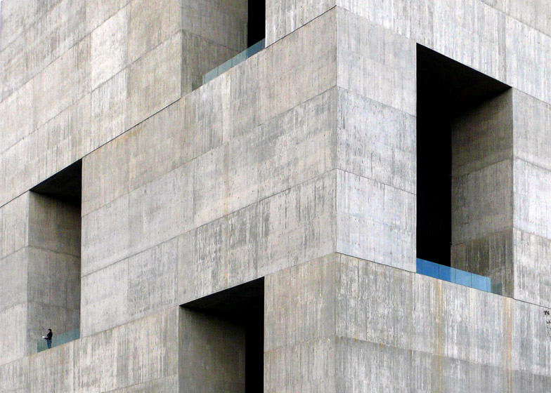
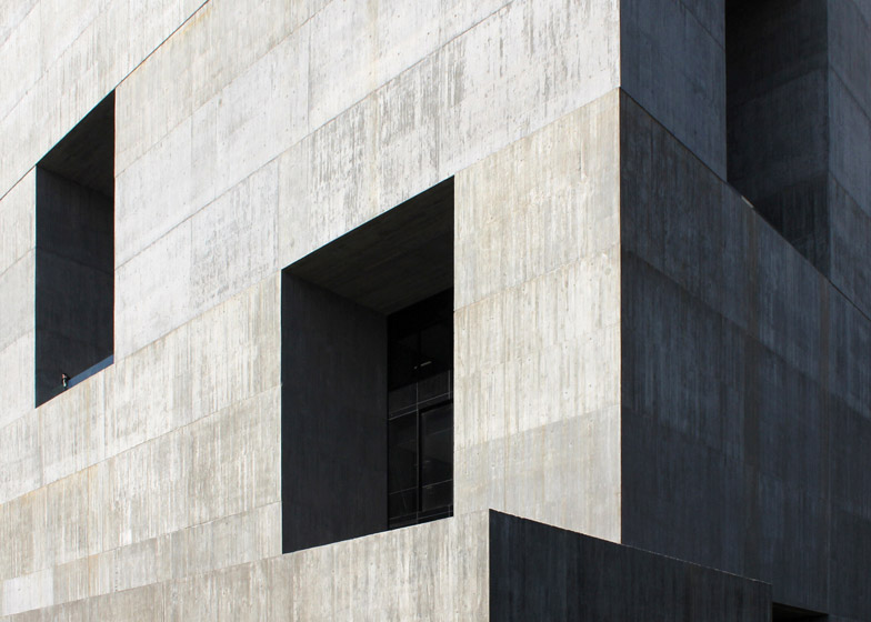
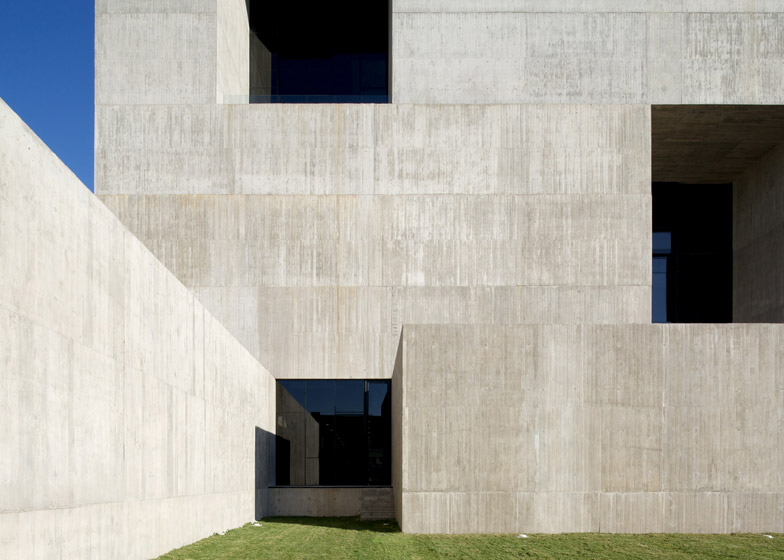
A reinforced concrete construction was selected for the building, which has a facade made up of volumes of stacked concrete block-work and deep three-storey-high windows.
"From a stylistic point of view, we thought of using a rather strict geometry and strong monolithic materiality as a way to replace trendiness by timelessness," said the design team, whose previous projects also include a cantilevering concrete pavilion on a Mexican pilgrimage route.
To avoid costly air-conditioning bills, the architects added large recessed openings in the concrete facades that provide air flow and cooling for the building's interior. Large sections of concrete jut out from the facade to further shade the recesses.
The architects claim this feature has halved the standard energy consumption used by a glass tower block in Santiago.
The openings are fronted by panels of waist-height glass that transform the window sills into open terraces.
"The way to avoid undesired heat gains is not rocket science; it is enough to place the mass of the building on the perimeter, with recessed glazing to prevent direct sun radiation and allow for cross ventilation," said Aravena.
The opaque facade also removed need for interior blinds and curtains around working spaces, which are naturally dimmed by the deep-set windows.
"We thought that the biggest threat to an innovation centre is obsolescence; functional and stylistic obsolescence," said the architect, "in that sense the response to the context was nothing but the rigorous use of common sense."
On the interior the floors face onto a wood and glass-lined atrium at the centre of the building with a circulation path at either end.
The spaces are designed as a "matrix" of formal and informal areas with sofas, office furniture and exposed ceilings where both individuals and teams could work, and encounter other researchers.
"We thought that face-to-face contact is unbeatable when one wants to create knowledge," he said.
"We multiplied throughout the building the places where people could meet: from the elevator's lobby with a bench where to sit if you happen to run into somebody that has interesting information to share, to a transparent atrium where you can sneak into what others are doing while circulating vertically, to elevated squares throughout the entire height of the building."

